Simple interfaces and the pleasure of a “one-click” experiences remain elusive for consumers using mobile banking websites. No one gets it all right.
Before a bank or credit union turns its digital staff loose to redesign its mobile site to produce more and better sales, it ought to have them serve a short apprenticeship in a branch to learn how consumers make their financial services buying decisions.
That might be a bit of an exaggeration, but not by that much. Many of the people building the sales functions on financial institution mobile sites haven’t had any training or experience in selling banking products, says Alyson Clarke, Principal Analyst at Forrester. She adds that these technologically talented folks don’t spend much time with financial sales staff either. And yet they handle development of the potential sales channel of the future.
As a result, the sales and marketing functions they build for mobile sites often don’t hit the mark because they don’t approach the process in a way that matches the way that consumers buy financial services.
Read More: 3 Common Myths That Could Be Wrecking Your Mobile Banking Program

Navigating Credit Card Issuing in an Uncertain Economic Environment
Build a modern credit card strategy that balances profitability and risk, adopts the latest technology and delivers the customization that cardholders demand.
Read More about Navigating Credit Card Issuing in an Uncertain Economic Environment

The Financial Brand Forum Kicks Off May 20th
Explore the big ideas, new innovations and latest trends reshaping banking at The Financial Brand Forum. Will you be there? Don't get left behind.
Read More about The Financial Brand Forum Kicks Off May 20th
‘Mobile’ Should Mean ‘Easy’
Americans increasingly buy more goods and services on their mobile devices, but shopping for banking products and making the final decision often involves visiting multiple sites and delving more deeply into the details. It’s a far cry from one-click ordering on Amazon.
Take the checking account, heart of most consumers’ connection with their primary financial institution. While checking is a transactional product, the decision to open a checking account is not transactional.
“A checking account is a relationship with your organization,” says Clarke, not something consumers open regularly. “It’s a relationship that probably affects many people on a daily basis.”
But most banking organizations’ mobile sites don’t effectively sell these accounts. According to a Forrester report, U.S. banks are not shy about asking prospects for their business — from the signup offers, to clear calls-to-action. Most of the banks Forrester reviewed “failed to explain what makes them unique and why prospects should choose them for their primary banking relationship.”
What’s Lacking in Mobile Banking Websites?
Clarke thinks some financial institutions focus too much on digital technology and not enough on the people they are running the tech for.
Forrester analysts often refer to current times as “The Age of the Customer.”
“The firms that are and will be succeeding are those that are customer-obsessed,” says Clarke, not tech-obsessed. That obsession entails not just making things as easy on the consumer as possible, but making it as fair as possible. And part of the challenge is to make useful information more obtainable on many sites without contortions.
Forrester’s study of six major banks’ public mobile websites — those of Ally Bank, Bank of America, Chase, Citi, U.S. Bank, and Wells Fargo — found none were good at both of the criteria the firm was testing for: valuable content and function, and a smooth customer journey.
Bank of America took the top rating for content and functionality and Ally Bank provided the best user experience. (BofA also had the top overall rating, followed by Ally.)
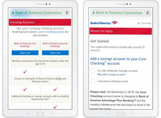
Content and function. The report said that Bank of America packed a lot of helpful content into a small screen. The mobile site made it comparatively easy to compare different types of BofA accounts and human help was easily obtained via a “chat” option. The inability to compare an institution’s various offerings while on its mobile site pulled down other providers’ ratings.
“Taking first or second place in every functionality category, the bank makes it easy for prospects using their smartphone to learn about and choose the right account,” according to the report.
“Sometimes the fullness of the mobile site makes it hard to navigate and read,” the report says by way of suggesting improvements, “but changes to the menu structure and visibility of search will expand Bank of America’s lead and make it hard for competitors to catch up.”
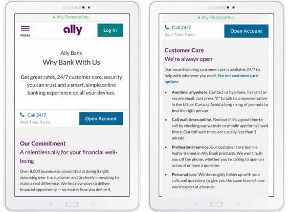
User experience. Forrester praised Ally’s mobile site for “outstanding content that is easy to understand and compelling messaging that convinces them to buy. It doesn’t shy away from the questions that prospects typically ask about the costs and benefits of being a customer because it has legitimate answers.”
The report also noted with approval that Ally’s mobile site was the only one that revealed the comments and ratings of customers.
Forrester suggested that Ally can improve the experience by easing the process of getting human help on the mobile site. Among other steps were the suggestion to improve navigability, especially to help consumers return to a screen they were reviewing when they looked elsewhere on the site for help.
Read More: Consumers Crave More Mobile Banking Features Despite Security Concerns

Sales Fails
Just stuffing a website with information about accounts is no more compelling by itself than a pianist playing the scales over and over again. The music comes when the notes are put in an order that creates a tune.
“The banks we reviewed have a lot of information on their mobile sites,” the report says. “That’s not a bad thing, except that prospects often have to scour around lengthy pages on their smartphone to read it, open PDFs and pinch to zoom in, or miss it entirely because information is on site pages that aren’t part of their purchase journey.”
Forrester objected to the frequent use of generic language that could have appeared on any bank’s mobile site. Hardly the stuff of which sales success is made. Indeed, lack of personalization in product recommendations emphasized the sameness.
“Prospects want to know why they should start a banking relationship with you, rather than your competitors, beyond rates and fees,” the report states.

Unlocking Digital Acquisition: A Bank’s Journey to Become Digital-First
This webinar will offer a comprehensive roadmap for digital marketing success, from building foundational capabilities and structures and forging strategic partnerships, to assembling the right team.
Read More about Unlocking Digital Acquisition: A Bank’s Journey to Become Digital-First

The Power of Localized Marketing in Financial Services
Learn how to enhance your brand’s local visibility, generate more leads, and attract more customers, all while adhering to industry regulations and compliance.
Read More about The Power of Localized Marketing in Financial Services
Keeping It Clear and Simple
Clarke sees several factors at work in the shortfalls among the mobile sites.
One is that some institutions’ products have grown overly complicated. This makes all comparison shopping harder. “They highlight what they want to highlight,” explains Clarke, “then they shove the rest into footnotes.” Those can be highly user-unfriendly.
“That plays into the perception that banks are just out to snooker people,” says Clarke.
She notes that Ally’s site keeps matters simple and clear, in part because the bank has worked to keep its product line simple and straightforward.
The frequent lack of ability to easily access human help concerned Clarke. Good human sales staff are generally trained in “needs-based” selling — probing a consumer to see what their financial needs and pain points are, rather than simply flogging the financial flavor of the month. A human can provide selling in that way, says Clarke. Mobile sites frequently can’t do that yet.
Human chat can help somewhat with this failing of mobile sites, says Clarke, but it has to be there, reliably, in order to assist consumers. Institutions need to make it clear when and how a consumer can obtain that help picking accounts, especially if it is only available at certain hours, or if help is offline only, say at a contact center number.
As proud as tech staff may be of mobile sites, the human factor makes a big difference. “Conversions are higher when a human is involved,” says Clarke.


