It’s Time Online Account Applications Got A Major Facelift
Financial institutions need to radically streamline and simplify their online account opening forms. And it doesn't really require any new technology, just a new way of thinking.
By Jim Marous, Co-Publisher of The Financial Brand, CEO of the Digital Banking Report, and host of the Banking Transformed podcast
Simple Subscribe
Subscribe Now!
Despite changes in technology and the ability to manage data, relatively few modifications have been made to the bank and credit union new account opening process, either in the branches or through online/mobile channels. The order of questions asked has stayed virtually the same as they were years ago, with the number of required fields actually increasing as opposed to decreasing like you might expect. Nay, on the contrary: it hasn’t become simpler or more streamlined as time has passed; it’s become more complex.
This has resulted in a cumbersome, sometimes confusing process that results in many consumers giving up. For those who do trudge ahead, online applications are frequently riddled with inaccuracies, resulting in a frustrating experience for everyone — consumers and the institution alike.
A few banks are trying to simplify the new account opening process by leveraging social channels like Facebook. Others are trying to follow the ultra-streamlined processes introduced by neobanks like Moven, Simple and GoBank. Most institutions, however, are stuck in the mud with old processes.
Leveraging recent research done in the retail industry, banks and credit unions can see there is indeed a way that the number of fields on a new account form can be significantly reduced, whether that’s in the branch or through online/mobile channels. For starters, the overall application process could use better “guideposts” — little interactive cues and well-placed tips designed to keep the process moving forward. Many of the suggestions are surprisingly logical.
For example, why not begin the entire new account opening process by asking for the customer’s email address? If you ask for the email address first, a bank or credit union could auto-populate the majority of successive fields if a current customer is opening the new account. If it is not a current customer, we have at least correctly prioritized the importance of an email address (i.e., “We will be using email as a regular communications and marketing channel.”)
Financial institutions always ask for the street address, then the municipality, then the state, and then the ZIP code. Why do we do it in that order? Habit? But by reversing the order and asking for the ZIP code first, the city, state and country could auto-populate. That saves the account opener time and eliminates the potential for any errors (of course the customer can always change any auto-fill information if it is incorrect). Some GPS-capable devices are already able to sense what should be input into form fields with geographic questions.
A Palo Alto retail consulting firm called Shanth and a Berkeley product design company called Anatta Design are two firms reshaping new customer applications in the retail industry. Based on their research, they proposed a series of changes intended to make the process both faster and easier, culminating in the launch of their Shanth Awesome Checkout system. For instance, they found that everything in the application process should be in a single, left-justified column. Not only does this make mobile interactions easier, it makes it easier to not accidentally miss filling out a field.
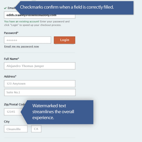
Another great enhancement are interactive cues that encourage application completion. By adding animations with encouraging messages and progress checkmarks, form abandonment decreases while both speed and accuracy increases. This is different than the current practice where an entire page has to be processed before the account opener is told that something — somewhere on the page — is a problem. Think about this — it makes perfect sense. You go to fill out a form and just before you hit the “Submit” button, you wonder if you’ve filled everything out right. You have this twinge of anxiety, unsure what will happen if you botched one of the form’s input fields. Will you have to start from scratch? You know what I’m talking about… we’ve all been there. And then, of course, are the forms that tell you there is an error — one… error… at… a… time. You hit submit, there’s an error that needs correction. You fix it, hit submit, but there’s another error. Ugh!
The Shanth + Anatta partnership also found that adding watermarked “helper” text kept consumer confusion to a minimum. It really helps consumers understand what kind of information should go where and in what format it should be input when they can see a sample of what they are supposed to enter in each field (shown in ghosted gray text in the fields in the example below).
Despite all the impressive ways the Shanth + Anatta alliance found that forms could be simplified, fields eliminated and the overall process simplified, improvements in the banking industry are few and far between. Is the lack of change simply a version of “that’s-the-way-we’ve-always-done-it” thinking?
There are undoubtedly many other ways to improve the way financial institutions collect information from new account openers. The above ideas are just a start, but if you’re looking for more cues and clues, keep your eyes on traditional retailers. They are in the forefront, and will continue to shed light on innovative processes that both banks and credit unions can use to improve online conversions.

