What is a brand identity? A brand identity encompasses everything you slap your logo on — signage, business cards, debit/credit cards, pens, staff apparel, vehicles, brochures, ads, etc. It is the exterior wrapper or visual veneer that covers the organization. It is a common mistake to confuse the terms “brand,” “brand strategy” and “brand identity,” and they are often used interchangeably. A “brand” is an organization’s reputation. A “brand strategy” is a deliberate plan for how an organization hopes to shape consumer perceptions — what kind of reputation the organization wants to have. And a “brand identity” is a visual expression of the brand strategy, and (hopefully) a true reflection of the organization’s reputation (or brand).
What are the components of a brand identity? The brand identity should define the look, tone, style and flavor of the brand in 2d, 3d and 4d space. This includes color, type, photography/imagery, logos, design grid, video treatments, jingles, etc. These things should all be defined in a brand identity manual or corporate design style guide.
What are the hallmarks of good brand design? There are many professors at art schools that will tell you great design incorporates “a maximum of variety” with “a maximum of unity.” While this may — on the surface — sound like contradictory advice, it actually makes a lot of sense. Human beings get bored quickly, so your brand identity must be able to accommodate a wide and varied range of executions otherwise it becomes visually redundant. But you also need to have some consistent elements to tie it all together or you risk creating a brand that is so disparate that people don’t recognize your marketing materials. And yet if you overemphasize consistency where everything looks the same all the time, your brand will turn into one big blur and people will stop paying attention.
Read More:
- 11 Tips For Building A World-Class Brand Identity
- How To: Brand Books For Retail Financial Institutions
1. Friend Bank
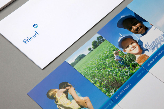
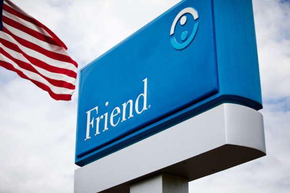
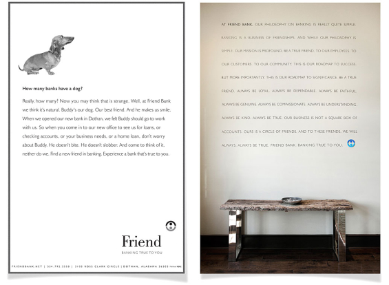
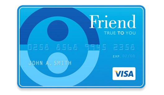
A comprehensive brand identity for Friend, a franchise of community banks. Name development, core values, mission definition, brandmark, visual system, signage and interior design by Slaughter Group.
What Works: The name. You can’t go wrong with a theme like “friends.” It affords a wide range of pleasing executions, both in terms of language and imagery (e.g., dogs).

Move the Needle from Attrition to Acquisition
Vericast’s 2024 Financial TrendWatch explores seven of today’s most critical financial services trends to provide a complete view of the current loyalty landscape.
Read More about Move the Needle from Attrition to Acquisition

Navigating Credit Card Issuing in an Uncertain Economic Environment
Build a modern credit card strategy that balances profitability and risk, adopts the latest technology and delivers the customization that cardholders demand.
Read More about Navigating Credit Card Issuing in an Uncertain Economic Environment
2. First Citizens Bank
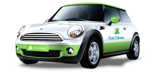
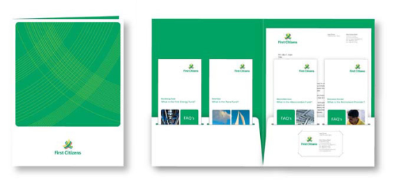
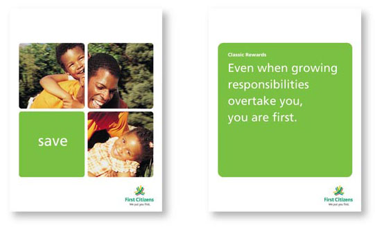
First Citizens Bank of Trinidad and Tobago revitalized its image in a way that would appeal to all its constituencies: local communities, international markets, private banking and corporate banking. The new logo is a dynamic series of upward-aiming, interlocking arches intended to communicate the bank’s energy, growth, flexibility and a sense of partnership/unity. Multiple colors reflect the vibrant multi-cultural environment in which the bank operates. This is a world-class identity from the big-time brand design agency Lippincott.
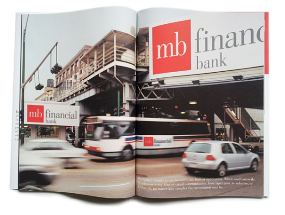
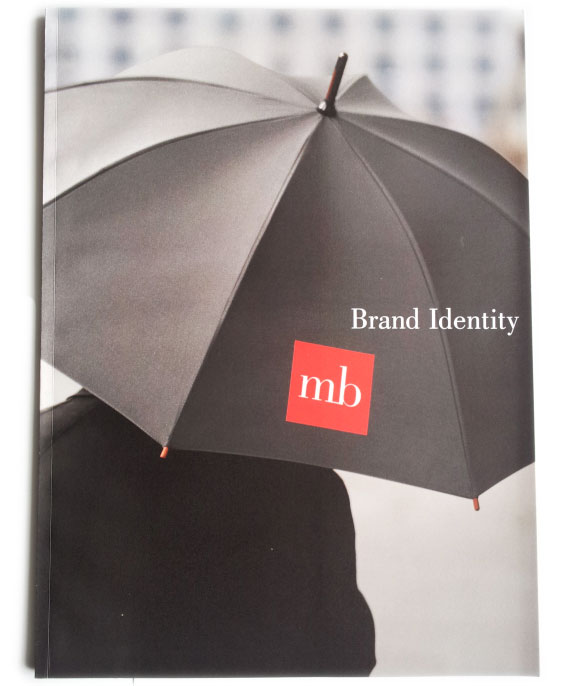
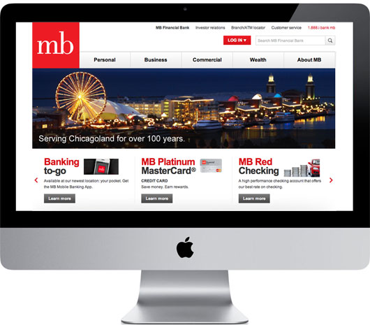
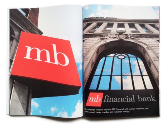
3. MB Financial
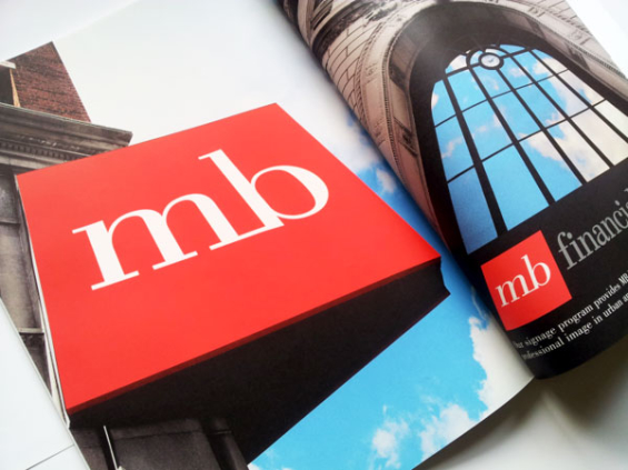
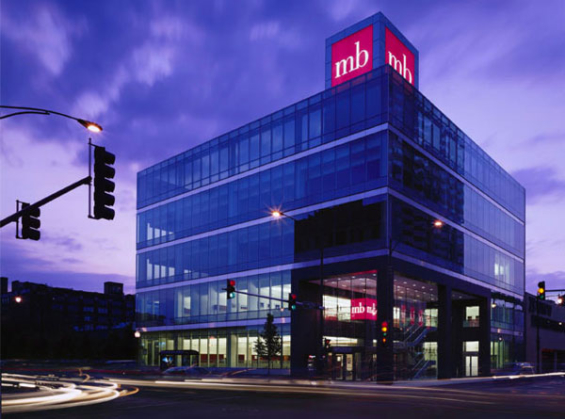
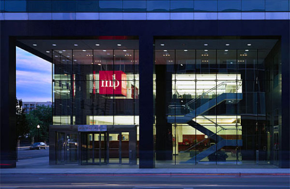
What Works: MB’s signature red square makes it easy to brand just about anything — layouts, schwag, buildings. It’s a wonderfully simple identity system.
4. Grow Financial
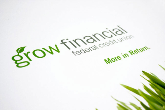
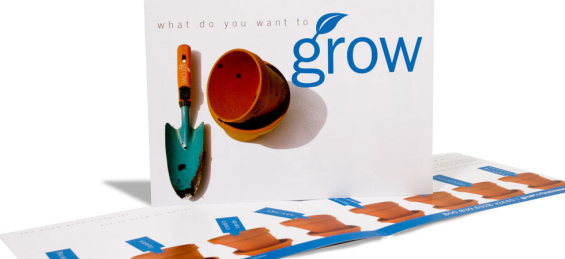
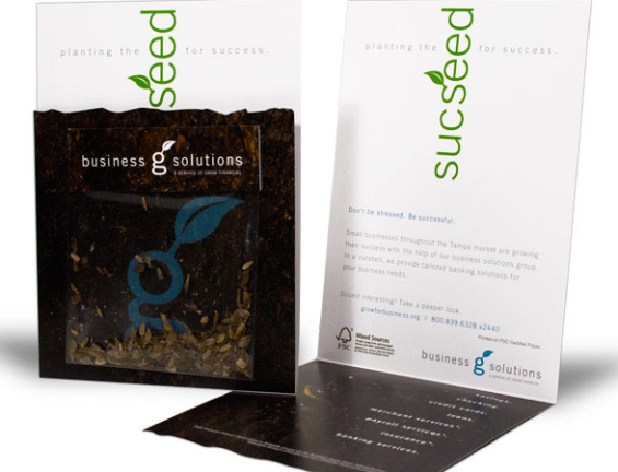
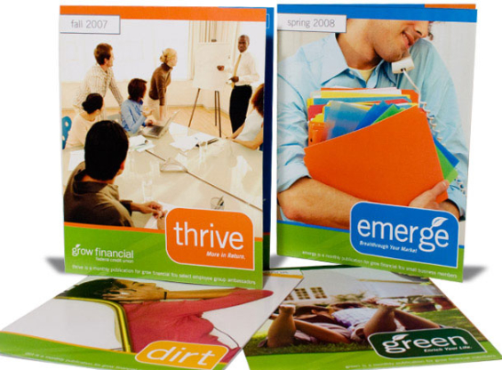
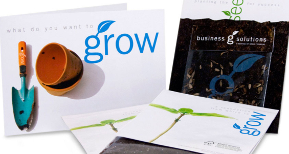
After successfully rebranding MacDill FCU into the decidedly more progressive Grow Financial, brand design agency Adrenaline wasn’t about to go conservative with the design of the credit union’s new identity.
What Works: There is tremendous synergy between the name, the visual language, the design choices and the financial services industry. The “grow” theme is used as a verb throughout. The design grid is executed with organic metaphors and refreshing simplicity. It’s fun, colorful and playful.
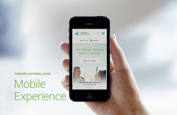
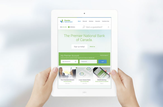
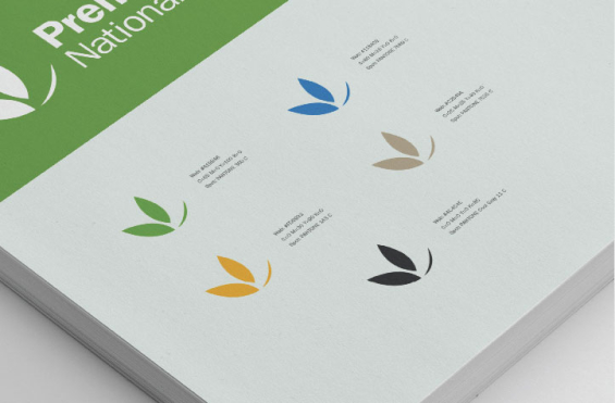
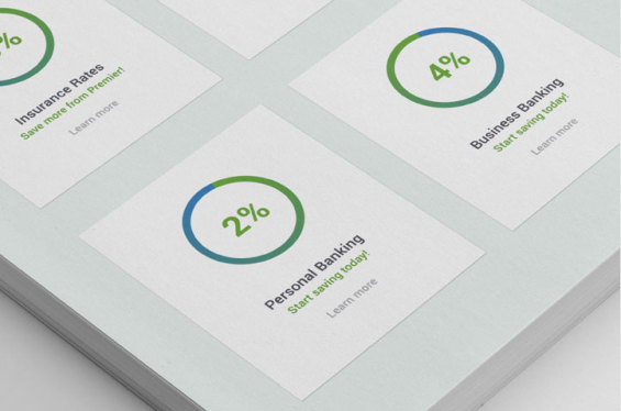
5. Premier National Bank
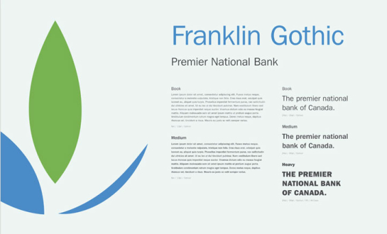
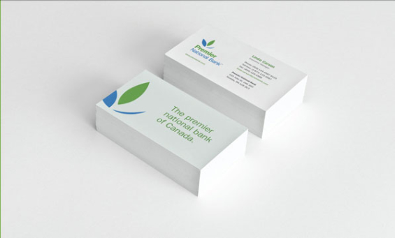
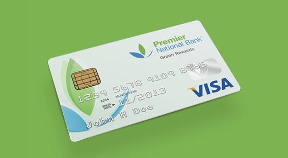
Premier National Bank in Canada specializes in business and small loans to young entrepreneurs in Canada. This is a student conceptual project by Amit Jakhu, but it illustrates many principles of sound, strategic brand design. Hopefully the kid got an “A.”

6. Sterling Bank
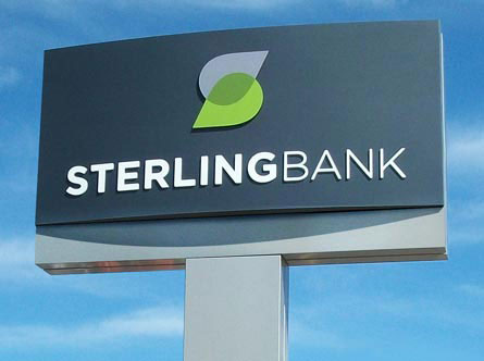
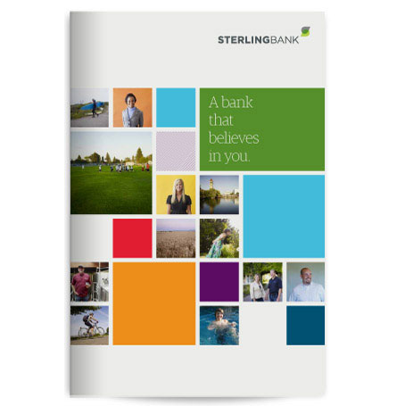
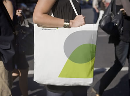
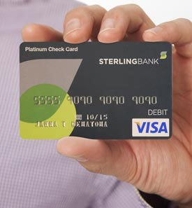
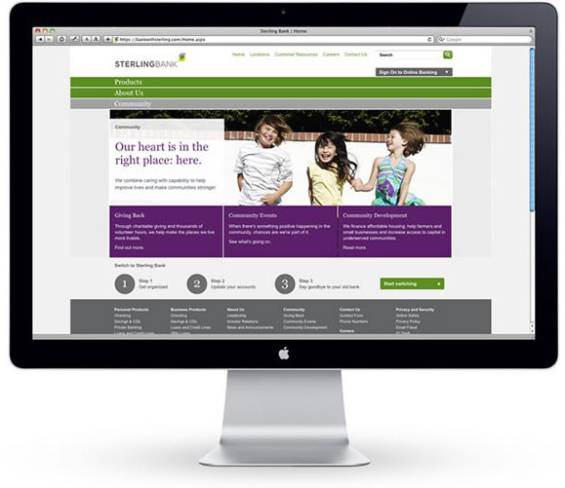
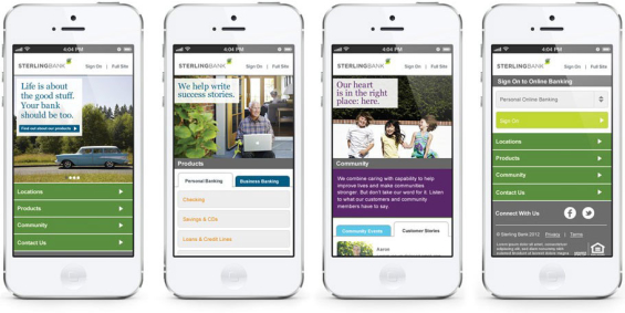
Sterling Bank serves clients in the Pacific Northwest and California. As they emerged from the 2008 financial turmoil as one of the best-capitalized banks in the region, they knew it was time to update how they should be perceived in the marketplace. Sterling partnered with Methodoligie to craft a brand strategy and new identity system that is modern, simple, cool and classy.
What Works: The ultra-clean design grid makes it seem like banking with Sterling is simple. The logo is a devilishly simple “S” monogram that’s cool enough to stand next to major retail and fashion brands. Sterling looks contemporary and stylish without coming across as upscale or expensive.
7. Grandpoint Bank
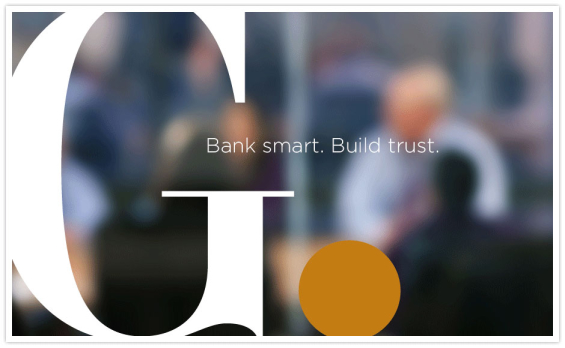
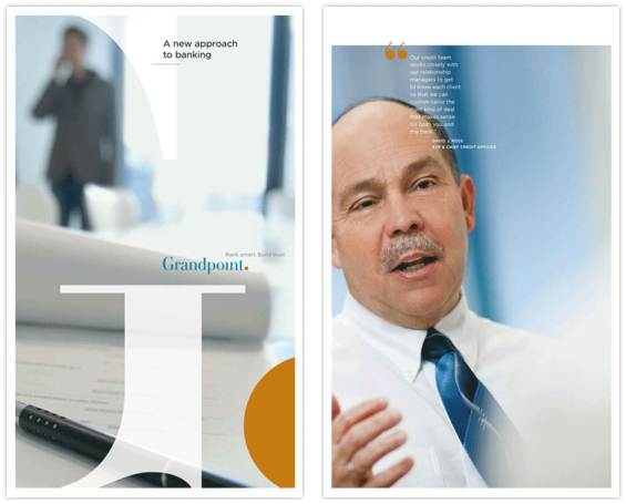
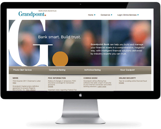
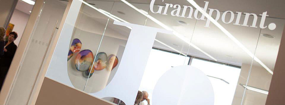
Grandpoint Bank hired Baker Brand to create a identity that would express the company’s service philosophy and aspiration to be a top-tier banking services provider. The scope of the project included proprietary imagery, stationery, collateral, signage and a website.
What’s Works: The unifying thread is a dot representing the word “point” in the name. The dot is used as part of a visual metaphor for “connections” or “links.” It’s also used as a graphical element to focus attention in photos.

8. Ajman Bank
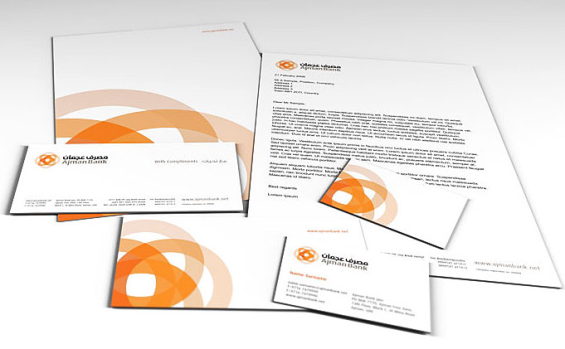
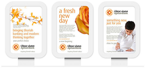
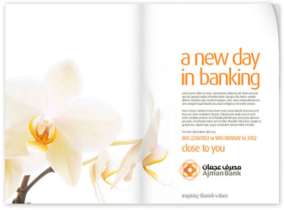
This brand identity for Ajman Bank, developed by Rareform Branding, is based on the ‘Shariah way of Being’ — four rings representing the self and responsibility to family and the wider community. The brand language is pure, warm and welcoming, underpinned with the strapline “Close to You.”
What’s Works: The consistent use of a single color helps tie everything together. And the color itself is unique, particularly for the banking industry — shades of orange fading all the way down to peach. When you have a cool symbol for your logo, you can turn it into its own supersized graphic design element.

Unlocking Digital Acquisition: A Bank’s Journey to Become Digital-First
This webinar will offer a comprehensive roadmap for digital marketing success, from building foundational capabilities and structures and forging strategic partnerships, to assembling the right team.
Read More about Unlocking Digital Acquisition: A Bank’s Journey to Become Digital-First

Instant Messaging. Instant Impact.
Connect with your customers and provide lightning-fast support as effortlessly as texting friends. Two-way SMS text messaging is no longer optional.
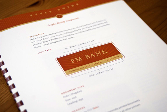
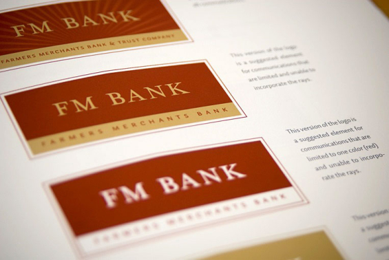
9. FM Bank
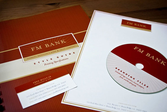
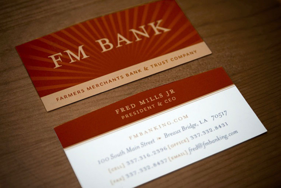
Farmers Merchants Bank needed to update their identity while retaining their traditional colors and image. Type&Image provided them with a new logo, business papers, and a branding style guide.


