What Are They?
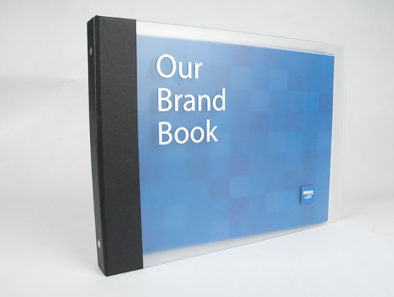
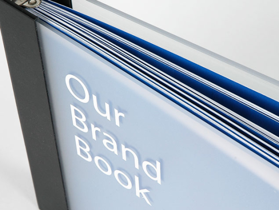
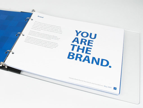
There are two basic types of brand manuals:
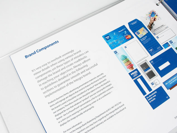
1.) Brand Identity Guidelines – a set of defined standards for the visual application of the brand’s look-and-feel — its identity. There are many different names for brand identity manuals (for instance, Corporate Style Guide), but they all share one distinguishing characteristic: they do not generally speak to the brand’s strategy — its meaning, significance and broader application across the organization. They are limited to visual executions, and usually intended for designers and marketing vendors — not for wider circulation among staff or the general public.
2.) Internal Branding Manual – a strategic examination of the organization’s brand. Typically these documents are written purely for internal audiences (management, board, staff training), but there are also examples of branding brochures designed for public consumption.
When The Financial Brand surveyed financial institutions earlier this year, 53% said they have some sort of written brand guidelines. Although it’s safe to assume that the vast majority have Type 1 manuals that primarily address visual applications, and few have Type 2 addressing strategic issues.
Words you will often find in the title of various brand manuals include: branding, design, communications, corporate, identity, graphics, style, guidelines, standards, book, handbook, manual. In the end, you should feel free to call it whatever you want.

Navigating Credit Card Issuing in an Uncertain Economic Environment
Build a modern credit card strategy that balances profitability and risk, adopts the latest technology and delivers the customization that cardholders demand.
Read More about Navigating Credit Card Issuing in an Uncertain Economic Environment

Navigating the Role of AI in Financial Institutions
83% of FI leaders agree investing in AI is essential for 2024 but how you leverage AI is instrumental in success and meeting customer expectations.
Read More about Navigating the Role of AI in Financial Institutions
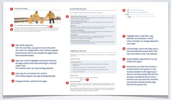
Brand Identity Guidelines
What goes into a good set of brand identity guidelines? Well, building a manual for visual executions is much easier and clearer than one covering a brand’s strategy. Here’s an outline of what you should include in your identity standards.
Logo Applications – You should address the full spectrum of various color applications in which your logo could be used: full color, spot color, gray scale, black-and-white and reversed. There is more to making a good “line art” logo than simply using Photoshop to remove color. You may need to make significant modifications to your logo in order to optimize it for black-and-white applications (e.g., you may have to forego a gradient for solid black or solid white). Define the logo’s “clear space,” the minimum area surrounding the logo. This prevents your logo from getting “crowded out.” Also include bad examples — what not to do.
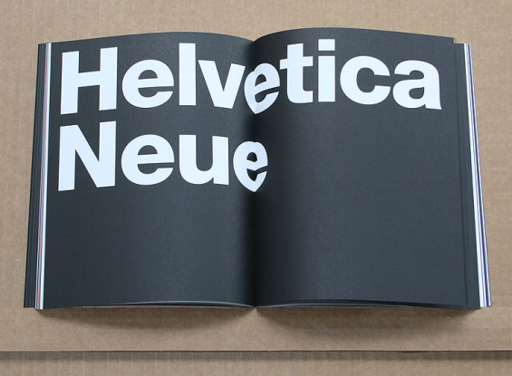
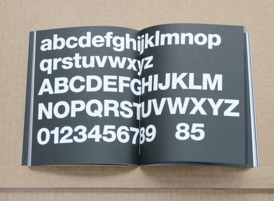
Typography – Define fonts and styles for brand elements such as your tagline, ad headlines, subheads, body copy, rates (APYs/APRs), captions, bullet lists, memos/letters, etc. You’ll want to specify colors, sizes, kerning, line spacing (leading) and horizontal scaling. What fonts should be used on the web when/if your preferred typefaces aren’t available?
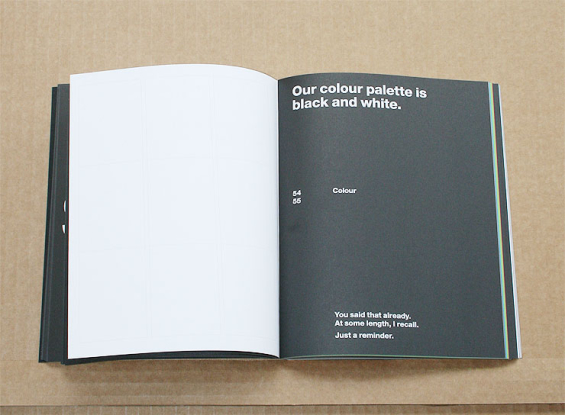
Color Palette – What are your logo colors? What are your brand colors and where should they be used? What other colors can be used as part of your brand identity, and under what circumstances? It’s a good idea to define your color palette in PMS, CMYK and RGB equivalents. If you have structured a color palette according to product lines (e.g., Investments = green, Personal Banking = blue, Business Banking = orange), make sure to provide clear guidelines for usage.
Tagline Usage – When does the tagline need to be used? Always, or only in certain situations? Where does the tagline go when the available space is limited or awkward? It’s dangerous to define standards that are too rigid. Allow for flexibility. If you say, for instance, “Our tagline must always be X-tall relative to the size of our logo and centered below it,” you’re boxing yourself in, resulting in applications that simply look ridiculous. Your brand identity manual should show how the tagline gets applied in extremely horizontal- and vertical situations.
Branded Products & Trademarks – You should spell out how you expect people to refer to your financial institution’s products and services. Do you capitalize “First Home Mortgage,” or is it “firstHome Mortgage™” with a trademark symbol?
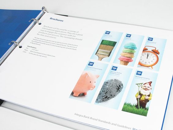
Brand Imagery & Photography – If your brand requires a specific style of imagery, define the criteria and provide examples. Do you use photos of people — employees, customers, full body, head-and-shoulders? What kind of photos do you use for home loans, credit cards, online banking? Do you have any icons associated with your products/lines? Be sure your identity manual includes any badges, buttons, awards, and regulatory bugs you often use. You might also want to define styles for other visual elements like tables, charts and maps.
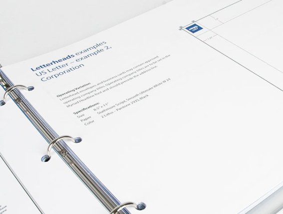
Corporate Communications – This includes design standards for stationery (letterhead, envelopes and business cards), memos, emails (including acceptable signatures), press releases and other forms of corporate-level communications.
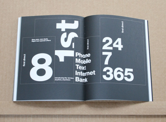
Design Grid – This is the hidden, underlying system of spatial units defining the organization’s use of imagery and how content is structured in two-dimensional layouts (e.g., printed pieces). In other words, this is where you show how everything all comes together — typography, photos, logo placement, tagline, contact information, offers, rate promotions, just about anything you can think of. Illustrate the wide range of ways your signature brand elements can be applied. Do you use large blocks of color? Or white space? What is the size of photos relative to the size of the overall layout? How does the design grid look when used in a vertical application, like a brochure? How about something horizontal, like a banner ad?
Promotional Items – Items like pens, Frisbees and piggy banks can be tricky. If you don’t define your standards, you’ll have pens with the 800-number, Frisbees with the web address and piggy banks with branch locations — none of them sporting the tagline. Usually with tchotchkes, you’ll need to allow for a high degree of flexibility. Specialty printers often have a limited range of colors, and their production demands can be quite limiting. This is where having a high-quality line art logo will come in very handy.
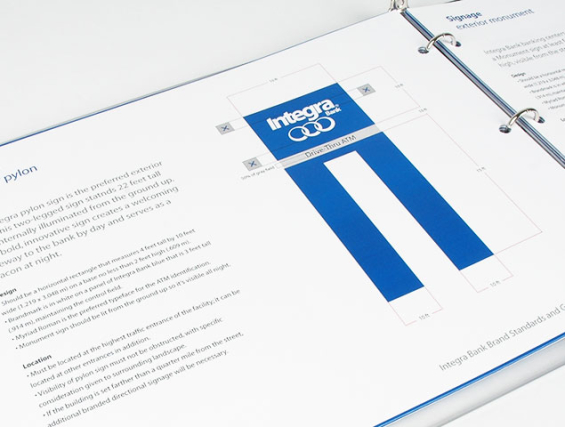
Extraordinary Applications – It’s impossible to illustrate every example of every possible brand execution. Showing a few extreme examples like vehicle wraps can provide a designer insights into the considerations they should make when applying the brand in unusual and unanticipated situations. Don’t just take a picture of your branded PT Cruiser; explain why a PT Cruiser was picked, and walk people through your design decisions/rationale.
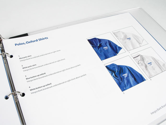
Corporate Apparel – Define acceptable logo applications for common items like shirts and hats. Specify color and quality of fabrics/materials that can be used. Create separate sections for screen printing vs. embroidery, and identify proper color combinations for each. If you’ve ever tackled an embroidery project before, you know how difficult it can be. So once you’ve found a solution that works, memorialize it in your brand guidelines booklet with thread colors and photos.

Internal Brand Strategy Manual
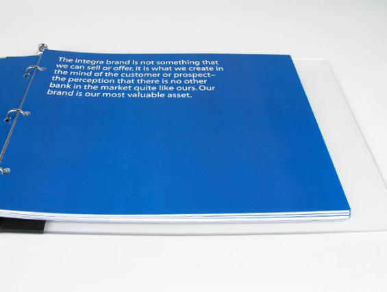
Building a brand strategy is much more difficult than defining the visual standards. It usually takes management teams hundreds of hours and dozens of meetings over many months to reach clarity and consensus around an organization’s brand. Once you’ve completed this work, you’ll definitely want to memorialize it in a document you can reference, and share with future C-level executives. Here are some of the more common components of an internal branding strategy book.
Brand Position – What kind of reputation do you you’re your organization to have? Some people call this a Brand Promise, others a Unique Selling Proposition. Whatever you call it, you need to articulate a strategy for your brand that is differentiated from your competition, relevant to your constituencies, something you can credibly deliver, and that is difficult for others to copy. (The Financial Brand has an article all about brand positions and how they are different from Mission Statements.)
Mission Statement – A mission statement is a short, formal written statement of an organization’s purpose, defining its scope and focus in plain, simple, descriptive terms. Avoid hollow rhetoric! A mission statement is a practical outline of business objectives that avoids grandiose corporate clichés and ridiculous boardroom buzzwords.
Core Values – The principles, ethos and philosophical ideology that all employees of an organization are expected to use, live by and demonstrate on a daily basis.
Brand Personality Attributes – A specific set of characteristics that identify the visual, verbal and behavioral traits of the brand, much in the same manner that personality attributes define the people we know. In other words, these are the adjectives used to describe the look, tone, flavor and style of the brand. The definition of Brand Personality Attributes can be expanded beyond marketing materials to include the manner with which employees deliver service. (The Financial Brand has an extensive how-to guide on identifying your brand’s personality attributes.)
Vision Statement – The goals, dreams and future aspirations of an organization. Vision statements describe what the organization wants to become or accomplish tomorrow, while mission statements define what the organization is doing today.
Brand Manifesto – It helps to create a manifesto that spells out what your brand does and doesn’t believe, what it does and doesn’t stand for. These can become powerful scripts that work perfectly in brand videos for staff and TV commercials for the public.

Industry Cloud for Banking from PwC
PwC’s Industry Cloud for Banking applies our deep industry knowledge to your specific business needs

Send the Right Offers to the Right Consumers
Achieve a better return on your marketing investment. Leverage behavioral data and analytics to target the right customers with the best possible offers.
Read More about Send the Right Offers to the Right Consumers
Target Audience(s) – Who are you targeting? Don’t say “all people ages 18-55.” That’s a cop-out, a non-answer. You can’t remotely believe your brand has the same appeal to a 20-something as it does to a grandmother. What age groups do you have the most success with? Which ones are critical to your future? What characteristics do they share in common? Where are they likely to have other financial relationships? How many have smart phones?
Competition – This is way more than just a list of your banking competitors. First, you have two types of competitors: those you have to defend against (threats), and those you can steal from (opportunities). Most financial institutions usually only worry about the threats and ignore the opportunities. People — including your employees — will judge a brand relative to its peers. Explaining who you see as your competitors, along with a summary of their brand strengths and weaknesses, will help everyone in your organization better understand
Examples of the Brand in Action – To help bring the brand to life, you’ve got to tell some stories. Employees will best identify with the brand’s most important principles if they can absorb them through narratives. These stories can be based on real life testimonials or hypothetical staff interactions.
Online Branding Portal
Large and mid-sized financial institutions may see value in creating an online brand portal. This can be used by brand managers to share resources with designers, ad agencies, vendors, the press and other media outlets. You can make your brand manual(s) available as downloadable PDFs (perhaps password protected). You can include a library of other PDFs — brochures, posters, direct mail pieces and other applications of the brand. You can even include design templates — files for common design applications like Adobe Illustrator, pre-loaded with logos and brand colors. If you have a library of brand photography, you might choose to make it available online as well.


