10 Tips for Banks Looking to Drive More Online Applications
Many banks and credit unions allow consumers to open accounts and apply for loans online. Few are thrilled with their results. To increase the number of deposit accounts and loan applications generated by your online channel, you'll need to reevaluate your website.
By Laurie McLachlan, SVP of Marketing at Andera
Simple Subscribe
Subscribe Now!
Over the past couple of years at Andera, I’ve spoken with dozens of institutions about how they can optimize their websites to drive more online application volume. Many of mistakenly believe that simply offering an online application is all it takes to drive success — “We’ve got online apps, so why aren’t people using them?” But adding links to online apps on your site isn’t enough. To maximize performance, you need to follow these 10 tips.
1. Make it easy to apply within the online banking system
Chances are, the majority of visitors come to your site to access online banking, yet so many institutions fail to make their online applications accessible once customers/members log in to the system. Existing customers/members aren’t likely to browse your public website to consider additional products, but they may be motivated to do so when they see a targeted offer within the online banking platform. Promote your products and services behind the online banking firewall, giving special emphasis to online applications, and you’ll increase volume without spending any money on advertising.
2. Let visitors apply directly from your home page
New site visitors will want to learn about your institution and the products you offer before applying, but some visitors have all the research they need and are ready to apply the instant they land on your website. If you simply add a prominent “Apply Now” button to the home page you can boost online application volume.
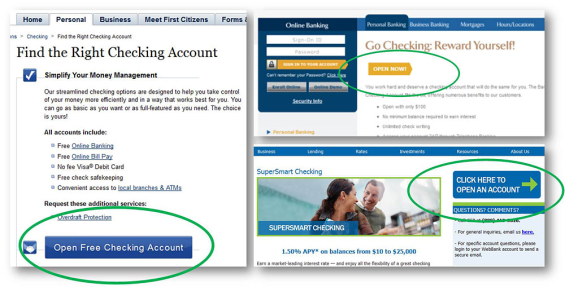
3. Include application buttons on all key product pages
Product pages should function like landing pages. It’s stunning to see a product page sporting a very subtle application link, or worse, when product pages don’t have any application links at all. All product pages should feature:
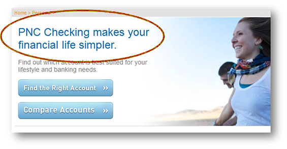
Big, benefit-driven headline. Headlines that say “Checking” or “Savings” don’t cut it.
- Few, succinct sub-benefits. Resist listing 25 benefits – focus only on those that matter.
- Clear and prominent call to action. Use big, contrasting buttons. It doesn’t hurt to include more than one, especially if users need to scroll to reveal all of the information.
4. Test all links to make sure they’re working
This one may seem like a no-brainer, but we’ve seen broken links to account/loan applications before.
5. Avoid putting a speed bump between your site and online applications
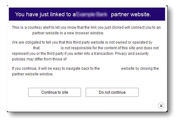
Financial regulators say that links on bank websites to third-parties need “speedbumps” to ensure consumers understand the risks associated with visiting linked websites. Some financial institutions mistakenly interpret this to mean that everyone who clicks the “Apply Now” button should be presented with a message that effectively says, “Your application is about to be handled by a third-party, and your institution is not responsible for what may happen next.” Nearly everyone abandons the process. Go figure… Would you enter your social security number after your bank or credit union warned you that the site “may not be secure?” However, some institutions mistakenly interpret this guidance to mean that speedbump warnings are needed in cases where their website links to an online application that is supported by an external provider, like Andera. This is not the case at all, and the FDIC makes this clear.
Bottom line: Speedbumps are unnecessary, and they will kill your conversion rate.
6. Make sure application buttons are prominent and contrasting in colors
Don’t use text links when inviting consumers to “Apply Now.” Use prominent, contrasting buttons instead. Consider placing them at the top and the bottom of longer pages and think about including them in the sidebar if you have one.
7. Use a branded application URL to make applicants feel safe
Many retail financial institutions have outsourced account opening and loan origination, but that doesn’t mean applicants need to be confused by it. When they click the “Apply Now” button on your website, it shouldn’t feel like they are being sent to another separate company. For this reason, it’s critical to ensure that your brand name shows up as a part of the URL.
8. Ensure your product pages clearly summarize the key benefits
Most bank and credit union websites structure their product pages in exactly the same way. Why? Who knows.
- Headline – Usually an unceremonious description of the product type (e.g., Checking)
- Copy – Long paragraphs of text or a lengthy set of bullets describing every possible account feature in tedious detail
- Call to action – Non-existent or too subtle
- Disclosures – Gobs and gobs of legalese
You should design your product pages the way you’d design any landing page. Use a headline that summarizes the biggest product benefit. “Checking” is not a benefit and should never be confused for a good headline. When communicating additional aspects of the product, focus only on the sub-benefits that truly matter – avoid including a laundry list of every last feature.
9. Make it easy to access rate information
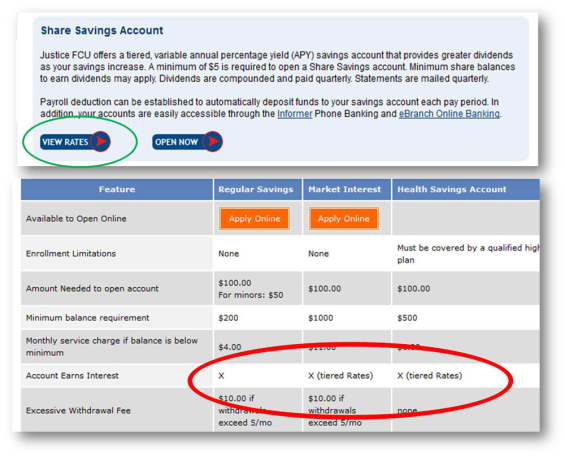
It’s shocking how many savings account product pages fail to provide rate information, even though we all know APY is the main criteria consumers use to evaluate savings products. Institutions say that because they don’t offer very good rates, they don’t want to highlight them. It doesn’t matter. If you’re selling a savings product, you must feature rate information. If the only way you can get people to sign up is to conceal the interest rate then perhaps it’s time to rethink your product strategy.
10. Don’t lay the cross-selling on too thick
Everyone knows that one of the best times to cross-sell is during the initial application process. It can be tempting to present every product offer you have, but this can backfire. People shut down and get confused when presented with too many choices and they may abandon the online application entirely. Present no more than three cross-sell offers during the online application process, it’s ideal if you only focus on just one or two.


