Branch Design Showcase: The Sleek, Slick and High Tech
Simple Subscribe
Subscribe Now!
Wall-to-wall whitewash
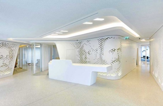
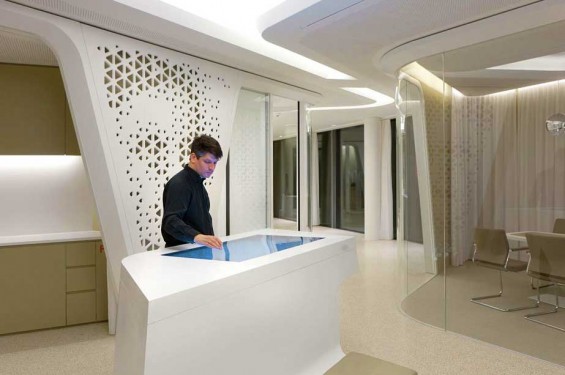
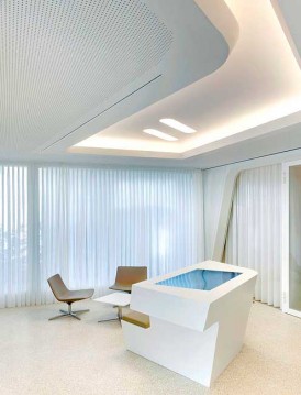
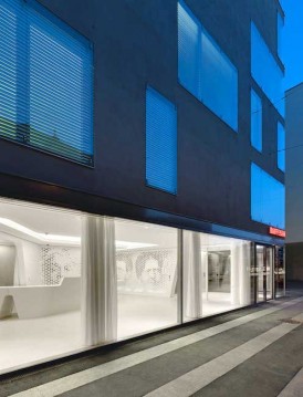
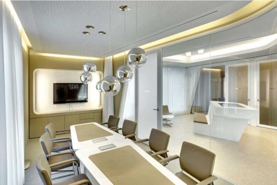
Raiffeisen in Switzerland is trying to shake a negative image with what it calls an “ethical banking” experience. Which has taken the form of white walls. White floors. White ceilings. White counters. White furniture. It looks like a laboratory where scientists in white lab coats conduct experiments.
Or as Will Novosedlik puts it, the Raiffeisen Bank branch “looks like the result of a chance meeting between the space station in Stanley Kubrick’s 2001 A Space Odyssey and a pair of jian zhi scissors (traditional tool used to create Chinese paper cut art).”
Santander’s ‘Select’ brand reflects luxury lifestyle
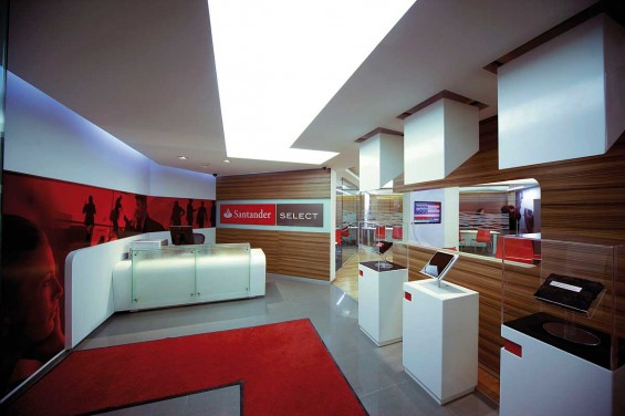
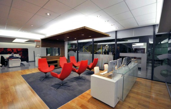
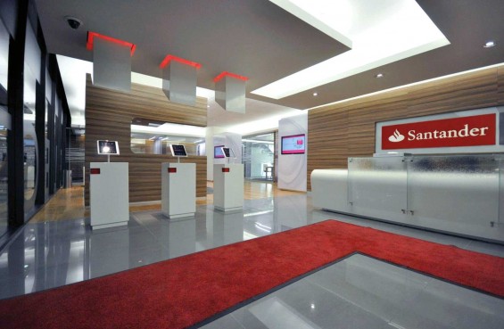
Santander, one of the leading banks in Mexico, wanted to update their Premier Banking concept, which was too corporate and cold, to one that was more contemporary and unique. Working with allen international, Santander developed a branch that connected with the target audience through complementary lifestyle brands. Special “brand showcase” pods in the branch highlight prestigious art, fashion and technology brands. To widen investment growth opportunities the brand is designed to become a hub for networking, where social events, seminars and third party luxury brand launches can take place.
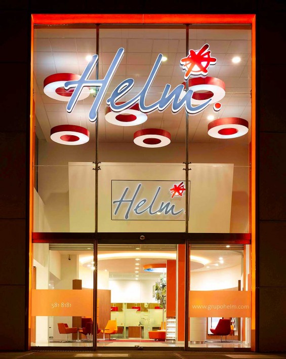
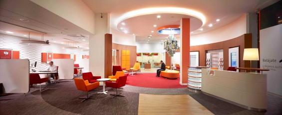
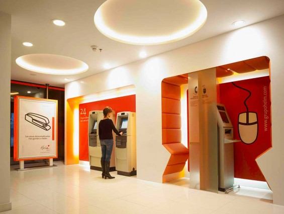
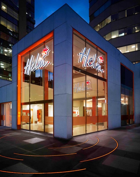
Tapping the 5 senses at Helm Bank
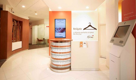
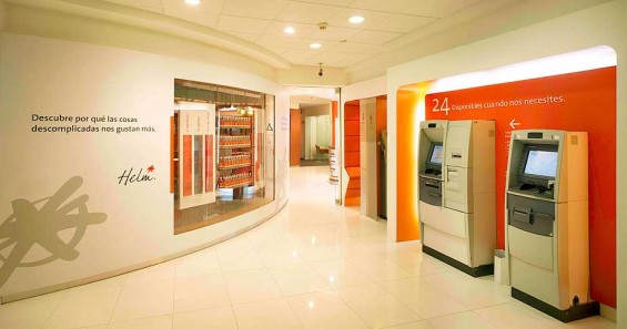
The vision of allen international was to create something that would tap the five senses to communicate with customers both consciously and subconsciously. Following a two-day “expression workshop,” allen international worked alongside specialists in sound, taste and smell, creating and developing visual and tactile expressions of the newly-created Helm brand.
Sight & Touch – A distinctive visual language was defined and expressed through all forms of graphic communication, while texture and form were used to create a sense of tactile comfort and warmth.
Sound – Soundscapes were developed to subconsciously affect customer behavior. Low density, low tempo, natural and synthesized sound was utilized to create comfort and encourage browsing, whereas higher tempo sounds were used to encourage speed and movement in transient branch zones.
Smell & Taste – Signature fragrances were created and deployed in key branch locations via the air conditioning system. In addition, Helm-branded treats and water were developed, further encouraging staff engagement with customers.
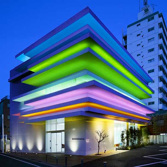
Architectural rainbow
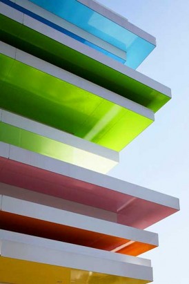
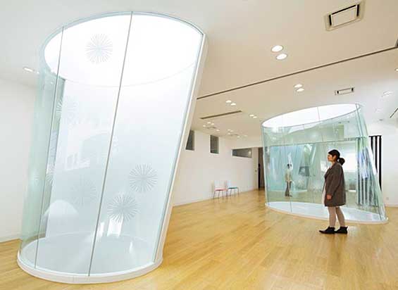
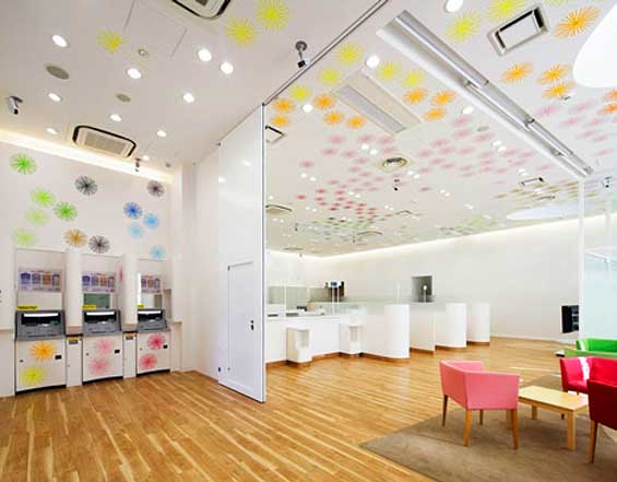
Horizontal layers of color protrude out from the facade of this Sugamo Shinkin Bank branch. The design, from architect Emmanuelle Moureaux, uses a palette of 12 rainbow colors. ATMs, teller windows, consultation booths and an open space laid out with chairs in are located on the first floor. The second story houses offices, meeting rooms and a cafeteria, while the third floor is reserved for the staff changing rooms. Photography by Nacasa & Partners.
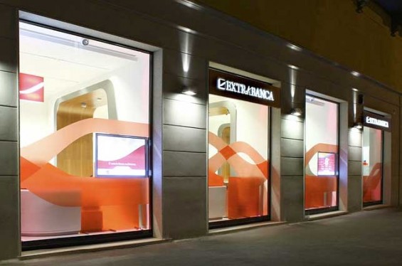
Extrabanca’s architectural ‘bridge’ metaphor
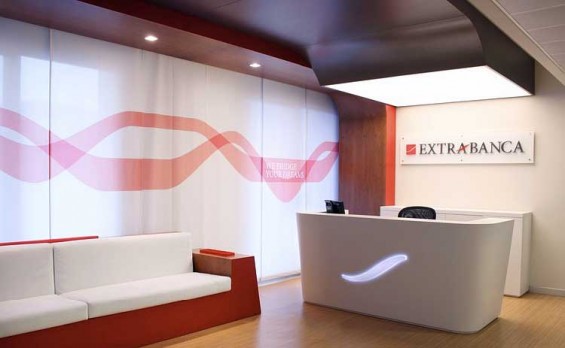
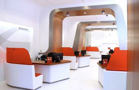
Are you ready for some heavy architectural lingo? Here we go… “The projectual metaphor of this new retail design concept is represented by ‘the bridge,’ which is the distinctive architectural feature,” explain the retail banking experts at Crea International, who developed Extrabanca’s branch experience. “It is seen as a sinuous portal of wood which spaces out the overall surface, articulating the operational desks and welcoming customers to a new reassuring retail banking experience — a powerful dynamic sign which decisively translates the sense of continuity of the project, and breaks up at same time the most conformist retail banking design layouts.”
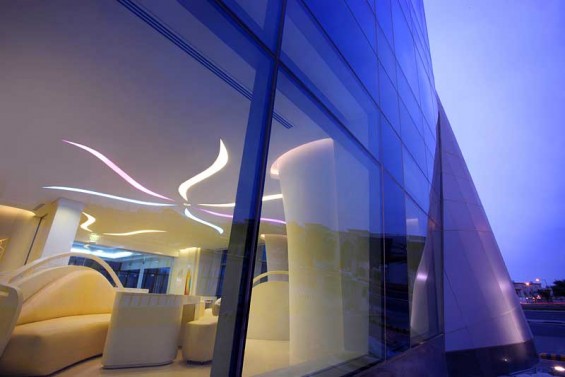
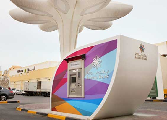
Qatari bank blends Middle east traditions with modern geographical elements
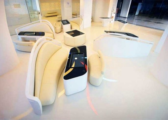
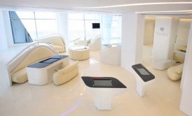
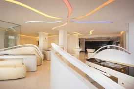
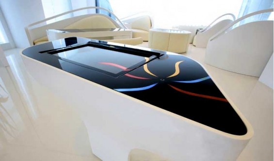
Barwa Bank wanted to create a tech-savvy environment space where guests would feel comfortable. A central banking area with multifunctional workstations allows tellers to share a touch-screen table as they sit with clients.
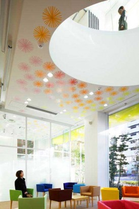
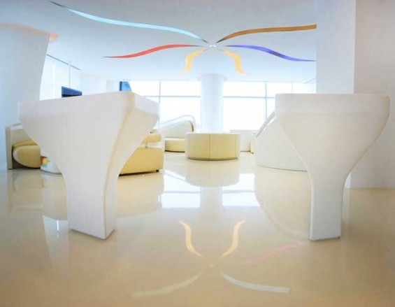
Designers at Crea International found inspiration in Qatari nature — smooth lines represent sand dunes while geometrical forms are symbolic of desert flowers. The focal point, giant blossom petals on the ceiling, are pastel shades to represent energy and growth.
The bank has no posters or displays – instead, its innovative design is its promotional tool. Clients do not need to queue; upon entering the branch, they are greeted by a butler who registers their priority of attendance.
Clean retail simplicity
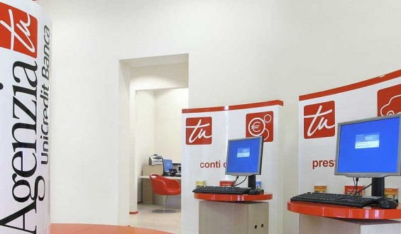
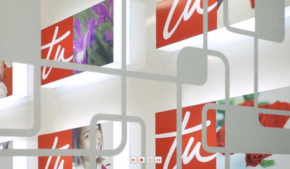
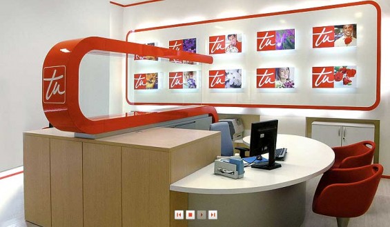
Agenzia Tu is a specialized network of branches from UniCredit, one of Italy’s largest banking networks The design concept from Crea International features glowing merchandising graphics with flowers from all over the world, multiethnic faces and the word ‘”you.”
Raining chains in Italy
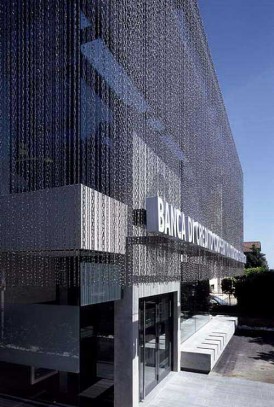
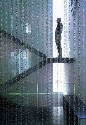
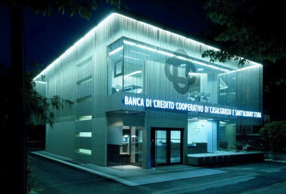
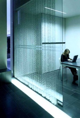
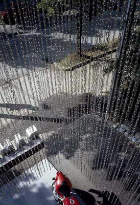
This branch for the Cooperative Credit Bank in Italy is draped — inside and out — in chains. There’s something slightly unsettling about having heavy metal chains enclose every space. It undermines whatever sense of transparency all the glass was supposed to convey. Maybe Italians relate to the space differently?
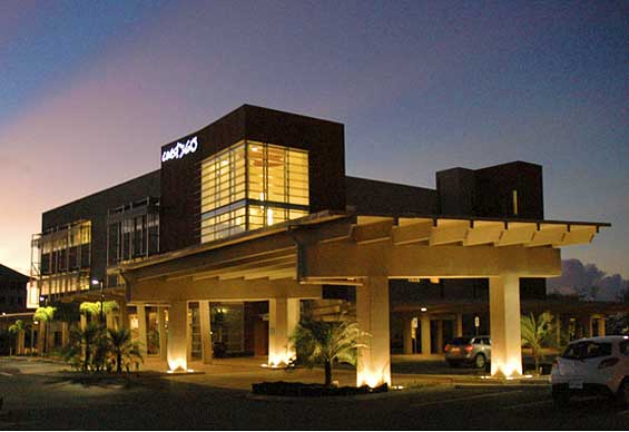
Coast360 FCU LEED Silver HQ & Branch
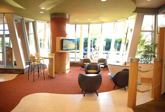
Developed by EHS Design and Weber Marketing Group, this new green headquarters and flagship branch will be the first private LEED-certified project on the island of Guam. The 48,000 square-foot, 3-story administrative and branch facility features an internal atrium, covered walkway, a green roof, and indigenous landscape design. The green design maximizes daylight, harvests rainwater, reduces solar temperature gain with sun-shading devices, and uses local concrete throughout.
