Here is a collection of notable branch design concepts to emerge in the retail banking sector: Acru’s “wine bar,” Virgin Money’s first real store, a whitewashed branch for a Community Bank, ING Direct’s iPad kiosks, and Itau’s redesign.
Acru – Cooler Than a Napa Wine Bar
Back in 2011 when The Financial Brand first wrote about Acru, the contemporary sub-brand spawned by First Cherokee State Bank, only a handful of photos of their revolutionary branch concept were available. Now there’s a lot more to look at.
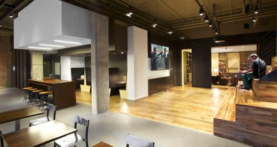
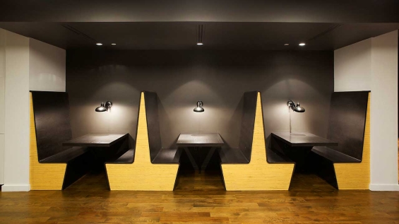
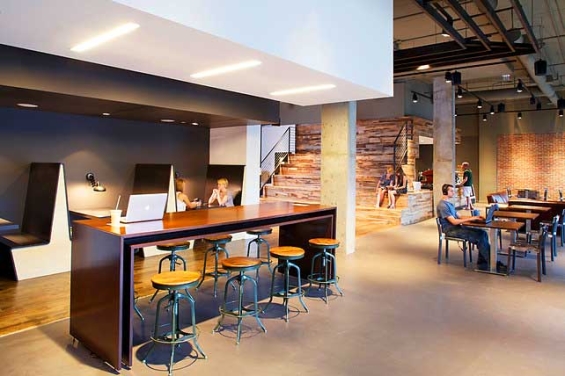
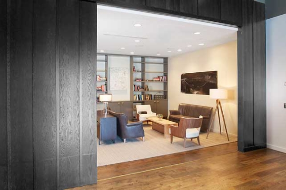
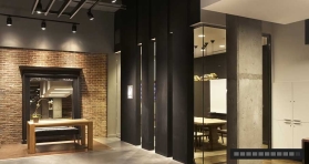
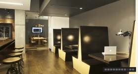
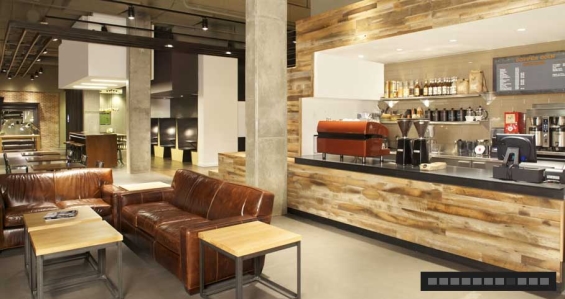
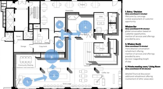
While it isn’t actually a wine bar, the space looks like it could be one. Guests entering Acru are greeted by casual associates manning the “Wisdom Bar.” Directly behind the Wisdom Bar is a set of booths for more discreet conversations with Acru advisors. Just beyond the entry is Copper Coin Coffee, an independently owned and operated coffee bar that gives the branch a sense of community and extends the space’s useful life beyond traditional banking hours. The location features a set of bleachers that accommodate after-hours music performances and seminars. Behind the communal space, there is a series of “living rooms” where advisors and guests can take their coffee and sit down one-to-one. ai3, the architects who designed the space, drew on the concept of the “third place,” a retailing strategy pioneered by Starbucks.

The Power of Localized Marketing in Financial Services
Learn how to enhance your brand’s local visibility, generate more leads, and attract more customers, all while adhering to industry regulations and compliance.
Read More about The Power of Localized Marketing in Financial Services

Are You Ready for a Digital Transformation?
Unlock the potential of your financial institution's digital future with Arriba Advisors. Chart a course for growth, value and superior customer experiences.
Virgin Money Opens First Store
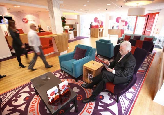
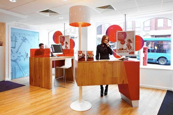
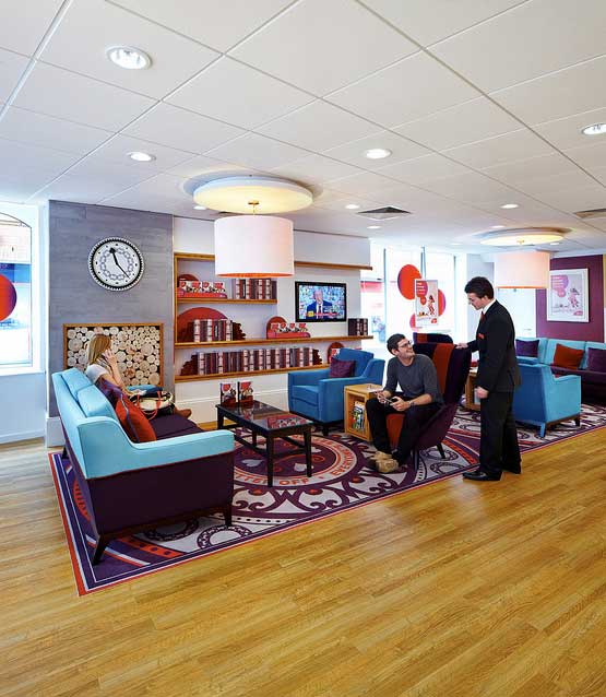
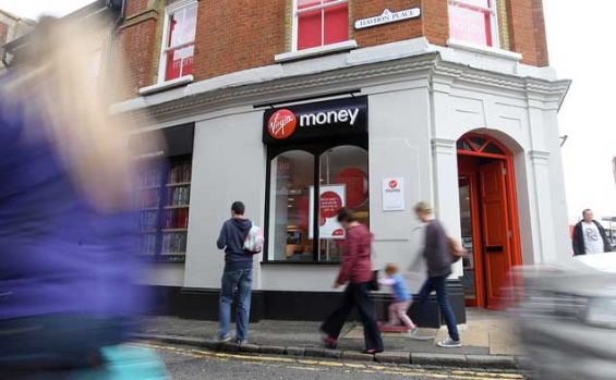
In July, Virgin Money opened their very first new banking store in Guildford, Surrey. The new store replaces a previous Northern Rock branch, with plans in place to transform the entire network of Northern Rock branches (about 75 in total) to Virgin Money Stores.
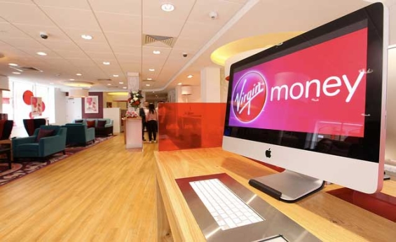
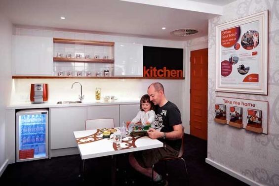
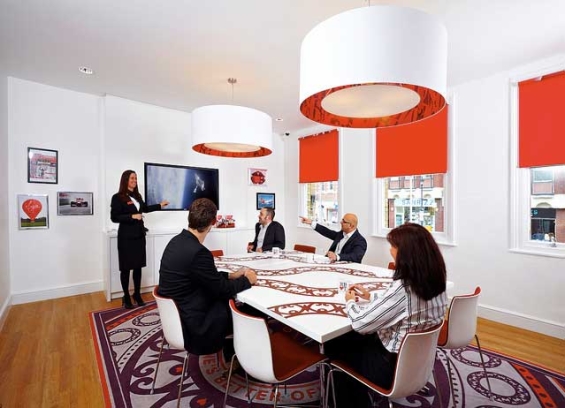
Virgin Money Stores feature free WiFi, iPads and iMacs, and a “no hard-sell policy” adopted by staff.
“Customers can simply come in, take the weight off their feet, enjoy a cup of tea and use our free facilities,” explained Kerry Merrington, Manager of the Guildford Store.
If you like the look of the Virgin Money Stores, check out what the inside of a Virgin Money Lounge looks like.

Community Bank
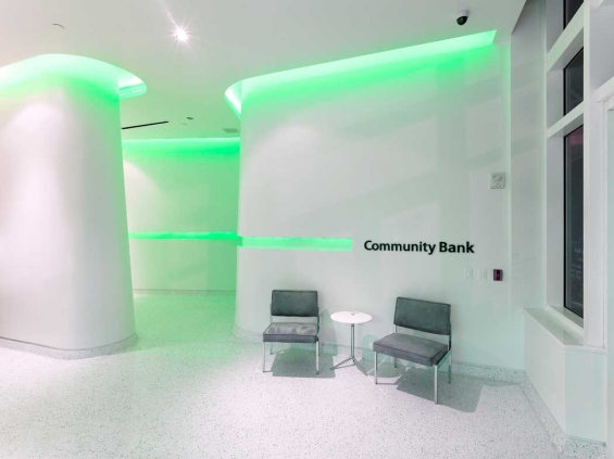
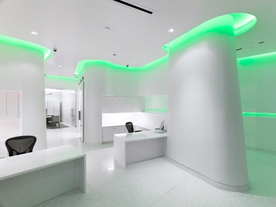
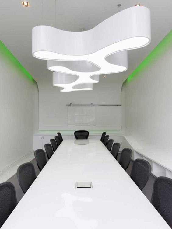
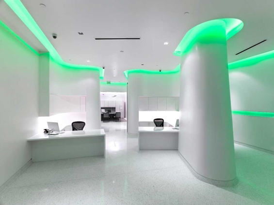
Community Bank wanted a branch design that bridged its on- and offline brand experience. Their new, flagship branch is located along Beach Drive in St. Petersburg, Florida.
The floor plan establishes five specific zones: Teller Zone, Sales & Advice Zone, Dwell Zone, Community Zone and Brand Zone.
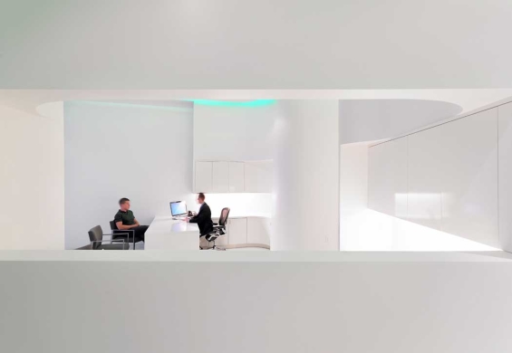
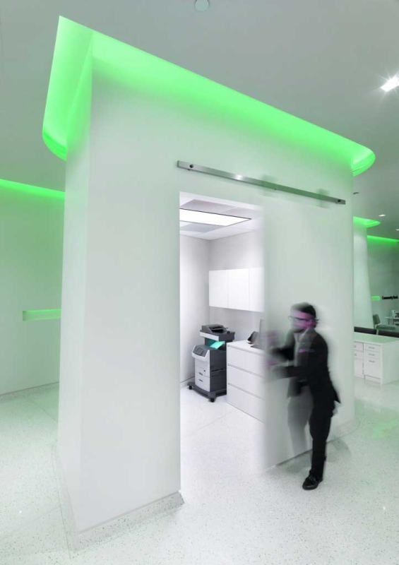
Programmable LED lights splash onto an snow white canvas of gently curving forms, a touch designers say was inspired by Apple products. They also say (and this is a quote) that the display becomes “a visual barometer for the company’s brand, mood, social awareness and public relations.”
It’s reminiscent of what a few other banks have tried in the past, most notably Raiffeisen in Switzerland and Chebanca in Italy.
Architect: Wannemacher Jensen Architects, Inc.
ING Direct – iPad Enclosures
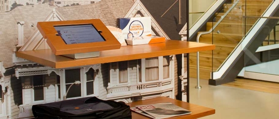
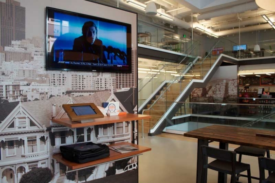
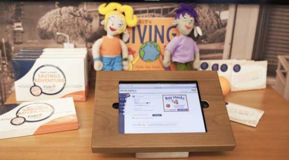
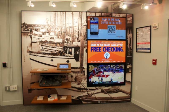
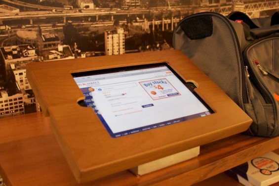
There are iPads everywhere you look in ING Direct’s latest café, which opened in San Francisco earlier this year. These iPad kiosks are mounted on tables below multi-screen displays and at a special “tech bar.” ING Direct’s iPad kiosks feature a stained wood finish reinforced by a steel enclosure, and secured with a key lock. The end result is an interactive touch screen allowing customers to switch between watching TV and surfing the web. In the far corner of the main floor, you can see a four-screen wall of TVs. Apparently, all the wood and steel used in the iPad enclosures cost about three grand through a company called iPad Enclosures.

Itaú Branch Redesign
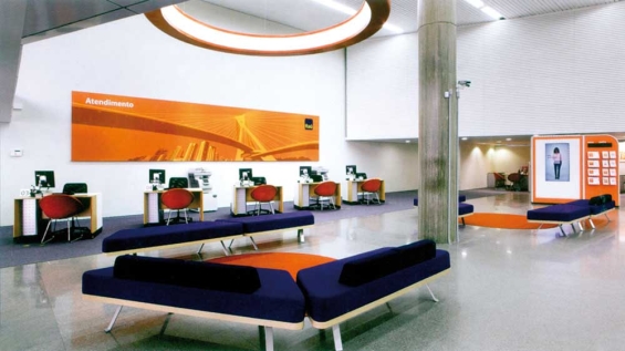
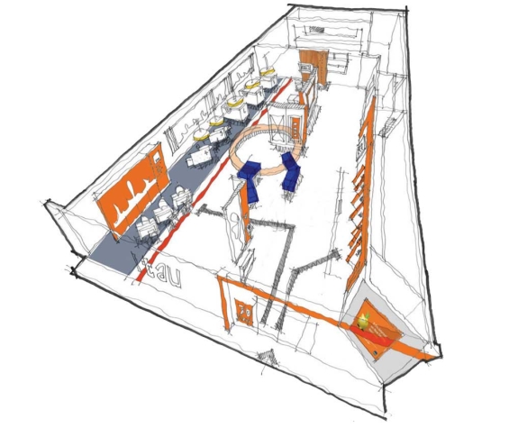
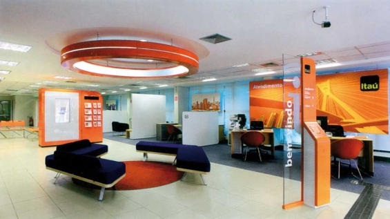
The merger of Itaú and Unibanco has made it the largest bank in the Southern Hemisphere with nearly 5,000 branches. To complete the union of the two banks, allen international was appointed to redesign the network of branches under the Itaú brand.
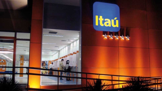
The most significant change was to make the exterior and entrance of the new branches much more inviting and easier to enter. Revolving metal detector doors were removed and the branded fascia was given a 3D treatment. A Q-matic system was introduced into a waiting area for customers to relax and browse the interactive digital product wall while waiting to be served. Customer segmentation was enhanced by separate areas for Attendimento/Gerencia, Uniclass and Negúcios customers through different colors, furnishings and materials. Lightweight screens and friendlier customer furniture support the relationship-focused strategy as well as improve privacy.

Navigating Credit Card Issuing in an Uncertain Economic Environment
Build a modern credit card strategy that balances profitability and risk, adopts the latest technology and delivers the customization that cardholders demand.
Read More about Navigating Credit Card Issuing in an Uncertain Economic Environment

The Financial Brand Forum Kicks Off May 20th
Explore the big ideas, new innovations and latest trends reshaping banking at The Financial Brand Forum. Will you be there? Don't get left behind.
Read More about The Financial Brand Forum Kicks Off May 20th
RBC – So Old and Stuffy, It’s Actually Cool
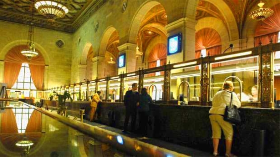
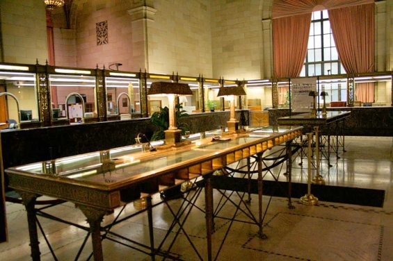
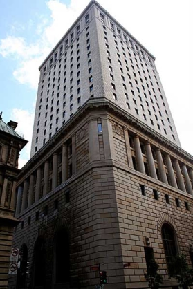
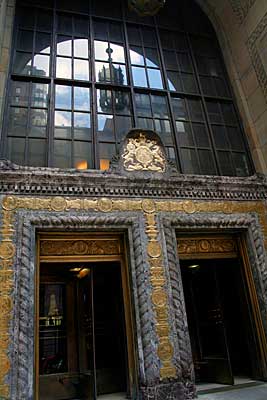
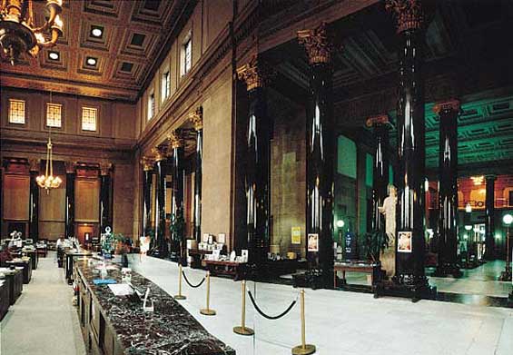
This branch from RBC on 360 St. Jacques street is a historic gem. Established as the Royal Bank headquarters in 1928, the building cost $6.5 million to erect. It remained RBC’s HQ until 1962. There were 20 tellers along one wall alone! Before the bank chose to close the branch altogether in 2010, the location had stood for more than 80 years, in its cathedral-like grandeur and monumentality — an icon from Montreal’s heyday as the financial capital of Canada.
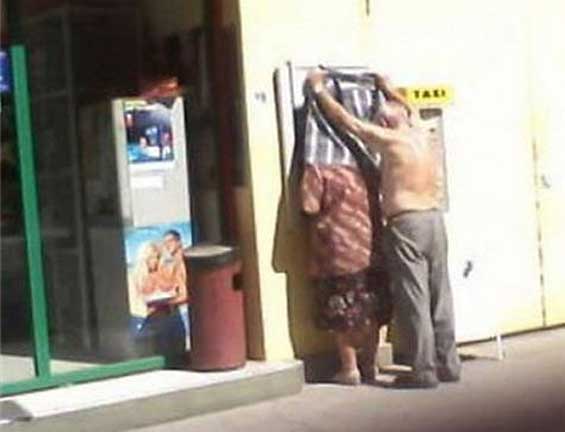
Reminder: Please Keep Your ATMs Shaded From Midday Sun
Most Western countries don’t usually struggle with this, but it’s a good thing to remember anyway: Customers hate it when they can’t see the ATM screen because the sun is blaring down on them.

