“Change means opportunity. Opportunity for our members, for our community, and for SAC Federal Credit Union.”
— Gail DeBoer, President/SAC FCU
After conducting research, SAC Federal Credit Union in Nebraska found that their somewhat dated, military look reinforced the perception that the credit union was for the military only, even though SAC had been open to everyone in the area for years.
The research also showed that people don’t generally know credit unions are different from banks, why they might want to join a credit union, or that they could even join in the first place.
So the $350 million credit union, along with their agency obi creative, set out to change things.
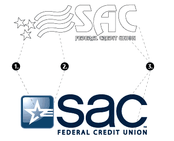
SAC wanted a new identity that would appeal to a wider, more progressive audience without abandoning their heritage. The credit union’s new logo evolves some central features of the old logo into a fresh, more modern design.


SAC got its start as an on-base credit union for the Strategic Air Command.
The credit union created a TV commercial — one that’s very well-produced — to support the rollout of the new logo.

The Power of Localized Marketing in Financial Services
Learn how to enhance your brand’s local visibility, generate more leads, and attract more customers, all while adhering to industry regulations and compliance.
Read More about The Power of Localized Marketing in Financial Services

The Financial Brand Forum Kicks Off May 20th
Explore the big ideas, new innovations and latest trends reshaping banking at The Financial Brand Forum. Will you be there? Don't get left behind.
Read More about The Financial Brand Forum Kicks Off May 20th
In its campaign materials, SAC spends most of its time explaining the basic differences between banks and credit unions.
“Hi, my name is Amy…And my name is Bill. We’re members of…SAC Federal Credit Union…Unlike banks that are for-profit and shareholder owned…SAC’s owned by members, people like you and me…We have a say…SAC makes decisions based on our best interests…Because SAC is member-owned. It gives back profits to us…through better rates and services. That’s how I got a better deal on my car loan…More interest on my savings…Dividends on my checking account…Switch to SAC Federal Credit Union…It’s a better way to bank.”
 Reality Check: These kind of messages are the general “credit union difference.” If the credit union industry and its leaders could ever find a way to produce a national awareness campaign, then credit unions across the country could stop expending mounds of marketing capital conveying the most basic information about their financial model. Until that time, credit unions will continue to tow the bulk of the party line.
As part of the rebranding effort, the credit union is replacing its old slogan, “Your Financial Partner for Life,” with “Better Banking.”
SAC has updated its website with an announcement about the changes, including a hotlink to their member newsletter.
SAC stresses that the makeover is not part of any reorganization, and that only the brand imagery will be changing. The credit union’s newsletter reassures members that “SAC FCU remains strong.”
According to data from CreditUnions.com, SAC has a capital ration just under 12%, which is considered to be strong and well-capitalized by any standard.
Key Takeaway: In this economic environment, people seeing any changes in their financial institution will automatically assume the worst. When rates, fees and even logos change, you need to follow SAC’s footsteps and explain the changes, or people will draw their own, fearful conclusions — e.g., merger, buyout, collapse, failure, new management, etc.
SAC says its signs, stationery, and collateral material will be gradually updated over the next year. The credit union has started introducing the new look in an integrated media campaign including TV, radio, billboards and print.
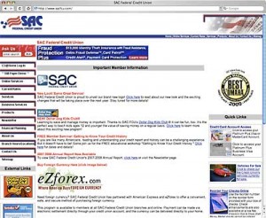
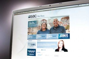
The old SAC website (left) gives way to a much more attractive and contemporary replacement
(photo, shown right). Using the web address joinsac.com, the new site is pitching switching
solely to prospective members. The microsite is pretty slick, thorough and well-designed.


