“Since the mid-1800s,
the term ‘savings bank’
indicated a
financial institution of
somewhat limited scope.”
— Julie Livingston
CEO, Marblehead
Marblehead Savings Bank has updated its new logo while also deciding to drop the word “Savings” from its name.
According to the local Marblehead paper, the bank changed names to “better reflect its wide range of products and services.” Apparently, people interpreted the word “savings” too literally.
Neither the name change nor the logo redesign are all that radical, but sometimes it only takes slight evolutions to stay current and remain relevant.

The bank’s previous logo used a font called Palatino,
one of the oldest — and most-common — typefaces around.
In the old logo, the symbol of a bird seems disproportionately large and imbalanced relative to the type. The new logo keeps the bird, but shrinks and tilts it. The beak of the bird dips down to replace the visual pause that is missing now that spaces between words have been removed:

The basic, solid blue of the old logo gives way to
a softer, more sophisticated color palette.

The Power of Localized Marketing in Financial Services
Learn how to enhance your brand’s local visibility, generate more leads, and attract more customers, all while adhering to industry regulations and compliance.
Read More about The Power of Localized Marketing in Financial Services

Unlocking Digital Acquisition: A Bank’s Journey to Become Digital-First
This webinar will offer a comprehensive roadmap for digital marketing success, from building foundational capabilities and structures and forging strategic partnerships, to assembling the right team.
Read More about Unlocking Digital Acquisition: A Bank’s Journey to Become Digital-First
The new logo uses a mix of two typefaces. Trajan, a classic typeface that looks like something straight off the Roman Colosseum, is used for the word “Marblehead.” “Bank” is set in Futura, a clean, retro-contemporary typeface that never loses its popularity among designers.
The new logo also preserves its formal and conservative all-caps typesetting. Lately, many financial institutions have opted to typeset their names in all lowercase letters to convey a casual, contemporary, approachable and easy-going personality (like BNZ).
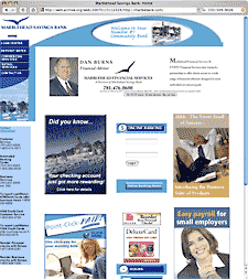
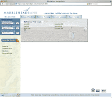
The Marblehead website got an upgrade too. There’s a lot less clutter in the new design (shown right), but the placement of the compliance bugs in the extreme lower-right creates an awkward amount of whitespace.
Bottom Line: The upgrade to the bank’s overall image is subtle, but better.
To support the name change, Marblehead Bank has a “Scratch the ‘SAVINGS'” instant-win game. Prizes include a $2,500 cash grand prize, three $1,000 cash prizes, and gift cards and discounts to participating Marblehead retailers.


