For 20 years, Umpqua Bank relied on a distinctive logo that evoked the Pacific Northwest: An evergreen tree and a font that looked like it could have been carved in wood.
But now, this well-known bank from Portland, Ore., is rolling out a more modern logo with a new color, new font and new symbol. Taken together, the new visual identity is designed to accomplish a variety of goals, according to David Moore Devine, Umpqua’s chief marketing officer.
The bank wanted to reflect its footprint following its merger in March with Columbia Bank, based in Tacoma, Wash., while honoring the history of both institutions, Moore Devine says. It also wanted a design that represented sophistication and expertise to commercial customers but that would still appeal to consumers and small business owners. Finally, it sought a look that honored both banks’ roots in the Pacific Northwest.
“It was a complicated challenge, but I think we developed something that accomplished all those goals and resulted in something that is also very iconic,” Moore Devine says.

Why Industry Cloud for Banking?
PwC’s Industry Cloud for Banking helps deliver personalized products and services that today’s customers expect.

Redefining CX Through Innovative Social Media Strategies for Financial Services
Learn how Sprinklr is redefining success in the financial sector by harnessing the potential of tailored content and personalized engagement.
Read More about Redefining CX Through Innovative Social Media Strategies for Financial Services
The Name: Umpqua Bank Joins Array of Columbia Brands
Mergers often give banks an opportunity to rebrand. In some cases, that can lead to a new name, such as when BB&T and SunTrust became Truist.
But that kind of change was not of interest to Umpqua and Columbia, says Moore Devine. “They’re strong, powerful brands, and nobody wanted to leave that brand equity on the table.”
The merged institution, which has assets of more than $50 billion, operates under the Columbia holding company, Columbia Banking System Inc., with its headquarters staying in Tacoma. The banking unit is using the Umpqua Bank name and keeping Portland as its hometown. Other subsidiaries retain the Columbia name: Columbia Trust Co., Columbia Wealth Advisors and Columbia Private Bank.
The bank serves customers in Arizona, California, Colorado, Idaho, Nevada, Oregon, Utah and Washington State, as well as nationally through niches such as health care and Native American banking.
Though they kept a mix of the legacy names, leaders at Umpqua and Columbia seized the opportunity to give the brand a fresh look and feel.
“This whole idea of evolving the brand, we thought, was a really important way to represent the new capabilities and the new strengths of the combined company,” says Moore Devine, who had been Columbia Bank’s CMO before the merger.
Columbia is best known for business banking as well as its private bank and wealth management services. It also takes pride in its community-service initiatives, such as an annual campaign to collect donations of cash and winter clothing for homeless shelters and relief agencies.
Umpqua has a reputation for innovation both in technology and customer service. The bank was in the vanguard, for example, when it came to reimagining branches and in blending human and digital approaches to customer service.
The new logo was first unveiled internally in March, just before the high-profile failures of Silicon Valley, Signature and First Republic. Umpqua, like other banks at the time, had focused its external messaging on reassuring customers about the safety of their deposits. As a result, the new logo has been introduced through a soft-launch approach, using a mix of advertising, social media and sponsorships.
The Tree: Umpqua Logo Is Strong Like the Nike Swoosh
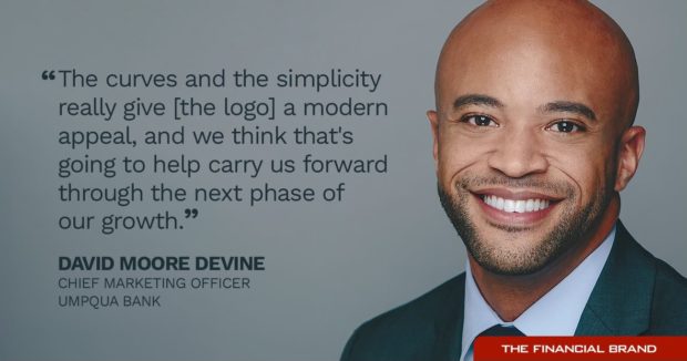
The previous logo for Umpqua Bank incorporated a stylized evergreen tree. The new logo replaces it with a pair of upward-pointing arrows that connote the branches of a tree. “The curves and the simplicity really give it a modern appeal and we think that’s going to help carry us forward through the next phase of our growth,” Moore Devine says.
The arrows also symbolize upward motion, connecting the logo to the bank’s purpose of bringing prosperity to its communities, he says.
The creative work was all done in-house, Moore Devine adds. Umpqua’s designers of record are Naz Afshar and Brian Abbott.
Outside marketing experts praised the simpler look.
“The icon successfully delivers the duality of the tree and the up arrows in a way that balances both messages equally,” says Rob Smith, executive director of Varsity, which is part of Pavone Group in Harrisburg, Pa. “Neither the stylization of the arrows nor the tree takes precedence. They both work in harmony with each other in a very pleasant form.”
The symbol is strong enough to stand on its own, just like the trademark Nike swoosh, says Denise Kohnke, founding partner of 51 Group, a marketing firm with offices in Boston, Milwaukee and Harrisburg. “And if you have the opportunity to ‘be like Nike,’ you should take it.”
“If you have the opportunity to ‘be like Nike,’ you should take it.”
— Denise Kohnke, 51 Group
The evolution of the Umpqua logo is similar to that of the rock in the Prudential Financial logo, which has morphed over time, Kohnke says.
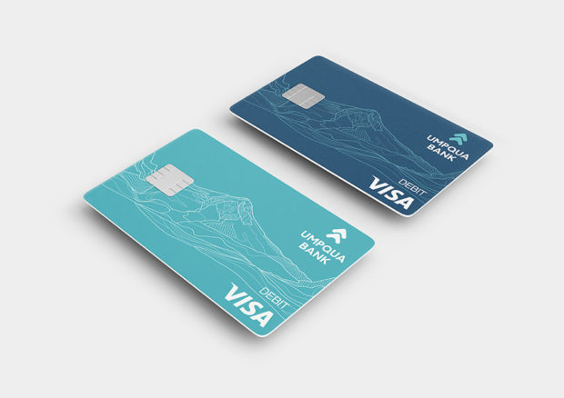
Umpqua has added other visual reminders of the West as part of its rebranding. In some places, such as its homepage, the bank incorporates outlines of prominent peaks, including Mount Shasta in California, Mount Hood in Oregon and Mount St. Helens in Washington state.
The imagery is designed to create emotional connections with customers in the West, who are familiar with the mountains’ contours, Moore Devine says. “And for those who are not in the West, they look like fantastic modern graphic elements that are equally as exciting to them.”
Read more:
- Flagstar’s New Logo Is Just One Step in ‘Lifestyle Brand’ Makeover
- Tactics from a Nail-Biter Merger That Every Bank Marketer Can Use

The Color: A Blend of Umpqua’s Green and Columbia’s Blue
As they sought a new color for the Umpqua logo, the designers contemplated many shades of green, Moore Devine says. They finally landed on a color they called “blue spruce,” which blends the blue from Columbia’s logo and the green from Umpqua’s.
The color also has geographic ties. The blue spruce is the state tree of both Utah and Colorado, two new markets for Umpqua, Moore Devine says. But the tree is relatively common throughout the west as a whole.
The color change is a noticeable improvement, according to marketing experts. The old dark green color verged close to black, they said.
The new color is a subtle combination of earth and water, Kohnke says, noting that it is fitting, since the Native American word “Umpqua” can be translated as “a place along the river.”
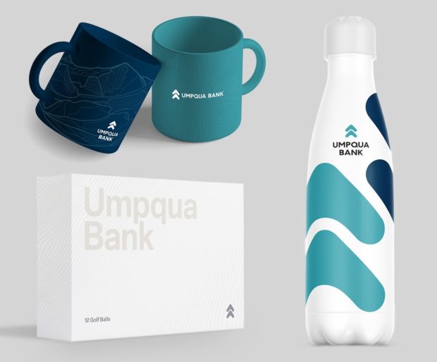
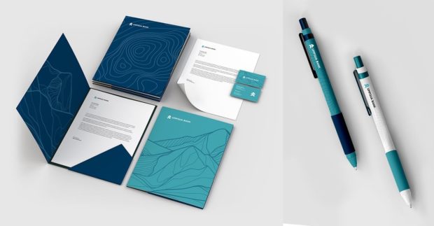
It also has allowed the bank to embrace a broader palette of colors, Smith says. In addition to the blue spruce, Umpqua uses a darker blue on some items, such as mugs, pens and debit cards. “The colors are new, but they don’t feel disruptive,” Smith adds. “Rather they come across as a natural progression in the brand evolution.”
Read more:
- Huntington’s Ad Campaign Revives Customer Testimonials with Flair
- See all of our latest coverage of bank marketing strategies

The Font: Umpqua Joins Other Brands in Trend Toward Simplicity
For a new typeface, Umpqua wanted something that conveyed sophistication to commercial customers but that was also appealing to consumers and small businesses, Moore Devine says.
“We think Elsa does that beautifully,” he says, referring to the name of the font, not the character from the movie “Frozen.”
In today’s volatile market, banks are seeking to project stability. And Umpqua’s new font does just that, marketers say.
The font is also simpler, reflecting a broader trend away from distinctive lettering. Health care giant Johnson & Johnson, for example, recently ditched its cursive font. Other brands that have adopted a more streamlined typeface in recent years include Airbnb, Burberry and Pinterest.
The bank is pleased with the reception so far for its new brand look, Moore Devine says, noting it has been rolling out gradually since March. “I think part of that is because of the homage we paid to the original identity.”
From the archives:


