Every website today should be considered a constant work-in-progress. No web design project is ever “finished”. The bar just keeps on rising.
To find out what’s working and what isn’t, The Financial Brand reached out to five firms with extensive website design expertise in the banking sector to get their insights and specific suggestions — what do banks and credit unions need to do to elevate the online experience?
1. Make It Visual
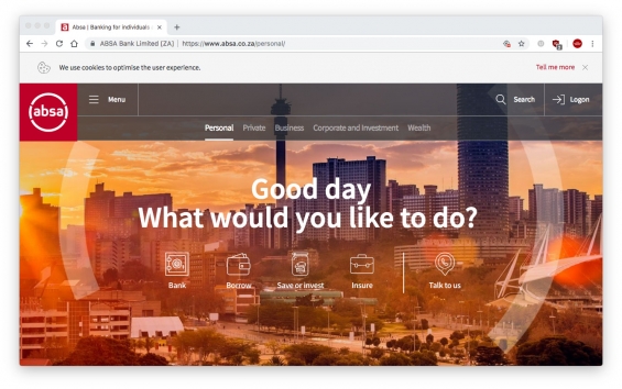
Marne Franklin, CEO of Uncommn, recommends using large, attention-grabbing images and icons to help consumers easily move to where they need to be on your site.

Instant Messaging. Instant Impact.
Connect with your customers and provide lightning-fast support as effortlessly as texting friends. Two-way SMS text messaging is no longer optional.

Industry Cloud for Banking from PwC
PwC’s Industry Cloud for Banking applies our deep industry knowledge to your specific business needs
2. Always Be Thinking About SEO
Adapting your site to ever-changing trends in search engine optimization is crucial.
“Creating a digital experience without utilizing SEO is akin to throwing a party no one will attend,” says Craig McLaughlin, CEO of Extractable. “Your site may be beautiful, but who will see it if it doesn’t rank well in search engine results?”
One way to get a higher ranking in Google search results is to have a fast-loading site. Banks and credit unions can make site load times faster by using a mobile-first approach and “flat design” — a minimalistic design approach that emphasizes usability.
3. Embrace Minimalism
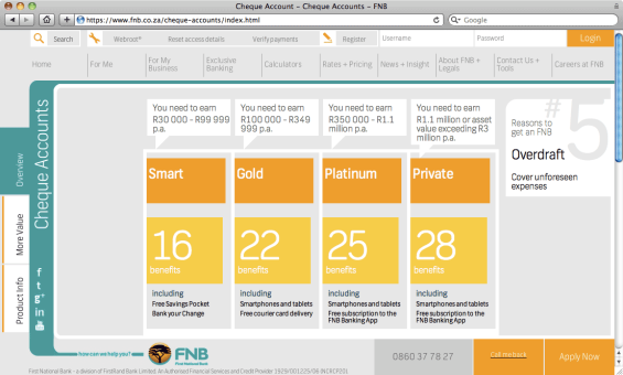
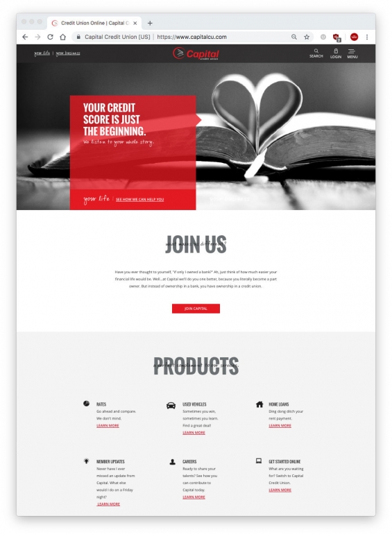
McLaughlin says you shouldn’t do this just because it’s the latest design trend, but because it provides a more impactful user experience. He points to Capital Credit Union’s use of reduced navigation and two-color design (see below), and Australia’s CommBank, a leader in simplicity for many years, for its use of a card-based web design built around “tiles.”
4. Adopt the “Hamburger”
What’s a “hamburger”? It’s the navigation system commonly found on mobile websites — three horizontal bars stacked on top of each other representing the “Menu.”
Jennifer Buccini, Art Director with ZAG Interactive, says progressive financial institutions are beginning to use this design element in the desktop version of their websites. Not every link needs to be embedded in the hamburger though. You can keep links to the most popular pages (e.g., Login, Locations, Contact Rates) readily accessible.
5. Simplify With Sliders
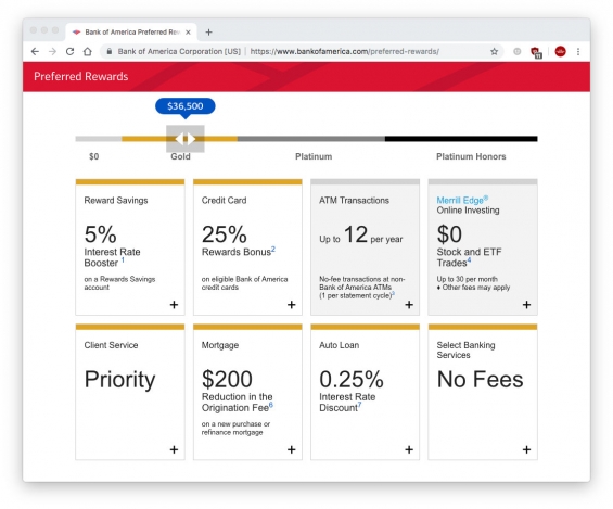
“We love sliders that help guide consumers toward best-fit financial options rather than overwhelming them with huge comparison tables,” says Kerala Taylor, Digital Strategist at PixelSpoke. She cites Bank of America as a good example (see below).
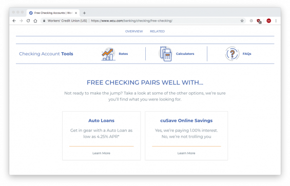
6. Suggest Related Products
This is what e-commerce retailers do. These messages can be alert-triggered or use personalization for more tailored content, says Michelle Brown, VP of Marketing for ZAG Interactive.

7. Adopt and Adapt Ideas From Non-bank Sites
Banks and credit unions can find ideas outside the banking space that can help capture the attention of Millennials and other purposes. McLaughlin suggests looking at Financial Gym’s site as one example. Taylor points to SuperBetter, a website that gamifies life goals to help people overcome obstacles. It could be adapted to help financial institutions’ consumers achieve financial wellness.
 ( Read More: The Financial Gym: Pumping Money Out of Financial Education Programs )
Six Design Steps to Reduce Site Complexity
One of the most serious website problems facing banks and credit unions is complexity. UX Design Agency CEO Alex Kreger says financial institutions can make their products easier for consumers to use by implementing these six steps:
1. Reduce density. This is the worst enemy of design. Too many elements frustrate the user and ruin experience. Provide sufficient “white space.” Clear indents will separate elements from each other and make the interface more readable.
2. Divide tasks into smaller parts. When a digital service requires some action from the consumer, divide it into step-by-step tasks instead of putting it all on one screen. For instance, divide forms into several screens, and use progressive disclosures. This should help focus users’ attention and keep the process flow clear.
3. Leverage what’s familiar. Both desktop and mobile already have well-developed standards and common interface solutions. For instance, users expect to see a profile or login in the upper right corner. Also, the search bar in mobile solutions should be at the top of the list.
4. Fix pain points and focus on critical touchpoints. Analyze the journey consumers must take to research and acquire each digital service through their eyes. Identify any trouble spots that could frustrate them, then find a better solution — rearrange the flow, make “micro-interactions” more obvious (small functions such as turning a feature on or off, or a slider), or just add some handy tips.
5. Use a consistent “design language.” When using a website, the experience should be predictable and intuitive. Its flow should be smooth, connected, and consistent. That’s why it is essential to see web design as a system. Use the same interface mechanisms throughout your site with militant consistency.
6. Improve accessibility. About 4% of all people have some visual problems. It’s very important to ensure banking interface accessibility for them through the right use of contrast, color, and font size. For example, in case of an error, avoid using color as the sole element to indicate the necessary action. It is better to combine it with an icon and a notification as well.

Navigating Credit Card Issuing in an Uncertain Economic Environment
Build a modern credit card strategy that balances profitability and risk, adopts the latest technology and delivers the customization that cardholders demand.
Read More about Navigating Credit Card Issuing in an Uncertain Economic Environment

The Power of Localized Marketing in Financial Services
Learn how to enhance your brand’s local visibility, generate more leads, and attract more customers, all while adhering to industry regulations and compliance.
Read More about The Power of Localized Marketing in Financial Services
Stay in The Pack or Break Away?
To anyone who spends a fair amount of time surfing the web, it becomes apparent that certain design elements, conventions, and functions flow in and out of fashion. Following some trends is simply smart — e.g., when everyone starts adopting a new solution that improves the experience and/or compatibility. Other times, following the herd can take you down the wrong path. When does it make sense to adopt common conventions, and when does sameness undermine your brand’s differentiation?
Michelle Brown says the short answer is to always prioritize functionality and the overall experience. “What good is a flashy, new website if it is not intuitive to use?” she asks rhetorically. “Once the basics have been checked off, then you can focus on how you stand out from the pack.”
But Brown also concedes that some times a few gratuitous bells and whistles might be appropriate. “When the target audience has a high tolerance for a non-traditional approach, it’s important to push the envelope.”
Marne Franklin at Uncommn agrees, saying different isn’t a negative if there is good a reason for it.
“If you truly know there is a feature or element that resonates with your audience and why, then go for it — even if it isn’t a common or trendy thing to do,” Franklin says. “But if you throw out all the rules and best practices just because you don’t want to be like everyone else, you are probably doing a disservice to your website users. Always remember that your site should reflect your brand, no matter what anyone else’s site looks like.”
Kerala Taylor at PixelSpoke, doesn’t worry whether financial institutions sprinkle digital glitter on their websites or not. She’s more troubled by all the me-too imagery and ineffective copy she sees on banking websites. “Too many financial institutions rely on bland stock photography and clunky messaging,” she explains. “Community is a key differentiator for local financial institutions. They don’t need tech gimmicks. They need rich visuals of local businesses, local landmarks, real local people, and stories from around the community to help their sites stand out.”
Taking Mobile Websites to the Next Level
The importance of having a responsive website design — in which all the elements automatically adapt to fit the screen size of the device being used — has been talked about for years now. However, many bank and credit union websites were created before people walked around with a “supercomputer in their hand at all times,” as Marne Franklin puts it, and haven’t changed.
“The result is text and images that don’t resize on their own and menus that don’t function properly on a phone or tablet leaving users feeling frustrated and unwelcome,” she warns.
The industry is catching up, says Franklin, but there is much work to do. Even for those who already have responsive sites, there’s much more that should be done.
Beware of third-party features, modules and plugins. “Many financial institutions have beautifully responsive sites that look great on mobile devices, but they use third-party tools that are not mobile-friendly,” Taylor at PixelSpoke points out. “That leads to an inconsistent and frustrating experience for their users.”
Design specifically for the mobile experience. On mobile devices, it’s critical to quickly provide the information mobile users are most likely to be looking for. “For instance, people are more likely to want to find a local branch when on a mobile device,” Brown with ZAG Interactive says, “so quick access to a branch or ATM finder is critical.” She says that load times are another important consideration; websites that are fast and load quickly are critical to both the user experience as well as organic SEO ranking.
Don’t regurgitate the desktop experience. You don’t need to recreate the entire desktop experience for mobile users. You can edit, chop and cut. “Many loan or account applications are simply too long for mobile devices,” says Franklin with Uncommn. “Consumers get frustrated and abandon the application after ten minutes because of having to constantly scroll and enter information in a format that isn’t easy to navigate. We’ve found giving people the option to fill out a very short ‘interest form’ — name, email and phone number — instead of the full application generates more submissions and leads.”

