The Financial Brand evaluates the following 10 bank and credit union websites using the following criteria:
- Clear connection to marketing goals and/or brand strategy
- Likelihood that consumers will visit
- Cross-promotional opportunities
- Relevancy, quality and depth of content
- Functionality, information architecture and interface
- Creativity, design and visual aesthetics
- Linkage to the brand’s look-and-feel and/or application of visual identity standards
Merchants Bank – Vermont Matters
URL: VermontMatters.com
Description: This microsite links the Merchant’s brand with the local communities the bank serves in two ways.
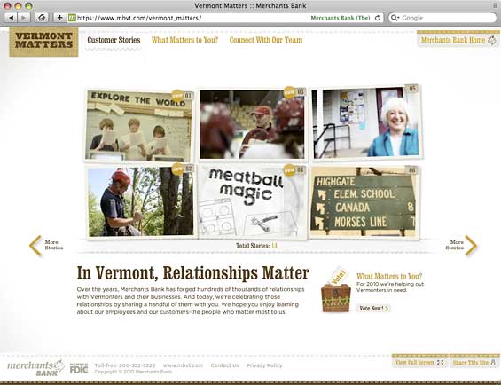
First, there are 14 testimonial stories from retail customers, business clients and community organizations the bank has helped. Each story has a two-minute video overview, plus two other background videos: raw footage with interviews and “lessons learned.” You can also “meet” the Merchants team member who handles the relationship.
Second, there is a reoccurring contest, “What Matters to You?” that allocates money to a worthy cause based on an online public vote.
Pros: The stories are relevant and engaging. The URL isn’t just a clever domain name, it is the bank’s tagline. The videos are excellent, and professionally produced. Each story has depth, and has real potential to engross Vermonters. The entire campaign has an attractive and creative design that aligns with Merchants’ overall brand identity. The bank cross-promotes the “Vermont Matters” initiative on its main website homepage.
Cons: It a long time to pre-load the site because it’s built entirely in Flash.
Bottom Line: Great stories about how the bank has made a real difference for real people in Vermont. Add in the charitable giveaways and community organizations, and it’s a giant warm fuzzy for the brand.
TD – Get Saving
URL: TDGetSaving.com
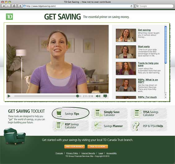
Description: A young woman named Erica walks people through savings and investment concepts in a series of seven videos. There are additional pages with Savings Tips, a Savings Planner, a Simply Save Calculator, an RSP Savings Calculator, a TFSA Savings Calculator and FAQs for RSPs & TFSAs.
Pros: Videos make financial education more interesting. There is a branch locator and “Talk to Us Now” button to facilitate next steps. The site is also available in French for TD’s French Canadian customers. The site clearly reflects TD’s green brand identity.
Cons: The microsite makes numerous mentions of products like RSPs and tax-free savings accounts, but there are no links to the corresponding pages on the main TD website where much more information is available. The only link back to the TD website points at the generic homepage. The Savings Planner concludes that you need tax-free investments no matter what, which is silly. There are only six Savings Tips, and they are all predictable clichés.
Bottom Line: It’s a little flat. The educational material has depth, but the microsite and Erica do not.

Industry Cloud for Banking from PwC
PwC’s Industry Cloud for Banking applies our deep industry knowledge to your specific business needs

Navigating the Role of AI in Financial Institutions
83% of FI leaders agree investing in AI is essential for 2024 but how you leverage AI is instrumental in success and meeting customer expectations.
Read More about Navigating the Role of AI in Financial Institutions
Beehive FCU – Beehive Bug
URL: BeehiveBug.com
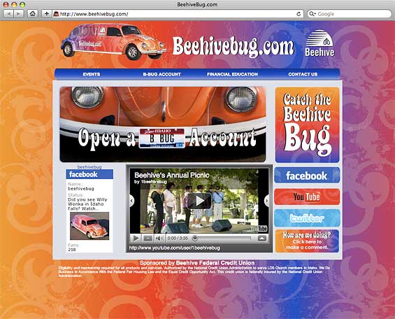
Description: A 1972 Volkswagen Beetle stretch limo with the slogan “Catch the Beehive Bug” became the centerpiece of a new campaign celebrating the credit union’s 50th anniversary. The credit union uses the limo to giveaway prizes around town, including free use of the limo itself. The microsite provides links to connect with the Beehive Bug on Twitter (19 followers), Facebook (218 fans) or YouTube (13 videos viewed 776 times).
Pros: You gotta love anyone with the brass to use a stretched retro VW Bug, especially when their name is “Beehive.” It’s fun and creates “buzz” (get it?).
Cons: There isn’t really any reason to visit. The site is somewhere between a placeholder, a social media portal and an afterthought to an otherwise excellent campaign. This interactive press release telling the story of the Beehive Bug is more interesting.
Bottom Line: The limo is cooler — and more useful — than the microsite.
SAFE Federal Credit Union – Unlike A Bank
URL: UnlikeABank.com
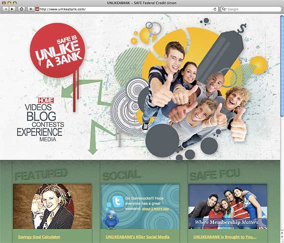
Description: The microsite is SAFE’s ambitious first foray in social media. The site warehouses seven TV commercials, a handful of articles in its quasi-blog, a couple of photos and a section for contests. The site incorporates an option for sharing content on Facebook.
Pros: The double entendre in “Unlike a Bank” is superb. There is a product offer for SAFE credit cards. There’s an opt-in email form for the credit union’s newsletter.
Cons: There is a lot of wasted space on a large homepage graphic. A group photo of kids (HeaderImageRight.png) takes a long time to load because its file size almost exceeds 500K when it could be under 38K. There is no connection back to the SAFE brand, not even a logo. There is no RSS feed for the blog, nor a lot of content. You can’t comment on “blog” articles. The “Contests” section of the site is currently empty.
Bottom Line: Probably too ambitious for a financial institution that only wants to dip its pinky toe in social media’s waters.
Columbia Credit Union – The Better Move
URL: TheBetterMove.com
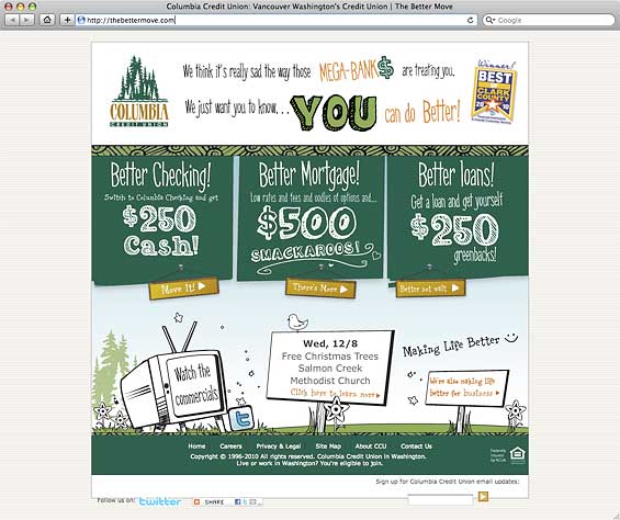
Description: Columbia created a microsite supporting its advertising slogan, “The Better Move.” It’s part of a three-pronged “move your money” campaign. The credit union is offering $250 cash with checking accounts, $500 on mortgages and $250 on other loans. There are links to Columbia’s business banking page, its Twitter account and a few upcoming community events. There’s also a link to the credit union’s YouTube channel where you can watch three women gripe about banking in a series of 30-second commercials. Social media sharing tools and an email opt-in form are included in the site’s layout.
Pros: The product offers are compelling, driving straight at WIIFM (“what’s in it for me”). The funky, illustrated style gives the credit union a pleasant personality. The copy is fun — “oodles,” “smakaroos,” “greenbacks.” Overall it feels creative and playful.
Cons: There’s no way to find/get to the microsite from the credit union’s main website. The offers are on www.columbiacu.org, but it’s not the same thing — it’s more stiff and corporate.
Bottom Line: This microsite is about the bottom line (product acquisition).

TIAA-CREF – Become Your Future You
URL: BecomeYourFutureYou.org
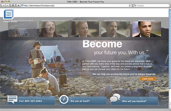
Description: TIAA-CREF likes using sloganized URLs. This one points at a microsite with a mix of educational resources and staff interviews — all about investing. The microsite links to many instructional pages hosted on the main tiaa-cref.org website.
Pros: The information and educational content is thorough. The URL has advertising value while also implying a benefit to consumers. The large photography makes for a dramatic, visually stunning experience.
Cons: The interface is hard to figure out, making it difficult to understand what the microsite has to offer. People probably won’t spend the time required to get through all the information.
Bottom Line: It’s nice eye candy, but consumers would probably reap greater benefits from spending their time at the main TIAA-CREF website.
Entrust FCU – Be a Good Steward
URL: BeAGoodSteward.com
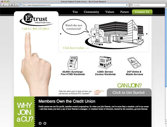
Description: This site serves up a mix of values, philosophy, ads and information about the credit union. There are three reasons to join a credit union. There are four banner ads, including two for products, one for a charitable initiative and another inviting visitors to watch the latest TV commercial. There is a short paragraph of copy about You, the Community, the credit union’s Values and the Future. Visitors can share the site with a friend via email or social media tools. You can also follow the credit union’s fictional representative Gary on Twitter.
Pros: “Be a Good Steward” is both the credit union’s tagline and the microsite’s URL, reflecting the organization’s focus on Baptist ministries. There are product offers for auto loans and Bonus Checking. The “Good Steward Tip” rotates every time you load the site.
Cons: Considering the site is titled “Be a Good Steward,” there could be more about good stewardship (as a member, as a credit union, as a Christian). The site lacks focus, cohesion or a common theme? Although the credit union talks about why people should join a credit union (in general), they don’t talk about why someone should specifically join Entrust. The “Can I Join” process is awkward, involving a PDF and a standard contact form. There isn’t much linkage to the credit union’s brand look-and-feel.
Bottom Line: A missed opportunity. A credit union serving Baptists should be able to create a microsite telling a rich, emotional, multi-media story.
US Bank – Credit Wellness Center
URL: creditwellness.usbank.com
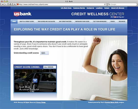
Description: An educational resource about credit that is available free to everyone. The site walks visitors through a linear path with the ins-and-outs of credit scores, how they are calculated and why they are important. There are four videos in the Credit Score Cinema that make humorous points about credit, lol. Oddly, all the videos are tagged with WhatsMyScore.org, a URL for a Visa promotion.
Pros: It’s a visually interactive learning experience. The site loads quickly.
Cons: US Bank should have bought the URL creditwellnesscenter.com.
Bottom Line: Considering the topic, it’s a solid presentation. Not terribly ambitious, but it provides functional content. It got the bank plenty of positive PR.

Are You Ready for a Digital Transformation?
Unlock the potential of your financial institution's digital future with Arriba Advisors. Chart a course for growth, value and superior customer experiences.

Why Industry Cloud for Banking?
PwC’s Industry Cloud for Banking helps deliver personalized products and services that today’s customers expect.
Connexus Credit Union – Flip My Loan
URL: FlipMyLoan.com
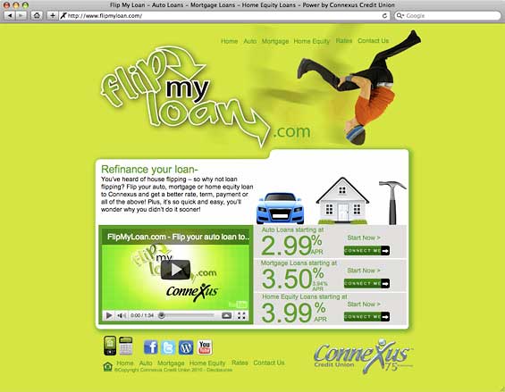
Description: This is a site all about refinancing, specifically auto, mortgage and home equity loans.
Pros: It’s focused on loans, and who doesn’t need more loans right now? The site is creative, attractive and has some nice details (like the chrome Connexus logo with rollover). The site’s design is connected to the main Connexus brand look and feel. Bonus: There is a mobile version of the microsite.
Cons: The microsite doesn’t integrate the credit union’s online applications for auto, home and home equity loans. The microsite is geared almost exclusively towards young people when it would take only a few tweaks to make it appropriate for nearly every demographic.
Bottom Line: It’s selling products, something a lot of microsites don’t do.
Numerica Credit Union – Num Num
URL: numnum.org
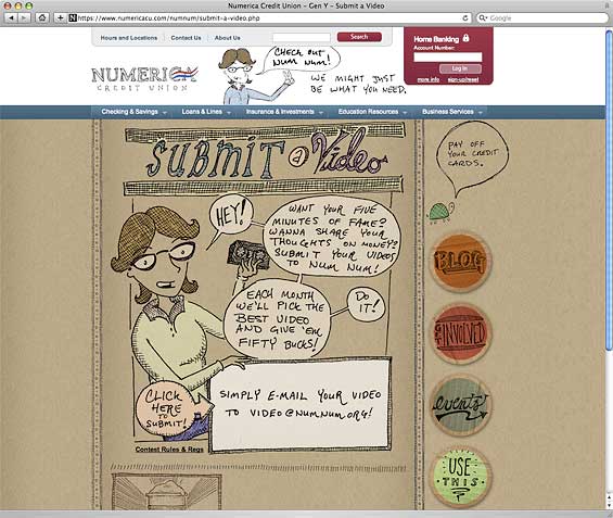
Description: A web site for young adults that features an ongoing video contest, a financial Blog, and special events. Video submissions about the topic of money are the prime focus of the site. Each month, the creator of the best “money” video will receive a $50 cash prize. Also, for each video submitted, Numerica will donate $10 to Spokane’s Crosswalk Teen Shelter.
Pros: The illustrated style is fun, distinctive and quirky, making the microsite’s design cool, casual and contemporary. There are little touches that make the experience more engaging. The website incorporates the entire nav bar and footer from the main Numerica website. Clicking on the logo/banner at the main website triggers an ad for the Num Num microsite — a very innovative approach.
Cons: The Num Num blog isn’t integrated into the microsite. Asking people to make videos eliminates a large segment of the potential audience.
Bottom Line: 16 video submissions in four months. The microsite probably triggers a bigger reaction than the overall idea behind the promotion.

