Here are over 50 illustrations showing brand identities, image makeovers and new look-and-feels from banks and credit unions around the world. You can click on any image to enlarge.
Garanti Bank
Garanti is the third largest private bank in Turkey. Garanti asked i-am associates to enhance its brand communications, physical environments and visual merchandising. If a bank in an Islamic country like Turkey can develop a fresh brand image, so can you.

Why Industry Cloud for Banking?
PwC’s Industry Cloud for Banking helps deliver personalized products and services that today’s customers expect.

Instant Messaging. Instant Impact.
Connect with your customers and provide lightning-fast support as effortlessly as texting friends. Two-way SMS text messaging is no longer optional.
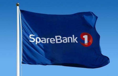
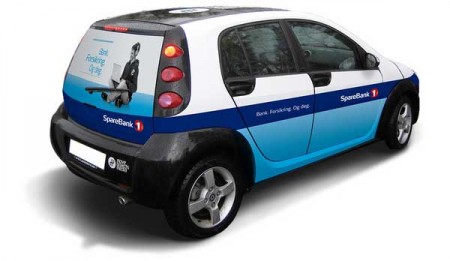
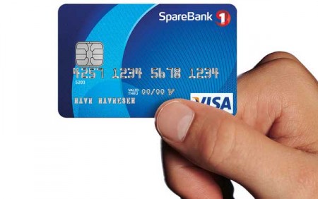
SpareBank 1
SpareBank 1 is Norway’s third largest bank. It was launched in 1996, and completed this image rebrand in 2006. While the bank does have a few accent colors in its brand color palette, the corporate blue and red colors are predominate, helping create a universal link between brand pieces. Also note the red dimensional logo element. The days when you could get away with a flat, one-dimensional logo are over. These days, it helps to have a logo that works in 3D space, and (even better) one that can be dynamically animated for web or TV.
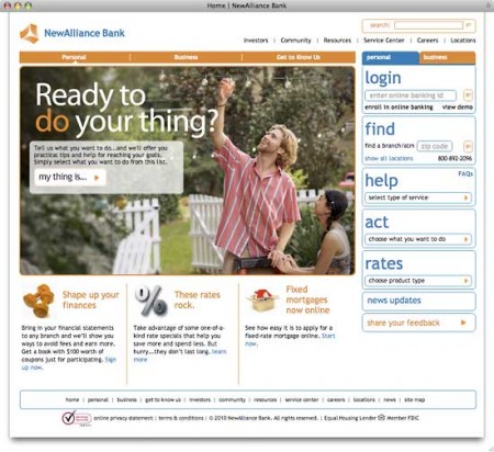
New Alliance Bank
NewAlliance Bank is a regional banking and financial services company headquartered in New Haven, Connecticut. It is the third largest bank in Connecticut and fourth largest in New England. They partnered with Adams & Knight for this image makeover. Does anyone else notice the similarities between this brand and regional banking powerhouse PNC (the orange color, the triangular logo)?
CU of Ohio
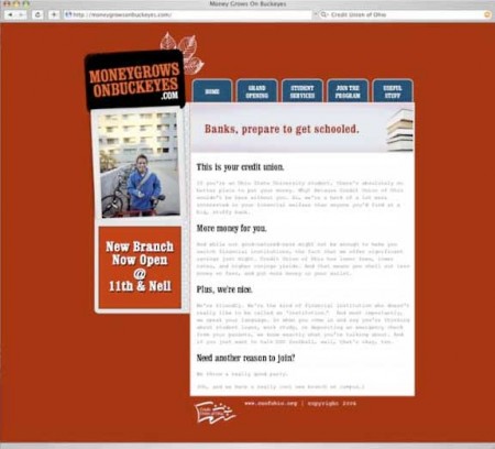
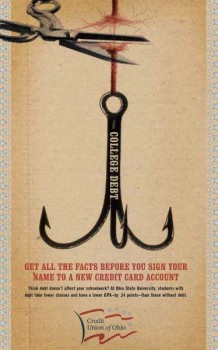
The Credit Union of Ohio hired Roust + Partners to help them reach Ohio State University students. A microsite, MoneyGrowsOnBuckeyes.com, is the centerpiece of the effort. Retail merchandising included posters, teller windows, bookmarks and printed paper coffee cups for the coffee café outside the new branch. A transit and point-of-sale campaign promoted financial literacy seminars. At times, the brand taps into the bitter rivalry between the University of Ohio and the University of Michigan.
New India Bank
The new brand identity i-am associates created for New India Bank is both ultra modern and corporate. The branch design radiates warmth and simple accessibility. ‘i-am’ was asked to look at every aspect of the business including brand image and culture. The branch is compact but bright, lively, colorful and energetic. Note: The first thing you should do if you want to create a retail branch experience is get rid of those fluorescent lights. Lighting makes all the difference. The high ceilings also help keep a rather small branch from feeling too cramped.
Innovations Federal Credit Union
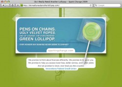
Raoust + Partners developed Innovations Federal Credit Union’s new brand identity around tagline “Spark Change.” The brand campaign introduced a redesigned website at sparkingchange.com, with a more youthful look and tone. Campaign components include in the brand launch included TV, radio, billboard, print and two unusual websites, greatanotherstupidtoaster.com and doireallyneedanotherlollipop.com.
Tinker Federal Credit Union
TFCU partnered with Third Degree in 2004 to create a completely new brand look-and-feel. The “we get it” campaign was used to reintroduce the TFCU difference to those looking for a financial institution that really understood them, their motivations, how they felt about money and what they wanted from life. It’s a conservative, lifestyle-based look and feel.
Bank of Scotland
Bank of Scotland tapped Young & Rubicam agency RKCR for the overhaul of this state-owned financial services brand. The refresh includes outdoor, print, radio and digital activity. Media planning and buying is by Mediaedge:cia. Archie Kane, Group Executive Director, said, “This is not about reinventing the Bank of Scotland brand, but allowing our customers to rediscover it.” The bank is also using the rebranding as an opportunity to drop “Halifax” from its old “Halifax Bank of Scotland” name. A television advertisement, voiced by Scottish actor Dougray Scott, features a young couple getting married, buying a home and starting a family, pointing out that “you never know where the next road will take you.” “This campaign will clearly and coherently communicate the Bank’s role in today’s modern and dynamic Scotland,” said Richard Exon at RKCR/Y&R.

