Direct Marketing Clinic: Ally Bank’s Email Techniques
By Joe Swatek and Steve Bieber, ACTON Marketing
Simple Subscribe
Subscribe Now!
Email marketing campaigns might not generate the kind of click-through rates financial institutions would like, but it is an efficient medium to reach consumers with a targeted marketing message, particularly those who have opted to receive offers.
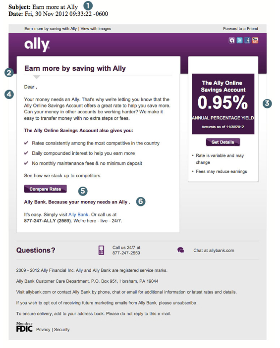
Here’s an Ally email campaign from late 2012 promoting the bank’s Online Savings Account. See what you can learn for your own campaigns from the pros and cons of Ally’s promotion. As a marketing email, this is concise, uses good techniques, and provides multiple links to the next step in the sale, the landing page.
Let’s take a look.
1 – Subject Line. Never underestimate the importance of an effective subject line. They’re tough to write, but like a teaser on an envelope, a headline in a print ad, or the copy covering a billboard, the subject line grabs attention (or fails) to get the prospect “inside” for more information. Common wisdom in the ad business says that 80% of consumers will read a headline, but only 20% will read the copy/offer. If that’s true, then you should spend 80% of your energy crafting the right subject line. Ally’s subject line is short and sweet: “Earn more at Ally.” It conveys an immediate and relevant benefit to the recipient, says who it’s from and what it’s about. That’s a lot to accomplish in a mere four words.
Layout. The two column format with body copy and a sidebar gives the email’s designer the flexibility to present more information in the reader’s visual field. With a quick scan, and without scrolling, the recipient can grasp the offer and understand what they’re being asked to do (i.e., the call to action is clear).
79% of banks and credit unions say they use email as a marketing channel. 9% don’t, but another 12% have plans to use it.
— State of Bank & Credit Union Marketing
2 – Headline. The email’s headline echoes the subject line. But the reader has already been told they can “earn more”; that’s what intrigued them enough to open the email and get as far as the headline they are now reading. So why waste the space repeating the same information? Tell the reader something new. Expand on the promise, and keep walking them through to the next step in the sales cycle.
3 – Sidebar. The most important thing a prospective savings customer waants to know about Ally’s product is the rate, so it’s the largest element on the page — and rightfully so, with a whopping 0.95%, which is extremely compelling in today’s dismal rate environment. It’s definitely an eye-catcher. And here near the jumbo rate is Ally’s first call to action: the “Get Details” button. Ally uses the bullet points as a unique way to serve up disclaimer text you’d ordinarily find tucked away at the bottom of the page. It’s a little odd, but it adheres to Ally’s straight-talk approach.
4 – Body of Email. This customer email is personalized, which can help improve response rates. Whenever people see their name, they stop scanning and pause to start reading. Ally could have carried the personalization even further by adding “Sincerely” and a personal signature.
Half of the email is taken up by the subhead and three benefits. It’s good to always point out benefits, not features — “earn more” is better than “no minimum deposit.” Emphasize how your offer helps prospects, as the bullet points in Ally’s email do. And always keep email copy short, as you see in this example.
5 – Compare Rates. The Compare Rates button is a technique you seldom see, yet it gives prospects the chance to compare Ally’s 0.95% rate against the competition. It’s a great technique for a financial marketer brave enough to prove their statements and show they truly do have the best offer. Both the “Compare Rates” and “Get Details” buttons take recipients to the same landing page.
6 – Sloganitis. Here Ally gets bitten by the slogan bug. This is the perfect place to restate the offer or add a sense of urgency in another call to action, but instead Ally serves up their tagline. In email world where consumer attention is fleeting and capricious, brevity reigns supreme. There is a premium placed on every word, every character. It isn’t necessary to use space for corporate sloganeering. Does it help convert more leads? That should be the over-riding issue guiding every decision you make as you craft your email. And no, a slogan isn’t going to increase sales. Give your next email campaign a sloganectomy.
Finally, there’s a call to action that gives the reader options for how they can respond to the offer. More options mean more opportunities to motivate the prospect. The phone and live chat options are repeated… a second time. And that’s good.
Conversions Hinge on the Landing Page
It’s important that your landing page has been obviously created specifically for your offer. Never send people to your home page or to a page that isn’t specific to the offer. Prospects won’t spend any time hunting around for the right page. They’ll lose interest faster than a jack rabbit on a date, and you’ll lose any chance at generating new business.
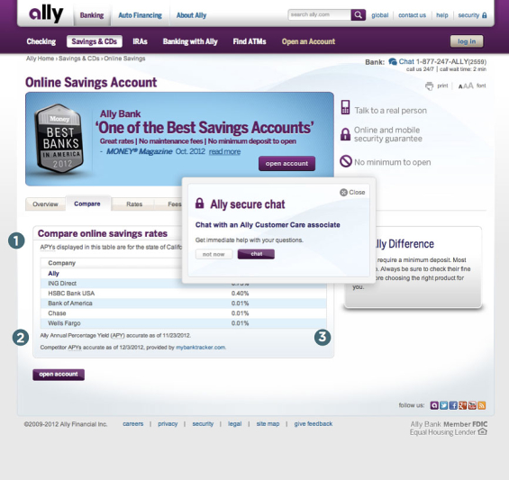
1 – Ratings, Rankings & Testimonials. Testimonials and rankings always add credibility to your product. Ally puts them at the top in a rotating banner.
2 – Comparison Shopping. Knowing rate shoppers will window-shop before buying, Ally puts the competitors’ numbers right in front of you. Now the prospect can make a decision without leaving the page. Other positives: notice the two “Open Account” buttons, and a “guarantee” link.
3 – Live Chat = Instant Help = More Conversions. Ally Bank has another useful technique on the page. Stay around for a short time and a secure chat box pops up. It’s another response device and another chance to sell to the prospect.
You don’t always see a chat feature on banking sites, but it’s a technique that’s highly recommended — especially within the sales cycle. Visitors to your site have received and email, read it, and clicked through to your website. They’ve walked through your virtual front door essentially screaming, “I’m interested. Here I am!” And they are far more likely to talk with you on your website than on Facebook. Use live chat to seal the deal right then and there. If anyone has questions, live chat is likely to leave them with a positive impression.
Conclusion. It’s not the perfect email promotion, but it has more positives than most others you’ll run across in the financial industry. The landing page and multiple options for response mean this kind of promotion will likely result in a higher number of new savings accounts.
Joe Swatek is Senior Copywriter, and Steve Bieber is Creative Director at ACTON Marketing. In their twenty years as a team, they’ve worked with hundreds of financial institutions on direct marketing promotions. They blog at Financial Marketing Insights. ACTON Marketing is a full-service direct marketing organization that provides complete direct mail marketing programs and strategies to financial institutions nationwide. Their work includes complete creative, production, staff training, and consultation.


