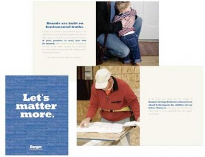
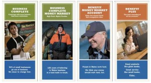
The brand identity for Bangor Savings Bank illustrates some important principles of financial branding.
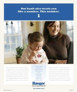
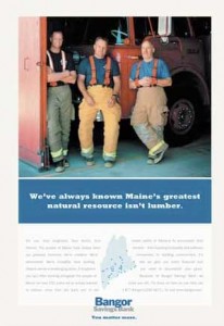
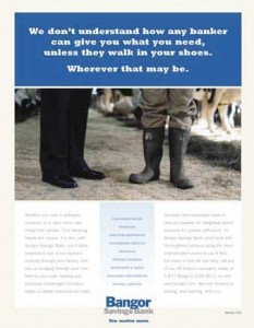
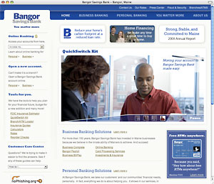
Consistency, for starters. Bangor always uses the same fonts and the same colors: blue and light beige. This makes it easier to spot something from Bangor Savings Bank and creates familiarity, whereas a constantly changing look confuses people and undermines awareness.
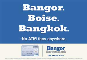
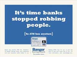
Bangor Savings Bank stays focused. They don’t send a wide and varied range of messages out to the market. They concentrate pretty much on one topic: Free ATMs. The bank is much more likely to get traction by sticking with one simple yet highly relevant message. How often do you see an ad with only one bullet point?
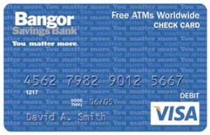
Even their ATM card reinforces the “free ATM” message. What kind of marketing message could you include on your plastic products?

Navigating Credit Card Issuing in an Uncertain Economic Environment
Build a modern credit card strategy that balances profitability and risk, adopts the latest technology and delivers the customization that cardholders demand.
Read More about Navigating Credit Card Issuing in an Uncertain Economic Environment

Industry Cloud for Banking from PwC
PwC’s Industry Cloud for Banking applies our deep industry knowledge to your specific business needs
They consistently deploy their identity across all touchpoints – branch, web, print, etc. This helps create a cohesive brand, one where all the parts feel like they go together. That way, there’s no surprises when someone switches from one channel to another.
Note: They allow dogs in their branches. Kudos.
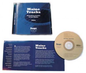
Bangor Savings Bank produced “Maine Tracks,” a compilation CD of alt-country and indie-rock musicians from Maine. The bank gives the CD away to show how it supports Maine’s creative culture. That, and because it’s just kind of a cool thing to do.
Bangor Savings Bank created a brochure all about their brand, which is increasingly common these days. The brochure’s primary audience is presumably employees (both current and future).
There is a secondary palette of brand colors – including contemporary hues like melon and pumpkin – to help visually categorize information.
Bangor’s brand identity is the work of a company called Forge. Forge won the account in a review including two other agencies. In the pitch, Forge showed the bank a video it secretly shot in Bangor branches. The video connected with the CEO, who jumped up during the presentation and said, “Yes! That’s It. These people have got it right.”
“Wait. That’s it?? All these months and all we get it three words?”
– John Edwards
Chief Banking Officer
Bangor Savings Bank
At the first presentation of creative materials, Forge opened with the new slogan, “You Matter More.”
Bangor’s Chief Banking Officer recalls thinking, “Wait. That’s it?? All these months and all we get it three words?” That’s the irony of branding. There’s a million pieces of input on the front end, and comparatively little visible output on the back end. Successful brands keep it short, sweet and simple.

