Cambridge Building Society is an independent, local mutual financial institution founded in western England in 1850. While having 161 years of history has its upsides — people view the brand as a stable fixture in their community — there are downsides too.
When we did customer research, we were surprised at how few people knew about us,” Stephen Mitcham, CEO of Cambridge Building Society, told a local paper. “If they did, they had such an old fashioned view of how we were.”
Mitcham he didn’t want consumers to perceive his organization as a small, insignificant building society. It had, after all, grown to a respectable 56,000 members and £900m in assets (USD$1.5 billion). In order to expand their reach and build membership, Mitcham chose to rebrand.
(The building society’s problems will sound very familiar to many US credit unions. England had more than 3,000 building societies at the start of the 20th century, but now has only 48.)
Following a five-way agency pitch in March 2010, Cambridge Building Society appointed Mobas as its integrated marketing partner. By June later that year, Mobas was underway.
The brand identity project started with a series of workshops and included market research and focus groups.
“We did a vox pop on the streets, had a day at Duxford Air Museum with the staff to find out their aspirations,” said Mark Easy with Mobas.
“At that point in time we had no idea what the final brand identity would look like,” added Sonia Lawrence, Client Development Director for Mobas.
Mobas said it took a team of 10 staffers around three months to complete the first phase of the job. The agency estimates that 50% of the work involved was research.

Navigating Credit Card Issuing in an Uncertain Economic Environment
Build a modern credit card strategy that balances profitability and risk, adopts the latest technology and delivers the customization that cardholders demand.
Read More about Navigating Credit Card Issuing in an Uncertain Economic Environment

The unfair advantage for financial brands.
Offering aggressive financial marketing strategies custom-built for leaders looking to redefine industry norms and establish market dominance.
What Mobas found was that people wanted a fresh, new, confident look. The strategy zeroed in on words like “vibrant,” “optimism,” “positive,” “welcoming” — something more friendly than a faceless bank.
Mobas pulled three ideas together ranging from safe to radical, then tested them with the client. The Cambridge team pushed back, asking for something brighter and more eye-catching.
“Testing was really key,” Mr. Easy at Mobas said. “It was not just a matter of taking the client’s word for it, so we tested it all out with members and with strangers.”
So what’s out? Bandit barriers in branches, the name “Cambridge Building Society” and the logo, among other things.
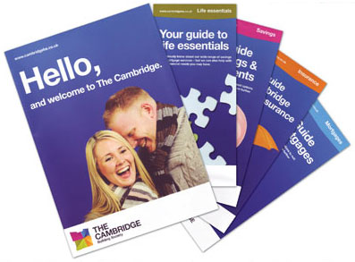
What’s in? Comfy chairs, coffee tables, music. And the building society will no longer be calling itself a “building society.” The new moniker will simply be “The Cambridge.” The brand is wrapped with the tagline “Building a brighter future, together,” something echoed in new products like the “Brighter Savings Bond.”

« OLD LOGO || NEW LOGO »
CEO Mitcham said he was wary at first about making such big changes. But research proved the building society was seen as boring, so he pushed ahead.
They launched the new brand at a live event held in Cambridge’s city center. Dignitaries including the mayor and high sheriff were in attendance as The Cambridge pulled a shroud of black sheets off a branch to reveal its bold, bright identity.
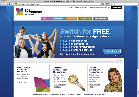
The last line at the bottom of the screen reads, “Your home may be repossessed if you do not keep up repayments on your mortgage.” Not quite the “friendly,” “welcoming” message you’d expect from a financial institution with an “optimistic” and “positive” brand strategy.

The total price tag: £750,000 (around USD$1.2 million).
When a local business reporter asked Mitcham how long he thought it would take to see a return on the £750,000: “Three to five years,” he said. “Which is the same as we expect when we open a new branch.”
What’s the reaction been so far?
“Very positive,” Mitcham said. “It has got us back on the map, and I’ve had only one letter against, from a member who said she liked it the way it was.”
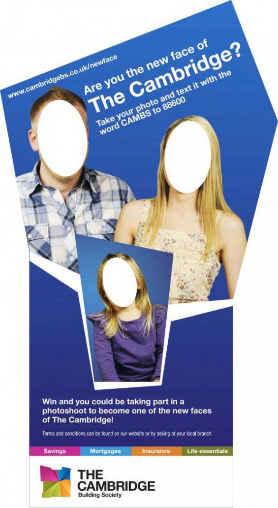
The Cambridge recently held a promotion to find real people to star in its marketing materials. As part of the campaign, a giant cardboard cut out toured local branches and other public places where people could take their picture and submit by text or email.


