The past few years have seen many developments in PFM user interface design, with pastel colors, bubble charts, and animation. Yet, in a world where marketing is supposed to provide customized and personalized offerings, PFM design–even with the new developments–has been a one-size-fits-all world.
But not for long. In the next few weeks, Geezeo, a leading PFM vendor to banks and credit unions, will announce what it calls “Segmentizations,” or consumer segment-specific interfaces, each tailored for different consumer segments. The first Segmentization to be released has been designed to engage a group of consumers that have lagged in their use of PFM: the over-55 crowd.
***
For many banks and credit unions–even those looking to attract younger consumers–older consumers represent significant profit opportunities with their larger account balances, investment portfolios, retirement needs, and upcoming wealth transfer needs.
Yet these older consumers don’t adopt PFM tools at the rate that Gen Yers do.
Geezeo is betting that a new user interface design will help correct this discrepancy. I was fortunate, recently, to get a sneak peek at Geezeo’s new user interface design, which I thought I would share with Snarketing readers.
***
Why don’t consumers 55 and over use PFM as much as younger consumers?
Consumer research conducted by Geezeo discovered that many consumers over the age of 55 have difficulty processing computer screens with more than three colors, and that animation–or any moving text or graphics on a screen–decreases their ability to quickly glean what’s on the screen, what it means, and what to do next.
Geezeo’s 55+ Segmentization was designed to address the issues uncovered in the research.
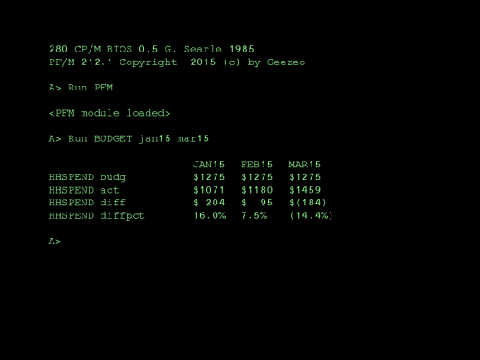
Seeing budgeted versus actual expenses need not be a blurry vision of flashing colors and floating bubbles. Geezeo’s 55+ Segmentization presents just the facts, m’aam:
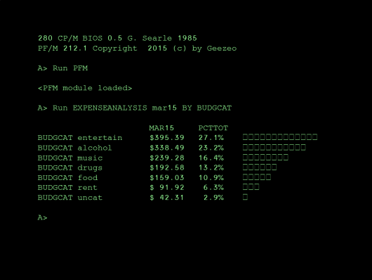
The other screen shot I was able to obtain shows an expense analysis for a specified time period, and the percentage of total expenditures a particular category represents:
***
My take: Geezeo’s Segmentization interfaces will bring a much needed dose of differentiation to the over-stylized user interfaces that exist today. But my bet is that even Geezeo wasn’t thinking about another factor that will help it drive user adoption: The Retro effect.
Time after time, in industry after industry, what’s old becomes new again. Whether it’s bell bottoms in fashion, or The Psychedelic Furs from the 80s selling out an upcoming concert performance in New Hampshire, the “retro” effect has proved to be timeless. Why not a retro effect in user interface design? I think it’s a good bet.


