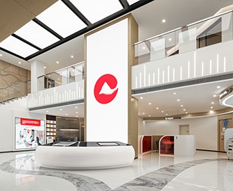
Bank branches are transforming — again. Observers who thought the Covid-19 pandemic had finally pushed brick-and-mortar banking past the point of no return are confronting a new set of facts as banking companies invest in creating more welcoming spaces that emphasize consultation, coffee and cross-selling.
These companies are closing underperforming branches and building new ones with a different purpose: to deepen customer relationships, offer personalized consulting and communicate their brand to differentiate themselves from scores of competitors.
Customers are likely to welcome the presence of these newly designed branches. In a recent survey of 44,000 consumers from around the world, Accenture turned up a surprise: Two of every three respondents said they wanted a bank branch near them.
The Financial Brand asked a trio of architecture and interior-design consultants for examples of the latest thinking in bank branch trends, with a focus on community banks and credit unions. In the gallery that follows, we reveal some of the latest work by NewGround, Adrenaline and PWCampbell.

Accelerate Time-to-Market with Rapid Implementation
Create a sustainable competitive advantage with faster time to market by drastically reducing implementation time.
Read More about Accelerate Time-to-Market with Rapid Implementation

The Financial Brand Forum Kicks Off May 20th
Explore the big ideas, new innovations and latest trends reshaping banking at The Financial Brand Forum. Will you be there? Don't get left behind.
Read More about The Financial Brand Forum Kicks Off May 20th
Virginia Credit Union: Always Be Consulting
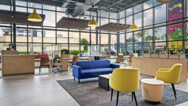
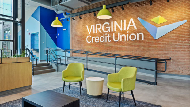
This Chesterfield, Va.-based banking company put consultation at the heart of its reconfigured branches to focus staff on creating more meaningful connections with customers. Dotting the interior are couches and chairs that use soft materials; an airy, wide-open feel encourages customers to relax.
While revitalizing and renovating existing locations, the credit union aimed to enter new markets, so the design had to be flexible. It typically selects sites with high visibility that are easily accessible and often near public transportation.
The updated branches feature bold colors — white, blue and yellow form the main palette. High ceilings with exposed and painted HVAC pipes and colorful ATMs in blues lend an optimistic feel.
Designer: Adrenaline
Libro Credit Union: Branches Attract Employees, Too
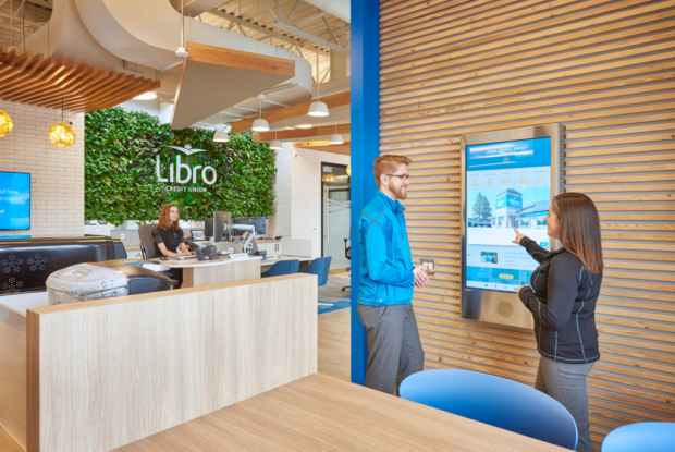
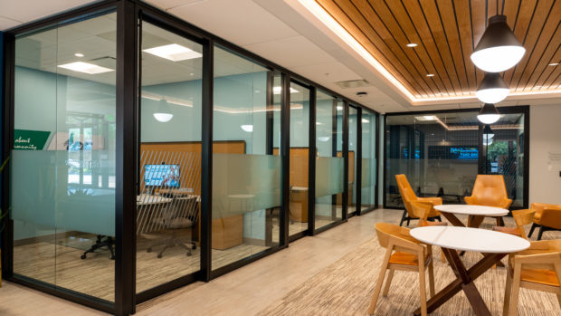
This prototype project centered on the redesign of a building that used to be a major depot for the Canadian Post, the country’s postal service. The headquarters for Libro Credit Union in London, Ontario, was repurposed and updated, with a focus being a technology floor, with cutting-edge workspaces partly aimed at attracting and retaining employees.
The design could be called a “coffee shop” look – a style with a long history among banks — with natural wood, hardwood flooring, exposed HVAC plumbing, high ceilings, light colors and bright spaces lit by hanging pendants. Inside, there’s lots of glass and uncluttered desks with an open, pod-like design. Libro rolled out this design across more than 20 branches throughout Canada.
Designer: NewGround
AMOCO Federal Credit Union: Erasing Physical Barriers
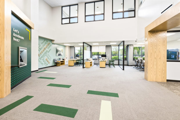
The goal for this prototype branch in Clear Lake, Texas, was to achieve an inviting and modern feel without being overly trendy. The idea was to get closer to customers and make transactions more efficient. The floorplan features an open concept, with teller pods instead of teller lines and there is functional, multipurpose office space available.
Like the open plan, the teller pods erase physical barriers and promote trust. The objective is for customers to spend less time waiting.
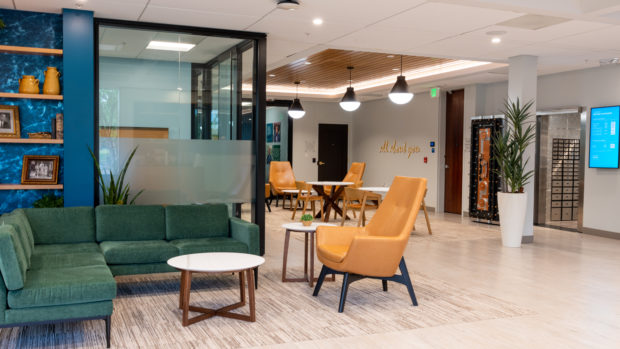
To keep the design centered on continuity, there are classic touches including wainscoting, framed photographs, darker colors, plenty of leather chairs and even a globe. Core elements such as video banking, teller pods, ITMs and multipurpose spaces will be incorporated into future branch designs.
Designer: Adrenaline
NextMark Credit Union: Sleek, Geometric, Interactive
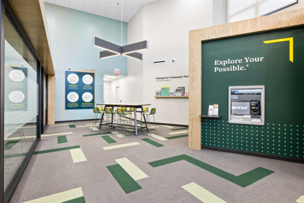
NextMark decided to rebrand and update its branches, calling for a look that’s inviting and modern. The most notable aspect of the project, in Fairfax, Va., is its use of a 24-hour vestibule and ITMs — interactive teller machines offering access to a broader range of services delivered as part of a more virtual, video-based experience. (Learn more about ITMs replacing ATMs and get a practical guide to ITMs.)
The designers created a hypermodern look, with geometric shapes everywhere, from rug patterns to wall angles to design schemes on walls. There are Scandinavian-style desks, and clean, modern lines throughout the space. The HVAC system is hidden, unlike many newer designs, creating an uncluttered look.
Designer: NewGround
Neighborhood Credit Union: High Tech in a Traditional Wrapper
This credit union decided to take a chance on a new branch concept in an urban part of Dallas. It made the branch cashless, with no traditional teller lines, pods or any way to interact with money transactions except through ITMs. A 24-hour ITM is set within a glass vestibule, with one glass wall being open during business hours and closed after-hours. Concierge desks are stationed prominently for customers who need staff assistance with this new technological transition.
Despite modern technology, the branch retains traditional design elements, with brick accent walls, a floor-to-ceiling paint scheme of an eagle and “1930” (the year of the company’s founding) stamped prominently on the wall.
Designer: NewGround
Learn more about Neighborhood Credit Union’s branch strategy.

Farmers Bank and Trust: Form Follows Function
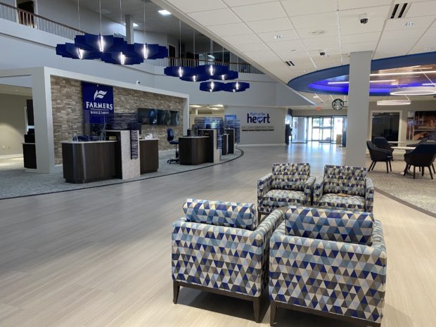
The Magnolia, Ark., bank was founded in 1906 in an area that, for decades, was known for cotton and oil. Farmers’ current strategy includes a heightened focus on retail banking, so the goal for its design firm was to make a big impression — with striking interior finishes and a distinctively new customer experience.
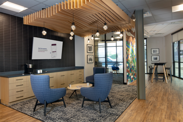
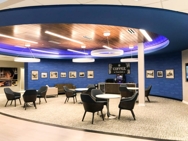
A room with a rounded wall features a coffee station and recessed white and purple lighting from above; bistro tables, couches and modern chairs complete the look.
This template has now been used in numerous locations, including a roll-out in nine newly acquired branches, creating a branded environment with a unified strategic purpose.
Designer: PWCampbell
PeoplesBank of York, Pa.: A Sound Decision for Peoples
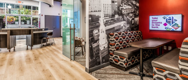
This Pennsylvania banking group created a prototype that uses what its designers call a “connections center” concept. Next to a concierge area are conversation spaces for customers to do business in a relaxed manner. There are sitting areas that resemble diner booths – though they’ve been upgraded with the use of wood and pleasing fabrics.
Elsewhere, single-seat areas feature tablets for customers’ use. High ceilings, abundant glass and oversized video screens create a modern vibe. For privacy, zones were created that can protect confidential conversations by utilizing internet radio or white noise. A branch in Lebanon, Pa., was first to feature the new concept, which has since been rolled out in two more locations.
Designer: PWCampbell
Parris Kellermann is a freelance writer based in Vermont. He has worked at several financial publications including MarketWatch, TheStreet, Bloomberg and Equities News.

