Banks and credit unions produce some classy and innovative annual reports, seizing the occasion to tell their story through strong narrative, images and graphics.
Not that they have to. Financial institutions can satisfy annual reporting requirements with less fuss by submitting the usual data in their regulatory filings, along with a 10-K to the Securities and Exchange Commission if they are a reporting company.
But some clearly don’t want to miss one of the biggest storytelling moments of the year. In an era of short attention spans, their annual reports show the power of the “glossy,” as the reports are known, to distill key messages, shape perceptions and showcase accomplishments. It’s why this approach retains its allure even as print publishing goes the way of the typewriter.
In an annual tradition, The Financial Brand combed bank and credit union websites and identified annual reports that raise the bar in one way or another. The creative approaches featured in the examples we chose are meant to offer some inspiration and ideas for other financial marketers.
The examples vary widely because institutions of different sizes have different budgets and resources. But, uniformly, they show how financial institutions can convert the numbers and narrative of a regulatory filing into a vivid display of culture and values and a compelling read. They suggest that leveraging marketing and communications talent to help craft the annual report can help maximize the power of the message that the chief executive officer, chief financial officer and chief risk officer want to deliver.
Many financial institutions produce a standalone annual report, but it’s not uncommon for SEC filers to create a report that wraps around or otherwise incorporates their 10-K. Some produce digital reports, while others optimize theirs for print. Interactive reports are catching on, and one from Camden National Corp. grabbed our attention by incorporating highly engaging animation.
High-quality imagery is abundant throughout our gallery, and it’s frequently used to convey a sense of place (as in the annual report from Zions Bancorp.) or to put people in the spotlight (as Technology Credit Union did).
Themes that recur in report after report include financial stability, customer focus and community impact. Data visualization, which has become an obsession at many banks and credit unions, continues to work its way into the glossy to present performance data and other facts and figures in crisp, easy-to-read form. Some institutions use their reports to mark milestones; OnPoint Credit Union, for example, prominently featured its 90th anniversary.
Annual reports are typically produced in the spring and early summer, and while they are meant to cover the prior year, some of those shown here incorporate answers to questions about federal deposit insurance that surfaced amid the bank failures in March and April 2023.
Enjoy this gallery of work from a diverse array of banks and credit unions that are embracing the storytelling potential of the glossy annual report.
Please note: You can click on any image in the gallery to enlarge it.
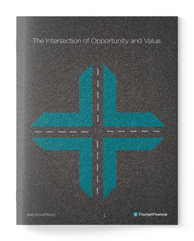
Eye-Catching Annual Report Covers

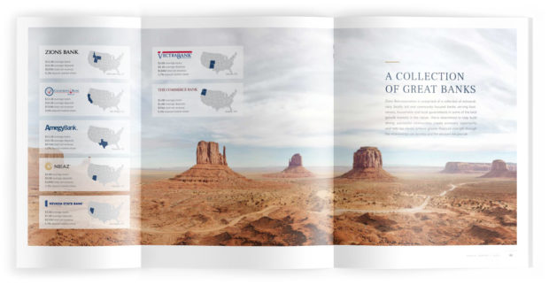
Zions Bancorporation
Key Stats:
Headquarters: Salt Lake City, Utah
Asset Size: $89.5 billion
EVP, marketing and communications: Rob Brough
Zions Bancorp.’s annual report resembles an alluring travelogue and has a unifying theme: resilience.
Zions, based in Salt Lake City, operates across 11 Western states and brands itself as a collection of seven separately managed and community-focused banks. The holding company also includes several other nonbank financial businesses. The annual report cover and its first 18 pages — the “Chairman’s Message” narrative — are dominated by stunning photos in subdued tones of the sweeping, rugged vistas of Monument Valley in Utah. The narrative, accompanied by the “rock solid” photo imagery, highlights messages of fortitude and strength — compelling notes to strike at a time when the banking industry has been rocked by turbulence.
Key points are illustrated with easy-to-understand graphics. Two pages are devoted to community activity and spotlight employees in action; the final four pages provide financial highlights and corporate information.
Other Key Strengths:
- Magazine motif strong throughout the report
- Beautiful photography
- Simple, but classy “Financial Highlights” at the end
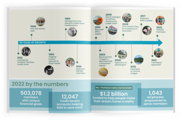
OnPoint Credit Union
Key Stats:
Headquarters: Portland, Oregon
Asset Size: $9.4 billion
Chief marketing officer: Tim Clevenger
90 years is certainly a milestone worth celebrating, so that’s what OnPoint Credit Union led with on the cover of its annual report for the 2022 fiscal year. Its transition since it was founded as Portland Teachers Credit Union is neatly plotted in an illustrated timeline that stretches over two pages. A quote from the son of the credit union’s first general manager further grounds the report in history.
Only nine pages in total, the report is simple and modest. The cover is text-only, unadorned by images.
Though it is brief, OnPoint’s annual report shows how to succinctly communicate a credit union’s endurance in serving its membership and its accomplishments along the way.
Other Key Strengths:
- Excellent timeline for showcasing the credit union’s history
- Financial statements consistent with OnPoint branding
- Strong use of color in financial statements instead of just monochrome text
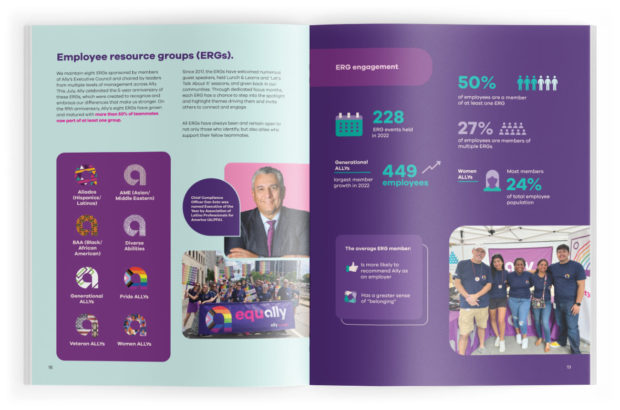
Ally Financial Inc.
Key Stats:
Headquarters: Detroit, Michigan
Asset Size: $181.9 billion
Chief marketing officer: Andrea Brimmer
Ally Financial’s brand styling has always zigged while other banking companies zagged. Its color palette, built around a vivid purple with surprising accents of cerise pink and turquoise, veers from the sedate blues and greens that most banks use to communicate trust. A modern font and layouts with rounded corners make for a recognizable and consistent design.
The 2022 annual report from the nation’s largest all-digital banking company exhibits a disciplined visual identity, offers a strong balance of images, graphics and text and establishes clear contrasts from page to page. The result: A truly distinctive report.
New this year was a focus on Ally’s eight employee resource groups, or ERGs, which celebrated their fifth year in existence. Highlighting these groups helps underscore the importance Ally places on an inclusive culture.
Other Key Strengths:
- Uses QR codes to link outside of the report
- Great use of illustrations to highlight key statistics from the previous year
- Full marketing breakdowns of new products that launched in 2022
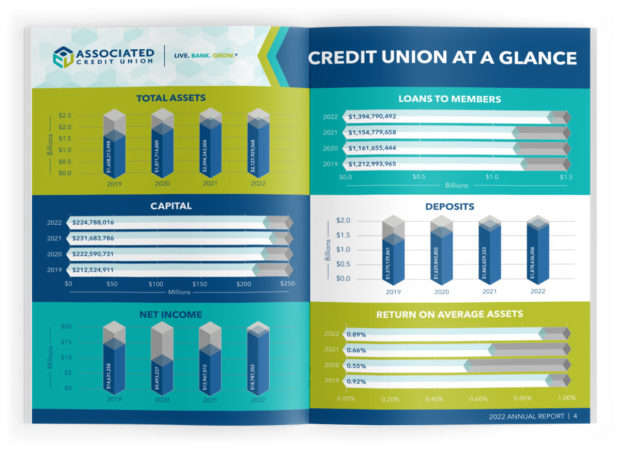
Associated Credit Union
Key Stats:
Headquarters: Norcross, Georgia
Asset Size: $2.1 billion
Vice president, marketing: Thomas C. Maiellaro
Data can be difficult to conceptualize; presenting it in a way that engage readers is even harder. Associated Credit Union — which already has an eye-catching cover — succeeded on both scores in its annual report.
The Georgia credit union took simple bar charts and tables and made them into 3-D visuals that help communicate the year-over-year growth in assets, loans, capital, deposits, net income and return on average assets.
The visuals neatly integrate with the cascading geometric imagery of the credit union’s branding. Honeycomb-style hexagons are used generously throughout the report to frame photos and facts.
Other Key Strengths:
- Vibrant display of board of directors
- Creative approach to provide financial details for the year
- Pictures of customers and employees add authenticity and don’t look like stock photos
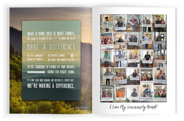
Uwharrie Capital Corp.
Key Stats
Headquarters: Albemarle, North Carolina
Asset Size: $1.1 billion
Chief marketing officer: Roger Dick
Every year, the parent company of Uwharrie Bank gives its annual report a theme, and this year it struck an aspirational tone: “Let the world we dream about be the one we live in today.” This focus on values sets the stage for a report dedicated to stories about customers and the bank’s community engagement.
The opening pages feature pictures of its customers, all holding signs reading “I Love My Community Bank! #banklocally,” as shown above.
Subsequent pages offer stories about some particularly interesting customers and businesses. They include a farm and nature retreat, an Asian-pizza joint, an Air Force second lieutenant teaching financial literacy classes, a packaging company and a family medicine clinic, to name a few.
Other Key Strengths:
- Pictures of community stakeholders peppered throughout the report
- Reflective, meditative cover image
- Consistent focus on values and principles
See Uwharrie in our previous gallery too.
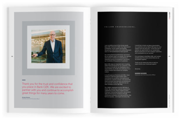
Bank OZK
Key Stats:
Headquarters: Little Rock, Arkansas
Asset Size: $27.7 billion
Chief marketing officer: Candace Graham
It’s challenging to make the annual shareholder letter from a bank CEO stand out. Often, these letters can be formulaic, thanking customers and employees for their dedication and loyalty through the years. Or they can feel long, sprawling and hard to digest. Moreover, the design around a shareholder letter can make the page easy to skip.
But Bank OZK’s “Fellow Shareholders” letter pops out. It’s a concise two pages. The first page consists of a bordered headshot of George Gleason, the chairman and CEO, plus a quote in the vibrant red tones of the bank’s logo. The next page is the letter itself, set on a stark black background with white typeface — an approach that catches the eye.
The rest of the report is light on narrative, leaning instead on informational graphics to present highlights.
Other Key Strengths:
- Excellent way to visualize charts and call attention to key statistics
- Showcases executive team in unique way
- Effective use of borders around profile photos to set them apart on the page
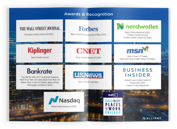
Alliant Credit Union
Key Stats:
Headquarters: Chicago, Illinois
Asset Size: $18 billion
SVP, chief digital and marketing officer: Sumeet Grover
Not every financial institution has 14 awards to occupy an entire page of its annual report. But Alliant Credit Union does, so it made the most of the recognition it has received from the Wall Street Journal, U.S. News & World Report, Business Insider, Bankrate and other organizations.
It utilized a basic outline with 14 boxes overlaying a stock photo of a Chicago backdrop, but it’s powerful to see the awards grouped in this way, and the layout is clean and clear.
Throughout this colorful report, Alliant’s highly recognizable blue-and-green branding is used to good effect.
Other Key Strengths:
- Simple tables showcasing performance trends for the year
- Unique page layouts for every page
- Table of contents highlights clear messages
Equity Bancshares Inc.
Key Stats:
Headquarters: Wichita, Kansas
Asset Size: $5.2 billion
Chief marketing officer: John Hanley
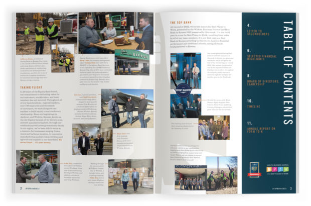
Few financial institutions opt for a two-tone black background as the cover of an annual report. But Equity Bancshares does — and the result is a cover that is sharp and minimalistic and that bears a single, understated message: #TOPBANK2023. The message is that its subsidiary, Equity Bank, has earned coveted “Top Bank” status by several measures.
Interior pages celebrate local traditions and industries in a region renowned for great barbecue, aircraft manufacturing and agriculture. They show bank executives visiting customers at a local trucking company, the flagship store of a local Kansas City BBQ joint, glass and door manufacturers, and more. A timeline illustrates the company’s growth since its founding in 2002.
Other Key Strengths:
- Key stats scattered throughout the report and offset to the right side of pages
- Strong data visualization on the “performance” pages
- Homey, unpretentious approach to the photos
Altra Federal Credit Union
Key Stats:
Headquarters: Onalaska, Wisconsin
Asset Size: $2.5 billion
Chief marketing officer: Cheryl Dutton
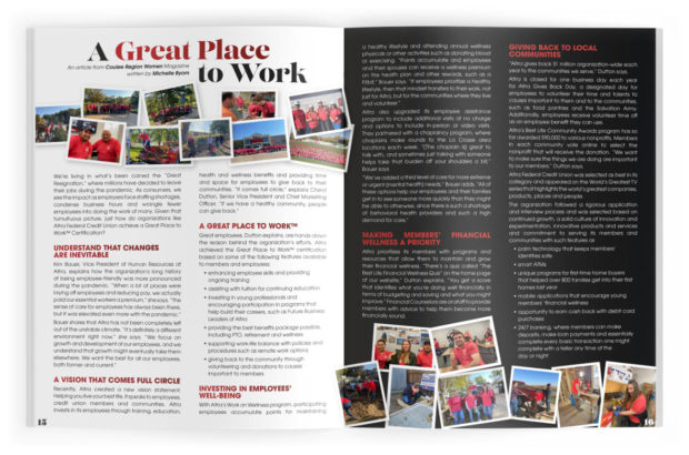
There is a fine balance between filling a page with content and information versus making it appear crowded and overwhelming. On the other hand, if an annual report leans light on the content side, it risks looking empty and insubstantial.
Altra Federal — on every page layout — does a great job of offsetting content with a design that’s easy on the eyes. Its “2022 at a Glance” page in particular gives readers a quick rundown of what they need to know about the credit union’s performance, using bold white numbers that really pop. It also recounts milestones and achievements and gives shout-outs to staff members who retired after decades of service.
Other Key Strengths:
- Excellent “Table of Contents” layout
- Intriguing approach to map of locations
- Creative way to showcase why Altra is “a great place to work”
See more: 13 Unconventional Bank Marketing Campaigns
Commonwealth Bank
Key Stats:
Headquarters: Sydney, Australia
Asset Size: $840.9 billion
Chief marketing officer: Jo Boundy
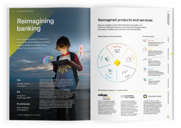
What better way to demonstrate the tagline “A Brighter Future for All” than with a sunny yellow annual report?
Commonwealth Bank is already known for incorporating bright swaths of yellow imagery in its branding, so it follows that its annual report is padded with consumer stories painted in lemonade tones. To communicate family, continuity and partnership, the cover features a beach photo of customers Debra and David — a married couple who opened accounts in the late ‘60s and ‘70s — with their daughter, son-in-law, and two grandchildren.
It’s a lengthy report running more than 300 pages, but the colorful theme resonates throughout, even in the usually nondescript financial statement pages and accounting pages. There is an interactive dimension to the PDF report, and online readers can click and be redirected to different pages both on the “Contents” page and in the “Strategic Priorities.”
Other Key Strengths:
- Strong data visualization for 2022 key stats
- Unique page layouts on every page
- Interactive content scattered throughout
Patelco Credit Union
Key Stats:
Headquarters: Dublin, California
Asset Size: $9 billion
VP of marketing: Rina Johnson
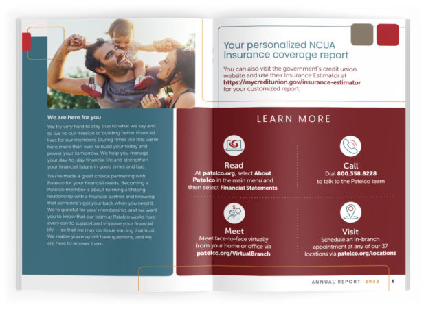
Credit union annual reports are generally geared to members and other stakeholders. They feature financial highlights, employee work in the community, plans for the year ahead and a touch of history. But very rarely does any financial institution add money tips for the reader into its report.
This year, Patelco Credit Union took that approach. Interestingly, the president and CEO’s letter focused squarely on financial empowerment and consumer education. The report also walked members through how to access a personalized NCUA insurance coverage report. It also explained how to follow up with experts at the credit union for more insights. Two pages were given over to a message titled “Our Strength Is Your Security.”
Other Key Strengths:
- Nice way to display awards and recognition of staff
- Attractive, modern page layout
- Fun photos of Patelco employees volunteering in the community
PCB Bancorp
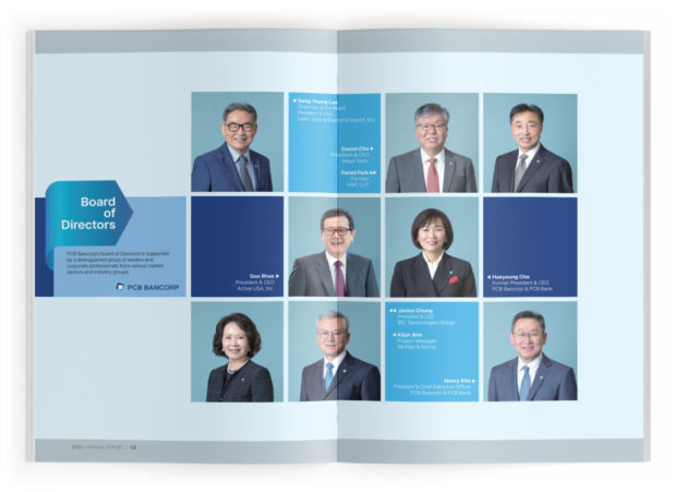
Key Stats:
Headquarters: Los Angeles, California
Asset Size: $2.5 billion
PCB Bancorp’s annual report takes the unusual form of a 5.5” x 8.5” flipbook rather than a standard-sized 8.5” x 11” report. The modular design looks snapped together, and provides ample space to highlight the new name of the bank subsidiary: PCB Bank, formerly Pacific City Bank, was renamed to evoke ideals of people, community and business.
One panel in the flipbook is devoted to headshots of PCB Bank’s eight-member board of directors in a sort of updated and more professional-looking version of the “Brady Bunch” approach. The design starts with 12 color blocks, arranged four wide and three deep. Directors’ photos occupy eight of the blocks; the other four contain names and titles. It’s a refreshingly fun and asymmetrical contrast to the typical array of board member photos.
Other Key Strengths:
- Interesting charts to showcase financial highlights from 2022
- Crisp map noting all the PCB hubs
- Simple but effective wayfaring elements orient readers to the content of each page
United Heritage Credit Union
Key Stats:
Headquarters: Austin, Texas
Asset Size: $1.5 billion
VP of experience and engagement: Kevin Farley
There are few starker images than the head of an American bald eagle, which dominates the cover of United Heritage Credit Union. It’s fitting imagery for an institution that opened its doors in 1957 as Military Federal Credit Union. Stylized images of the national bird of the U.S. recur in the pages that follow, along with photos of the eagle soaring through forests and resting on branches. The photos are a memorable backdrop to the narrative and informational graphics.
This design motif is striking for an otherwise simple report that is a mere eight pages long. It is filled out with branch locations, financial data, a sustainability statement and reports from key committees and officers.
Other Key Strengths:
- Palette that is mainly black, white and shades of gray projects seriousness
- Spots of red are scattered throughout to highlight certain statistics
- “New Member Satisfaction” pie charts stand out
See all of our latest coverage of bank marketing strategies.
American National Bankshares Inc.
Key Stats:
Headquarters: Danville, Virginia
Asset Size: $3.1 billion
Chief marketing officer: Andrew Yenne
A reader only needs to look at the cover of the American National Bankshares 2022 annual report to see its branding and marketing are all about people. The report features the faces of people who bank with and work at its American National Bank & Trust Co. unit.
The opening page highlights this and dedicates the report to Charles Somerville Harris, a director for 14 years who passed away in 2022.
Throughout the report, American National showcases its work in the community and staff achievements, with photo after photo of employees and executives volunteering at food drives, breaking ground on new property, reading at local schools and attending American Heart Association events.
Other Key Strengths:
- Fresh way to present the board of directors and executive team
- Bold “Table of Contents” page
Integris Credit Union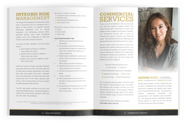
Key Stats:
Headquarters: Prince George, British Columbia, Canada
Asset Size: $1.8 billion
Marketing manager: Mandy Guerin
The hallmark of recent annual reports for Integris Credit Union — which appear in The Financial Brand’s gallery last year and the year before — is the use of a “great outdoors” brand that is simple in design, but powerful in effect.
The cover of its latest annual report features a long-exposure photo of a bonfire with chairs grouped around it. It includes the credit union’s tagline (“Life Out Here”) and an acknowledgement of Indigenous land rights, along with a list of its branch hubs. This is a departure from the simpler covers it favored in previous years.
The first two opening pages are light, with the Integris stamp and a map that evokes vintage frontier cartography and points out the locations of the credit union’s branches.
Integris includes the usual array of key financial measures while also showcasing its commercial services and financial education efforts. It airs out text-heavy pages to make them feel less dense and makes use of bullet points to break up blocks of type, as in the two-page spread shown above. On the first page, the credit union details its risk management initiatives and provides three fraud prevention tips. On the second page, it invites businesses to reach out to learn more about its offerings and profiles Integris’ senior manager for commercial services.
Other Key Strengths:
- Use of visually engaging map to highlight the branch network
- Creative design for the board of director pages
- Lots of white space and margin on the page, making it simpler to read
BOK Financial
Key Stats:
Headquarters: Tulsa, Oklahoma
Asset Size: $76 billion
Chief marketing officer: Sue Hermann
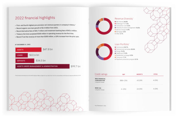
The red octagon is an integral element of the BOK Financial brand and its logo, and it is utilized to great effect throughout the banking company’s annual report.
The honeycomb-like motif is integrated into seven of the annual report’s eight pages. On the second and third pages, it neatly bridges the white space, propping up the financial highlights section and helping it stand out.
The report covers a lot of ground in an unusually compact format, which makes it a prime example of how to hit the key points and move on. BOK’s 180-page SEC 10-K filing is sandwiched between the eight pages. Up front, the report consists of a cover, two pages of financial highlights and a three-page letter from the CEO. In the back, it’s a one-page market map with brand summary.
Other Key Strengths:
- Uses symbols in the bank’s branding complemented with white space to help individual pages stand out
- Shareholder letter pages neatly highlight organizational values
Camden National Corp.
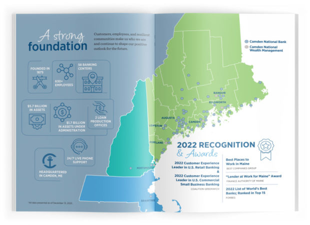
Key Stats:
Headquarters: Camden, Maine
Asset Size: $5.7 billion
Chief marketing officer: Renee Chapdelaine Smyth
Camden National Corp. flips the annual report on its side, literally, by using a horizontal layout. In the interactive edition on the website, it amplifies its tagline — “Embracing Change & Changing Outcomes” — by using movement and animation.
The cover page’s illustration ties into the theme by showing a highly stylized, tightly wound ball of wire or thread being untangled. Soft blue and green tones reflect the company’s coastal New England heritage. The uncluttered opening page is particularly eye-catching: It features a map of bank branches across three states and highlights recognitions and awards received in 2022.
Topics featured in the compact 12 pages include digital innovation, customer stories, community impact and employee excellence and diversity. Financial highlights are neatly encapsulated.
Other Key Strengths:
- Strong methods for displaying stats and figures throughout
- Nice individual page layouts with watermarks and simple visuals to highlight data points
- Unique information included such as its cash back rewards to customers, digital banking statistics and how the bank changed its domain from .com to .bank
Read more: Use of .bank Domain on the Rise to Counter Phishing
Technology Credit Union
Key Stats:
Headquarters: San Jose, California
Asset Size: $4 billion
Executive vice president and chief retail banking officer: Robert Reed
“Here for You” is the theme of Technology Credit Union’s 2022 annual report, and it nails the message on its cover with a silhouette of rock climbers helping one another up to a summit to watch the sun rise.
Its annual report makes bold use of portraits — a combination of original staff photos and stock images that communicate warmth and confidence. In 20 pages, there are eight full-page photos.
Data visualization is also used to excellent effect. One page hits the highlights on everything from deposits and assets to branch traffic, membership trends and core values.
The two-page spread shown here gives an overview of the credit union’s community involvement, including a mention of the Tech CU Arena, which is the home of the San Jose Barracuda of the American Hockey League.
Other Key Strengths:
- Attractive section headers use large typeface overlaid on an image
- Strategic placement of a handful of illustrations and other embellishments
For more annual reports, be sure to check out these galleries too: