They say it’s wrong to judge a book by its cover, but it’s human nature. With financial institutions, people today judge them not so much by their branches, but by the institution’s website.
A bank or credit union’s website is really its busiest branch. For most customers — especially younger generational segments — the website, along with the institution’s mobile app, also provides the first impression of the brand. In this article we focus on the design and functioning of banking websites.
“If you imagine your homepage being your branch entrance, it really needs to speak to those brand capabilities, be the voice of your brand and all the things you work so hard to develop,” says Paul Tonelli.
Tonelli, who is Vice President and Creative Director of Pannos Marketing, firmly believes the website is a critical point of connection between a financial institution and its customers. In fact, it picks up significantly more traffic than a branch. He and other Pannos executives addressed this topic in a webinar.
Same Message, Everywhere:
Consumers mostly get their first impression of a bank from its website, but the bank's brand message should be the same if a branch or the call center is the first stop.
One Pannos survey found the average new user rate for 80 different bank and credit union websites around the country (with an average asset size of $400 million) was 12,600 new users per year, which rounds out to roughly 1,000% more new customers through the website than the branches.
“Most new customers are getting their first view of you through their website,” observes Matt Larrabee, Pannos Director of Web Services.
A strong digital presence with a website equipped to match the functionality and ease of a physical branch is critical. In some ways, it’s an art form and one which should match a financial institution’s brand. Building a financial website is a compilation of technical elements, psychology, personalization, gamification, content and styling.
Importance of Brand Consistency Across Banking Channels
A great deal of thought is required in building a banking website customers will like and even enjoy. FI Grow Chief Strategy Officer Penne Vanderbush, in an earlier article on The Financial Brand, points to several critical functionalities that make a website a fully capable virtual branch: smart content, intelligent lead capture, fun partnership highlights, a wide range of resources, and video content that is worth viewing for the potential customer.
Pannos Marketing stresses the importance of brand consistency. When your financial marketing team upgrades or renovates your website, maintaining a balance between branch and website is key. Both channels should match the overall brand.
“They shouldn’t be independent parts,” Larrabee explains. “We emphasize a holistic approach and that’s something I feel many financial institutions lack. They treat their website as a different entity from their branches.”
Tonelli says it takes five to seven times for a customer to interact with a brand — any brand — in order for it to sink in and create a connection. The likelihood of all of those interactions to be via one channel is slim.
Whether a consumer is walking into a branch, calling a rep or — more often than not — going to the website, all services offered should be brand-related and consistent across every touchpoint, Tonelli states.
Read More: Consumers Expect Personalization at Every Banking Touchpoint
A Brand Is More Than a Logo
While brand is a critical element of a website, the Pannos team points out brand is not just about the visuals: the logo, font choice, color scheme and style. Those, of course, are a part of it, but brand should also integrate the big picture strategy of the financial institution, Larrabee maintains, as well as site functionality.
He cites Amazon as the gold standard of website functionality.
“Amazon has a very simple brand, visually and content wise,” he says. “But, when you think of Amazon, their popularity comes from the simplicity of using the site. It has artificial intelligence. It tracks what you’re doing. It gives you related products and things that it knows that you’re going to be interested in. And it makes it easy.”
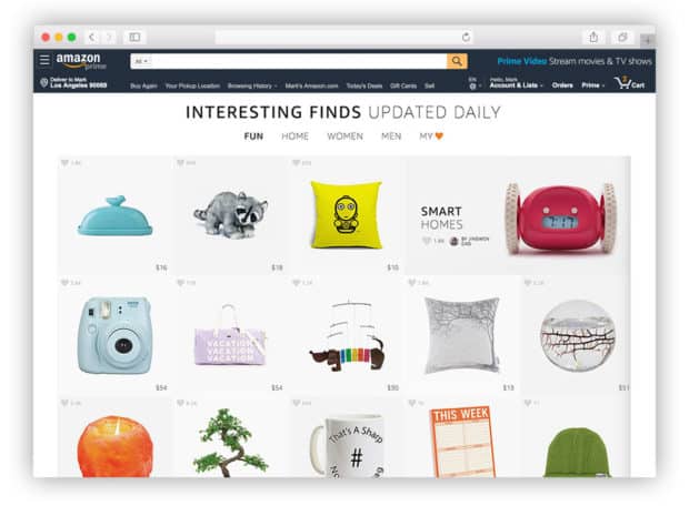
Even without the gargantuan resources of Amazon, a bank or credit union can adopt similar goals for their website: simplicity, ease of use and personalized insights. “You don’t want your brand to feel sluggish,” Larrabee states. “You don’t want your brand to feel dated or convoluted. Those are definitely words you don’t want associated with your business.”
Listen In: The Power of Design in Banking Digital Transformation
Keeping Younger Customers Engaged With the Bank Website
Functionality and personalization are key in banking, especially with online banking. It comes down to characteristics like page speed, animations and the user interface.
Although all age groups are using digital banking more now, Gen Z and Millennials are pivotal segments for online banking experience, Larrabee says. They might visit their local branch, but the bulk of their customer experience is done on the website, which should be tailored with self-service options and quick interactions.
Website Turnoffs:
Words you don't want associated with your bank's website: 'sluggish,' 'dated,' 'convoluted.'
Melanie Coleman, Director of Strategy and Media at Pannos, suggests gamification as a method for engaging younger customers. She says the role of a financial institution in 2022 is to also be an educator — but not in a traditional sense. You can’t just have a conversation with younger generations, you have to engage with them the same way they engage with other brands.
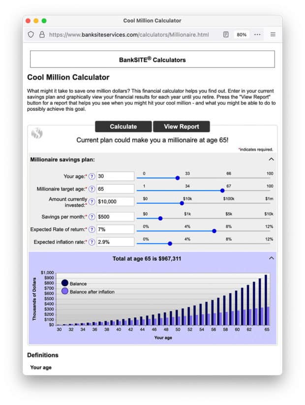
“You have to help make sure they feel like they’re in the driver’s seat of that conversation,” Coleman explains. “And the best way to do that is quizzes. Have them engage and play with calculators — fun ones that are engaging and interactive.” She says financial institutions can even award certificates or badges to create unique incentives.
Or, as Larrabee calls it: “Wordle for Banks”.
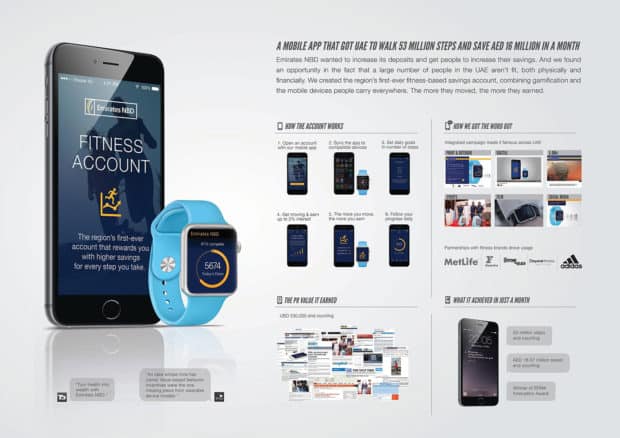
A good example of a way to build in gamification to a bank website is the Fitness Account offered by overseas bank Emirate’s NBD.
Another example is The Bank of Glen Burnie, a community bank based in Glen Burnie, Md. It has over 50 different calculators on its site, varying from student budgets to Roth IRA conversions to calculating how long it would take to make a million dollars.
But bank web design can’t just be about the younger generations either — Baby Boomers and Gen X are going to the same website.
However, websites do have a big advantage in addressing generational differences. “In a branch, you can’t have it change when somebody enters the door — if they’re seven years old or if they’re 20 years old,” Larrabee explains. By using personalization to segment your audience so you know who’s coming into your website, a bank or credit union can gear its brand messaging toward that person.
Does a Bank Have to Personalize the Entire Website?
The short answer is yes. It is not only customers who crave a personalized experience in the digital world. Personalizing a website can get some SEO love from Google as well.
“Google loves to see a site meant to serve the purpose of why the user is there,” Coleman says. For example, instead of offering wealth management to every customer who enters the website, she explains designing a website that can recognize a user and anticipate their needs is a key step toward true banking personalization.
Breaking down life stages is a first step in getting there, says Larrabee.
“Figure out what type of user is on the site by their actions and then give them the content they’re looking for right up front,” he explains. “It will usually be on your homepage, but can be anywhere on the site.”
One financial institution — Credit Union of Texas — is already integrating this strategy on a small scale, according to marketing firm Data Axle.
“When users visit the credit union website and fill out a form, that data gets pushed into their CRM for lead tracking. Then a third-party data provider takes the information provided by the visitor, and enhances and matches the information,” the marketing firm says.
Ideally, personalizing a website and tailoring it to the customer takes place through the right data aggregation tools, learning the demographics of new users through the actions they take and engaging with them from the onset to learn what products they are looking for.
“You want different content on your site for somebody who has a young family — maybe he’s looking for a mortgage and looking to get into a house — than somebody who is retiring and looking for help with investments, retirement and wealth management,” says Larrabee.