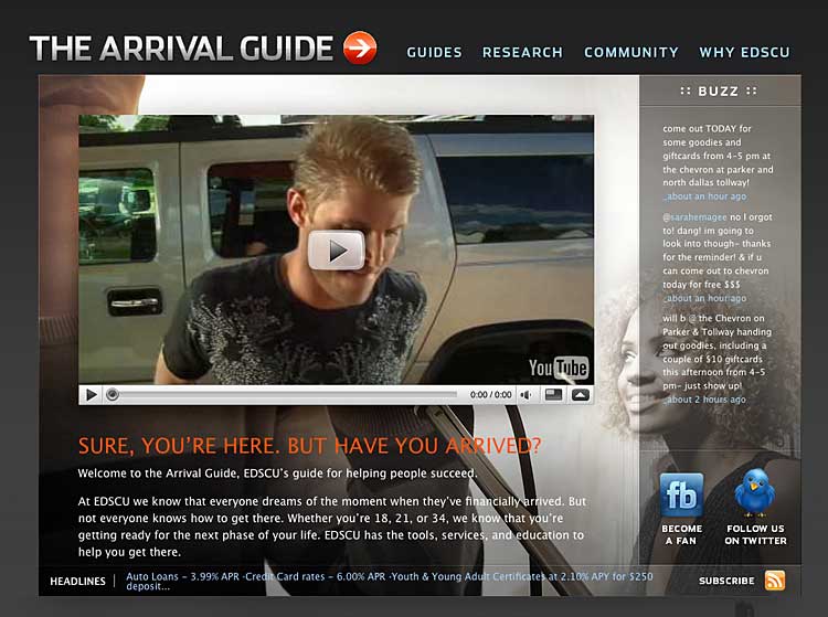
I always get excited when financial institutions venture out and try something new — to shrug off the hot and itchy grey flannel suit and put on some shorts, flops and sunglasses, and relax a little. This is the environment that marketers can really make their mark and prove their differentiation. That’s why I was so excited to review EDS Credit Union’s project, “The Arrival Guide.”
I have never heard of EDS Credit Union before, so my breakdown and analysis will be entirely based on my 12 years of experience in user-interface design and internet marketing, plus 10 years’ experience in credit union marketing.
So here it is: “The Good,” “The Bad” and “The Ugly.”

The Good
Any time a credit union tries to speak to the youth category, it is a good thing. You can’t go wrong trying to open lines of communication, so the prominent display of both their Twitter and Facebook accounts is a nice touch.
The design should appeal to the target Gen-Y demographic, but will also be visually pleasing to anyone else who may visit. It’s not overwhelmed by content, so the message stands out with great impact.
The video is kind of cute, but fairly typical fare from credit unions these day. Not bad, not great. However, the use of “swagger” kind of had me rolling my eyes, but it was a solid attempt and proper use of slang.
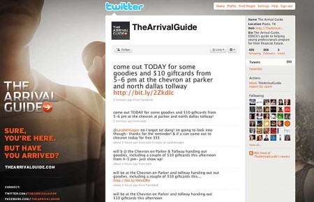
The “Tweetbox” on the home page is also nice, assuming you have good stuff to share. Which it seems they do. They have tweets directed to specific people (members or not). EDS corporate isn’t proof-reading every tweet, and references to local concerts and other such chatter consistent with the target is what Twitter is all about. Their Twitter account is followed by over 200 people, while EDS follows over 400 tweeters. It’s a good ratio, something that is difficult for some people to manage.
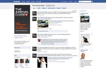
The linked Facebook fan page is doing well with almost 400 fans. That, my friends, is quite the coup for a financial institution. I don’t know if it is the content that gets updated consistently, a viral marketing effect, or the incredibly attractive young ladies in the photo stream. Whatever it is, it’s working.

Move the Needle from Attrition to Acquisition
Vericast’s 2024 Financial TrendWatch explores seven of today’s most critical financial services trends to provide a complete view of the current loyalty landscape.
Read More about Move the Needle from Attrition to Acquisition

Send the Right Offers to the Right Consumers
Achieve a better return on your marketing investment. Leverage behavioral data and analytics to target the right customers with the best possible offers.
Read More about Send the Right Offers to the Right Consumers
FACEBOOK PAGE FOR ‘THE ARRIVAL GUIDE’
The Bad
The website doesn’t really create the sale. There are no links to “become a member” or anything. I can’t understand that.
All the momentum created on the first page comes to a screaming halt on the internal pages. The copy is kind of boring, as are the internal pages. No more videos, no more pictures — just scrolling boxes o’ text. The “Old School” scrolling text box defeats any “street cred” earned on the home page.
Once in the site, I am a little lost as to what I am supposed to do. Why am I here again? Oh, because I have “Arrived.”
The Twitter profile page caries the same design as the website. The content is solid, although it can be a little salesy at times. The big faux pas here is that it was designed for a huge screen. There are links on the bottom left that many screens (including mine) will cut off, and my screen is pretty big with the resolution set pretty high. Joe Twitter will probably never see those links.
TWITTER PAGE FOR ‘THE ARRIVAL GUIDE’
And regarding the title for the promo, has the typical member of Gen-Y ever heard the expression, “You’ve arrived?”
The Ugly
After you watch the commercial on the home page, you get the typical YouTube slide shows of other videos that are similar to the content that you’ve viewed. This is incredibly dangerous and something that I recommend financial institutions do not do.
Don’t get me wrong, “remote hosting” of video content on YouTube — like what EDS is doing here — is great. It does good things for search engine optimization and helps spread the word. But streaming it from your official, branded website? Not so good…
Here’s why. One of the links that came up for me was a Sam Kinison comedy bit. Now I think Sam is funny, and I was kind of happy to get to listen to it while on the clock. But then Sam started talking about an Asian shopkeeper, using an exaggerated accent and obscenities that was pretty much, well, racist. Not cool to be watching that while still on a credit union’s official website.
If you cannot stream the video from your own server, select a content host that limits how far a user can get from your original content. This will help keep the craziness from diluting your message, and possibly save you from a major embarrassment.
Summary
Okay, I shot some arrows at this thing, some of which may seem a little harsh. But all-in-all it was a great effort by the folks at EDS, and the primary microsite is solid.
| Factor | Grade | Comments |
|---|---|---|
| Site Design | B+ | Good, but not great |
| Site Content | C- | Information is there, but it isn’t compelling. |
| Social Media | A- | YouTube, FlickR, Twitter, Facebook and even an Ning Forum. Nice job. Not much wrong here. |
| PR/Marketing | B+ | Nice t-shirts, parties, and events. |
| Overall Grade | B | A great effort! |
 I’m guessing there’s a lot more to The Arrival Guide campaign than what we can see on the web. I get the feeling from some photos on their Flickr page that there is some serious marketing out in the real world — as there should be. (What is that in the photo? Is that a postcard? Or a real, printed guide? And are those Dum Dum pops in the background?) This is where you are going to really create buzz. A website is just a part of that real world effort.
These types of promotional microsites and various social media tools aren’t “silver bullets,” or “golden keys,” or whatever you want to call them. They should be just a part of a larger marketing campaign. Online social media is just a tool, and if you are going to build an entire house, you need more than just a hammer. You need a variety of tools that all do something specific to achieve the desired results. And it helps to know how- and when to use each tool.


