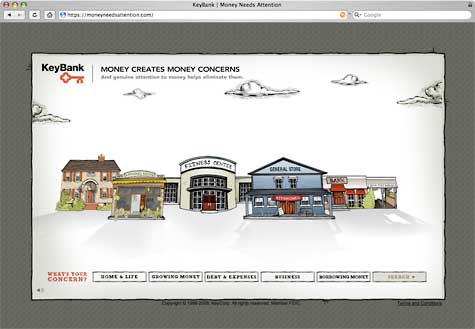
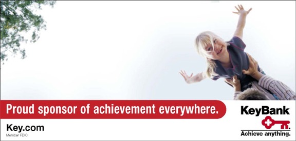
“Money creates money concerns. And genuine attention to money helps eliminate them.” That’s the underlying premise behind Key Bank’s latest brand ad campaign, “Money Needs Attention.”
The campaign includes print, TV and outdoor advertising, as well as a microsite.

The TV spots share the stories and concerns of real KeyBank customers, told in their own voices as captured in interviews with Starlee Kline of This American Life — a smart move if you want people to sound natural. The spots feature the animation work of noted illustrator Tim Tomkinson (known for his work for such publications as Rolling Stone).

Instant Messaging. Instant Impact.
Connect with your customers and provide lightning-fast support as effortlessly as texting friends. Two-way SMS text messaging is no longer optional.

The Financial Brand Forum Kicks Off May 20th
Explore the big ideas, new innovations and latest trends reshaping banking at The Financial Brand Forum. Will you be there? Don't get left behind.
Read More about The Financial Brand Forum Kicks Off May 20th
Key Bank admits the style of the campaign isn’t wholly unique. It borrows an animated testimonial concept from Schwab, and has a sense of design similar that’s becoming increasingly popular in the financial services industry, such as these campaigns from BofA and Alabama Credit Union.
In an interview with Marketing Daily, Karen Haefling, CMO/KeyBank, said, “We went to our agency and said, ‘We know this is not a new concept, but we would like to take a shot at doing something that’s differentiated.”
Nevertheless, the style is a marked shift from Key Bank’s more traditional, conservative look of years past.

An example of KeyBank’s previous brand identity.
The microsite is super robust. It’s got a lot more to offer than your typical 3-7 page microsite. There really is a lot going on. For instance, there are at least five different games.
The microsite’s interface is a little cryptic. The buildings used as a metaphor aren’t very intuitive. But that seems to be the norm these days — create an online site that requires people to dig.
The ad campaign is the work of Cramer-Krasselt/Chicago, who partnered with the visual wizards at Digital Kitchen. The microsite was created by marketing agency Sapient Interactive.
Tip of the Hat: To Terrell Meek of Verity Credit Union for the tip.


