There’s a reason that mobile banking apps can be downloaded for free: No one uses them for fun. They’re tools to get financial chores done. Yet they are becoming essential.
Because of that, how efficient and pleasing the consumer’s experience is with a mobile banking app — or how poor it is — will increasingly matter. As apps replace branches, their quality will determine how well banks and credit unions hold onto consumers, and mobile photo deposit in particular is a critical bridge between old banking and modern banking.
This isn’t lost on major financial competitors. In a new report Cornerstone Advisors ranks the appeal of 20 top retail banking institutions’ mobile banking photo deposit functions, used to shoot and virtually deposit checks.
Having a Good App Won’t Put Institutions in the Lead Anymore
The ranking saw some institutions rise higher than they had in past studies because they’d upped their game — JPMorgan Chase rose to #1 and Citibank to #2, bypassing Capital One, which had held the top spot for several years. Some other institutions fell in relative terms or stood still because they had, almost literally, stood still — they hadn’t improved their apps. On the other hand, Navy Federal Credit Union leaped into tenth place from seventeenth place in the previous study because it did a major revamp.
Yet the differences between top and bottom weren’t necessarily the difference between great and awful in the ranking. The field is close enough with each other that sometimes differences in a single facet were sufficient to pull an institution down.
“The banks at the bottom aren’t doing a bad job at mobile deposits,” the report states. “On the contrary, many do it well.”
In the latest study Cornerstone found that institutions must constantly balance their approach to mobile photo deposit. One side is user experience (UX), the design side of the app that determines how functional it is. The other side is customer experience, where policy differences improve or erode the consumer’s use of the app.
Examples of policy matters: How long an institution recommends that a consumer hold onto their checks after they capture them with mobile photo deposit service varies widely, as does how much a consumer can deposit in each transaction and in a given period of time.
“The leaders in the rankings focus on simple UX design and confidence-boosting policies on both limits and a short check retention time of only two days,” the report states. “Financial institutions toward the bottom of the list, however, typically suffered from too much text, a cluttered user interface, and the inability to access tips or help throughout the mobile deposit process.”
Let’s examine what the study, headed by Ron Shevlin, Director of Research, learned from a survey of consumers. Then we’ll look at its companion mobile app evaluation, which combined experts’ reviews and mystery shopping.
Read More:
- 16 Must-Have Mobile Banking Features that Raise the CX Bar
- Taking Mobile Banking to the Next Level with Innovation & Design
- How Smaller Financial Institutions Can Win the Mobile Banking Arms Race
- Great Mobile Banking UX Demands More Than a Flood of Features

Industry Cloud for Banking from PwC
PwC’s Industry Cloud for Banking applies our deep industry knowledge to your specific business needs

Instant Messaging. Instant Impact.
Connect with your customers and provide lightning-fast support as effortlessly as texting friends. Two-way SMS text messaging is no longer optional.
Auto-Capture Now a Must-Have Feature
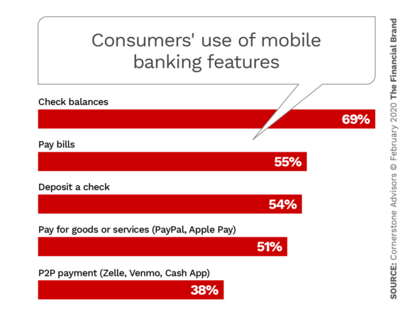
Americans’ quest for convenience increasingly embraces mobile banking but especially the ability to shoot a check and deposit it with your mobile device. As shown in the chart below, mobile deposit was used by more than half of the consumers surveyed at some point in the year before they were queried. In addition, 52% of the sample said that mobile deposit is one of the most important mobile banking services.
Pick the right technology. More specifically, auto-capture has become the staple to offer. This is where the user points the mobile device’s camera at the check and it snaps automatically when angle, background and lighting are right. Alternatively, it will prompt the user to some adjustment and then shoot. The consumer doesn’t have to fiddle with shutter buttons.
All but one of the large institutions in the report’s ranking offer auto-capture. The report urged smaller financial institutions to insist that their vendors provide this feature.
Notably, two out of five survey respondents said they would use mobile deposit even more frequently if their institutions improve their offerings.
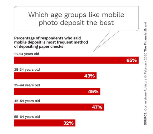
Consumers between 18-24 use mobile capture about two-thirds of the time, a higher preference than any other age group. Even among older segments, with the exception of 55-64 year olds, mobile proved to be the preferred deposit channel.
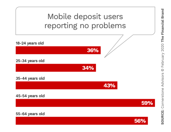
Americans’ growing love affair with mobile capture doesn’t mean that there aren’t issues with the technology. The survey found that the youngest consumers surveyed (18-24) reported having no problems least often. That group, as well as 25-34 year olds and 45-54 year olds, said their most frequent problem with mobile deposit was not having access to funds in a timely manner.
Security is on consumers’ minds. The study also found that consumers worry about the security of depositing via mobile. Many will only do so via their home wifi, out of concern that their cellular signal or outside wifi signal could be intercepted. The study recommended providers take steps to protect those channels. 22% of consumers surveyed said they would use mobile capture more frequently if they had better assurance that their checks had been deposited securely.
Read More: Marcus: A Digital Bank That Should Keep Rivals Up At Night
What It Takes to Be a Mobile Deposit Winner
Financial services advisors often speak of this or that service being “table stakes” to compete. What’s often forgotten is that table stakes is just the beginning of a card game. To stay in the game successfully you have to keep putting chips into the pot.
That’s clearly the case with mobile photo deposit. Chase and Citi didn’t pull ahead of Capital One because the latter suddenly lapsed. Chase and Citi improved their services and pulled ahead of Capital One.
“All three leaders,” the report states, “owe their rankings to a tight focus on simple UX design and the ability to offer confidence-boosting policies on both limits and a short check retention time of only two days.”
Chase, for example, cut consumers’ retention time on mobile-deposited checks to two days, “infusing a level of trust and confidence in the bank’s check processing abilities.” Citi did likewise. Capital One had already been doing that.
Other institutions had longer recommended retention times, but one of the longest was M&T, which had actually received high marks for UX and design.
“How did M&T land at 19th place?,” asked the study. “The answer lies with the bank’s inexplicable suggestion for check retention, coming in at a whopping 70 days.” [Emphasis added.]
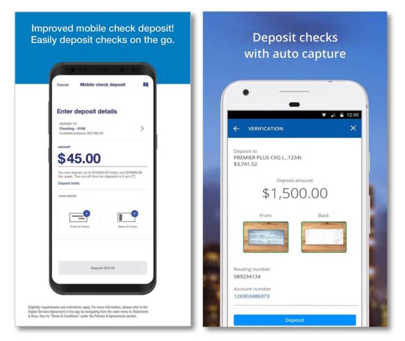
U.S. Bank, left, showed marked improvement in the rankings due to a major revamp. The mobile photo deposit offering of Chase, right, delivered by auto capture, ranked first in the Cornerstone Advisors study.
The study used nine criteria for ranking the institutions, devoting a detailed page to every institution ranked. Some of them were: efficiency of use; clear, plain English terminology; matching user expectations for ease and clarity; consistency and standards, such that tasks such as entering numbers are the same throughout the app; ease of navigation; and use of auto-capture.
Design and the text carrying out elements of the design played a part in putting institutions at the top and others at the bottom. Chase and Citi, for example, ranked highly in part because their deposit screens were clean and simple.
Among highly ranked institutions, Capital One got strong marks for “clean and simple design, making users comfortable with depositing a check and being aware of their limits while doing so.”
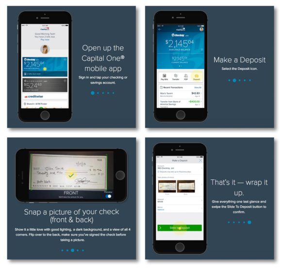
Capital One’s website gives visitors the chance to try out its mobile photo deposit function, complete with “pushing” buttons to move through the process.
Institutions also gained in the rankings when they required a minimum of movement between screens to accomplish a deposit, even making it possible to do most things on a single screen. Wells Fargo tied for fourth place with U.S. Bank in part on the strength of such factors.
Read More:
- More Consumers Will Leave Banks If Digital Offerings Don’t Improve
- Consumers Demanding Improved Digital Banking Customer Engagement
- The Mobile Experience Now More Important Than In-Person Banking

What Drags Down a Mobile Banking App
On the other hand, the rankings and accompanying commentary made it clear that institutions must walk a line between providing tips and overburdening the consumer with too much information.
Regions Bank, which the report compliments as a being a strong competitor in banking, was criticized in this digital area because its app doesn’t do it justice.
“There is an extreme over-abundance of text throughout that could be defended as necessary for compliance’s sake, but Regions takes the cake with the excessive word count on its screens,” the report states. “Aside from that, the app feels out of touch with today’s digital experience expectations, which could make new customers feel that the bank is as well.”
Yet too clean could also cost an institution. The report suggested that Fifth Third had gone too far: “While the clean aesthetic is a plus, the bank still needs to display key information for the user.”
In addition, commentaries made it clear that mobile capture must be tinkered with continuously. Bank of America dropped a couple of places in the standings because the bank hadn’t updated the look and functionality of its app.
Ally Bank’s look was called “decent,” but the report said it had a dated feel.
“What is notable is Ally’s unbelievable deposit limits,” the report states. “A daily limit of $50,000 and a generous monthly limit of $250,000 puts Ally light years ahead of the rest. If only it could match the UX to its unique and admirable limits offering.”

