The digital banking customer experience improved dramatically in the 23 years since the launch of the first internet-only bank, Security First Network Bank. While its lobby metaphor was creative, it was a clunky experience back in the dial-up Internet days.
These days, banks and credit unions have beautiful responsive websites with a clear path to the login button, prominent search, and a row of intuitive navigation labels across the top. But unfortunately, when customers log in to secure digital banking the user experience often drops dramatically.
Here are seven common digital banking UX failures and what you can do about them.
1. Fostering Financial Insecurity
Problem: For more than two decades, the biggest reason for not adopting digital banking? Security. Or rather “the perception of security” since few customers have the wherewithal to evaluate actual security. We should also include privacy in this discussion because it is often used interchangeably.
Solutions:
- Clear links to plain language discussions of security and privacy safeguards
- Understandable security and fraud protection guarantees
- Links to third-party credit monitoring solutions
- Availability of optional two-factor authorization
- Graphical treatment that reinforces security at login
- Ability for customers to “lock-down” their account(s)
Inspiration: BBVA’s Simple digital bank knows how to avoid jargon which is especially refreshing on the security front. It makes users feel more comfortable by first highlighting its people, then a list of technical safeguards, debit card on/off switch, and instant alerts.
Connect with your customers and provide lightning-fast support as effortlessly as texting friends. Two-way SMS text messaging is no longer optional. Build a modern credit card strategy that balances profitability and risk, adopts the latest technology and delivers the customization that cardholders demand. Read More about Navigating Credit Card Issuing in an Uncertain Economic Environment

Instant Messaging. Instant Impact.

Navigating Credit Card Issuing in an Uncertain Economic Environment
2. Hiding Customer Service Contact Info
Problem: You know where you tucked customer service contact info and tools, but your customers can’t find them right away. Not only is this frustrating, customers may think you are purposely trying to avoid them.
Solutions:
- Customer service contact link and/or phone number on every page
- Structured forms so that customers can better describe the problem
- Clear standards for call/email response times
- Online chat
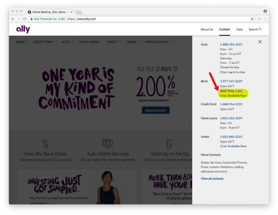
Inspiration: Not only does Ally Bank make it easy to find the correct customer service phone number and chat links via this drop-down menu, it also lets you know when it’s a good time to call with real-time call-center wait times.
Read More:
- 5 Undeniable Truths of Digital Banking
- Simplicity: The Core of Phenomenal Digital Banking Experiences
- The Rise of the Digital-Only Banking Customer
3. Your Desktop is from Mars and Your Mobile is from Venus
Problem: The majority of digital customers use both desktop and mobile services. But too often they have wildly different UIs. This friction reduces satisfaction and increases support calls.
Solutions:
- Create similar UIs for desktop and mobile banking
- Use the same names for features and functions, standardize navigation as much as possible, and maintain a similar look and feel
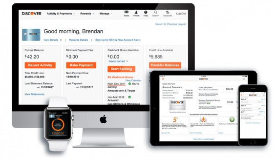
Inspiration: Discover Card provides a similar UI across all the various screen sizes.
4. Still Searching Like It’s 1999
Problem: Google currently handles 3.5 billion searches per day. With the advent of smart speakers in many homes and vehicles, that number is sure to rise. However, many FI sites have rudimentary search at best. It’s especially frustrating within online banking when you are trying to accomplish a relatively simple task but search fails to provide a clear solution.
Solutions:
- Make search easy to find on all pages
- Include a transaction search option
- Offer natural language input
- Voice-enable search
- Curate the results for the top 100 searches
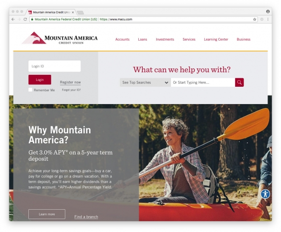
Inspiration: Mountain America Credit Union devotes much of the top-third of its homepage to search. And it helps users with auto-suggestions as you type and a list of curated top searches.
5. Alerts Are Too Introverted
Problem: Alerts are a vital way to de-stressing money management. But all too often they are hard to find, difficult to set at appropriate levels, and overly complex to adjust.
Solutions:
- Integrate alerts in all areas of online and mobile banking
- Provide history of alerts sent
- Provide alert-setting guidance including reasonable default values
- Make it easy to adjust alerts
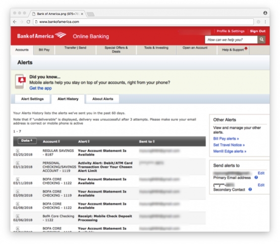
Inspiration: Although you have to search the Accounts sub-menu to find the Alerts area, once you find it Bank of America has a user-friendly menu of alerts along with something rarely seen, a history of alerts sent.
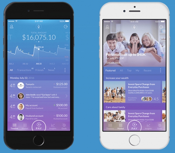
6. Transaction Data Wants to Be Free (form), Not Stuck in Columns
Problem: Financial institutions still display data in a format better suited for a paper statement or a spreadsheet.
Solution: You may love pouring over spreadsheets, but most customers don’t. Make it easier to track new transactions and spot anomalies. Think Gmail not Excel.
Inspiration: This mobile banking mockup from UX Design Agency has a time-stamped feed of relevant information.

Navigating the Role of AI in Financial Institutions
83% of FI leaders agree investing in AI is essential for 2024 but how you leverage AI is instrumental in success and meeting customer expectations.
Read More about Navigating the Role of AI in Financial Institutions

Industry Cloud for Banking from PwC
PwC’s Industry Cloud for Banking applies our deep industry knowledge to your specific business needs
7. One-Size-Fits-All User Interface
Problem: The majority of financial institutions have at least three of four checking/current account choices. Some have more than a dozen. But most retail banking customers are wedged into the exact same digital experience. It’s awkward to make 81-year old retirees use the same UI as a college freshman. Even worse, banks are leaving revenue on the table since many customers will pay extra for a tailored service.
Solutions:
- Provide unique UIs for key segments: children, retirees, small business, college students, and so on
- Charge extra for more security options
- Charge extra for higher levels of customer service
Inspiration: American Express pioneered the concept of financial services market segmentation 52 years ago with the launch of the Gold Card. And then doubled down 20 years later with the Platinum Card. It’s high time that digital banking follows the same path.

Jim Bruene is Principal of BUX Advisors, a digital banking user experience consultancy. He has spent 25 years at the forefront of digital banking founding Online Banking Report, the Finovate conference series, and most recently BUX Certified, a UX seal of approval. If you send an email to Jim, he will always reply back.

