CUES has put together an excellent website with an exhaustive portfolio of winners from every one of 31 separate categories. You can even download the original entry form for each entry, including all the creative materials submitted. It’s quite impressive. Everything you could ever want to know is available.
Branch Grand Opening
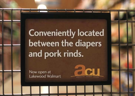
This postcard from America’s Credit Union is one of the funniest things The Financial Brand has run across this year. The copy — all eight words of it — sends a brilliant combination of messages. First (and most importantly), it accomplishes the basic goal of announcing where the credit union’s new branch location opened — both on a macro-geographic level (at the Lakewood Walmart) and within the store itself. It also connotes a sense of personality that is decidedly refreshing in the financial space. The credit union has a humbly modest self-image; they are, after all, putting themselves on the same plane as diapers and pork rinds. It’s this lack of pretention that’s so funny, specifically because it reflects consumers’ true feelings about the commoditization of banking services: ”Get over it already. It’s just a stupid checking account.”
Now Enlisting New Recruits
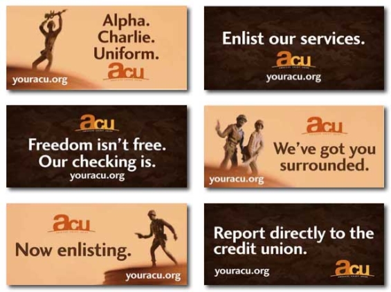
America’s Credit Union (ACU) has branches surrounding one of the largest military installations in the U.S. This coordinated campaign illustrates the creative power awaiting credit unions willing to target highly-focused audience segments. Everything about this campaign — copy, concept and execution — is fun.

The unfair advantage for financial brands.
Offering aggressive financial marketing strategies custom-built for leaders looking to redefine industry norms and establish market dominance.

Move the Needle from Attrition to Acquisition
Vericast’s 2024 Financial TrendWatch explores seven of today’s most critical financial services trends to provide a complete view of the current loyalty landscape.
Read More about Move the Needle from Attrition to Acquisition
Member Stories
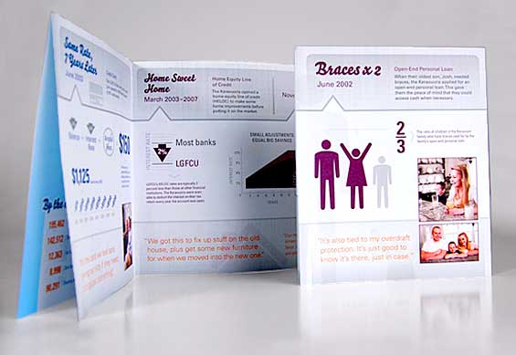
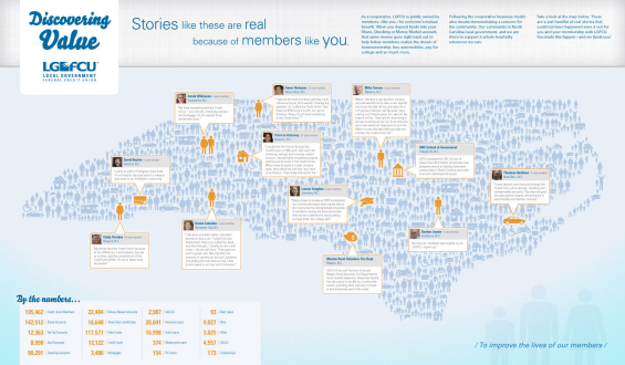
One of the more unique pieces of collateral you’ll see from a credit union — both in terms of content (it’s a package of vignettes with member stories) and design. The level of detail that went into this concept alone makes it worthy of an award. It’s as intricate as it is attractive.
Point of Sale… Hollywood Style
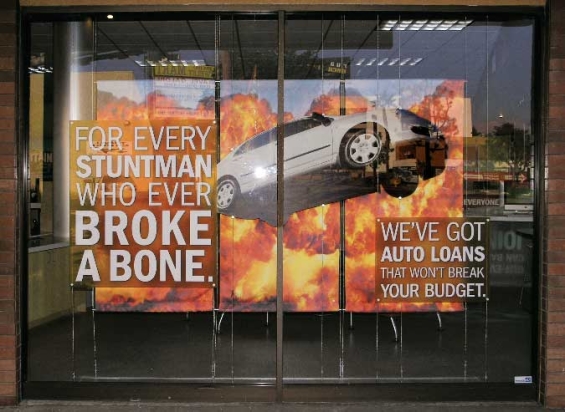
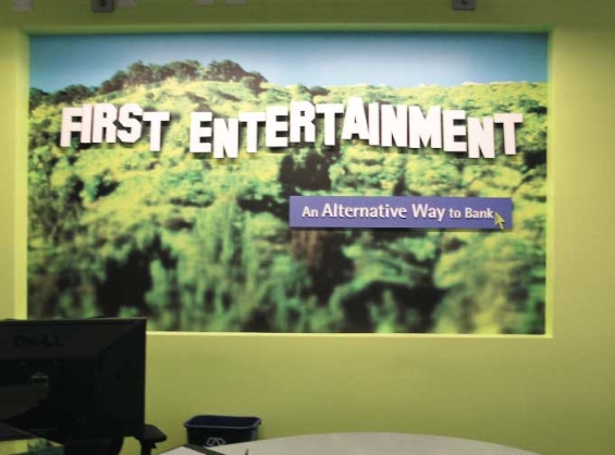
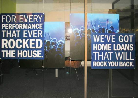
First Entertainment Credit Union, based in the center of Southern California’s film industry, serves the Hollywood crowd: actors, editors, boom operators, caterers and the like. This series of multi-dimensional point-of-sale displays shows how in-branch merchandising can be used to position and build the brand while cross-selling products and services. It’s also another excellent demonstration of how messages can be tailored when a credit union targets a specific niche.
Card Designs
Newsletters
These entries won awards in the Newsletter category probably because they look nothing like the traditional, expected credit union newsletter. First Entertainment’s “The Show” (left) is a perennial favorite at awards shows, and one admired by The Financial Brand for years — it looks as good as Entertainment Weekly magazine, inside and out. City & County Credit Union’s “Member’s Connection” (right) uses a similar magazine-style approach. Both newsletters are published quarterly.
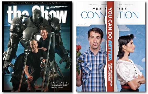
Newsletters – First Entertainment’s “The Show” (left) and City & County’s “Member Connection” (right).
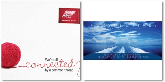
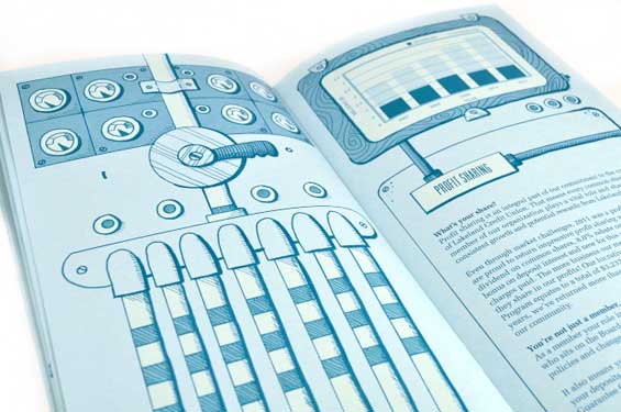
Annual Reports

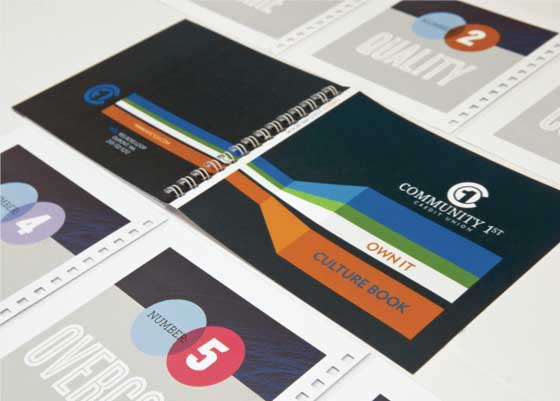
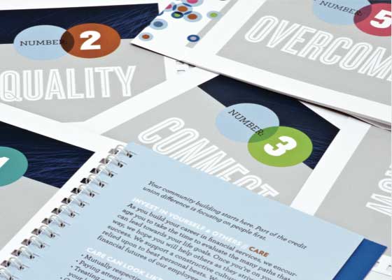
Culture Book
Community First put together this “Culture Book” so employees could learn more about the credit union’s brand. That they even have an internal brand book puts them ahead of competitors.
Lumpy Direct Mail
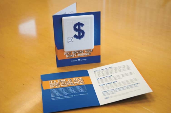
This mailer from Interior Savings Credit Union in Canada illustrates a critical principal in designing marketing: adding something “lumpy” inside the enclosure that recipients can feel. “What’s inside?” They have to open it. Indeed, there is nothing that will increase engagement rates with direct mailers more than adding mass and texture inside your envelopes. You can see open rates shoot above 50%.
The Financial Brand Forum Kicks Off May 20th
Explore the big ideas, new innovations and latest trends reshaping banking at The Financial Brand Forum. Will you be there? Don't get left behind.
Read More about The Financial Brand Forum Kicks Off May 20th

Unlocking Digital Acquisition: A Bank’s Journey to Become Digital-First
This webinar will offer a comprehensive roadmap for digital marketing success, from building foundational capabilities and structures and forging strategic partnerships, to assembling the right team.
Read More about Unlocking Digital Acquisition: A Bank’s Journey to Become Digital-First
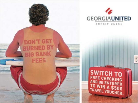
Don’t Get Burned
It gets harder and harder to find new ways to poke fun at bank fees. This coordinated switching campaign for Georgia United was honored with a CUES award for coming up with a new twist to a familiar meme. The travel/vacation theme was executed throughout the campaign, even on internal materials like the sales tracking form used by branch staff.
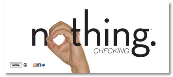
Free Checking is ‘Nothing’
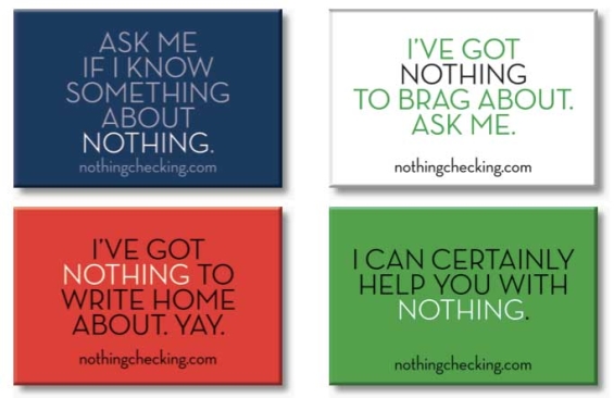
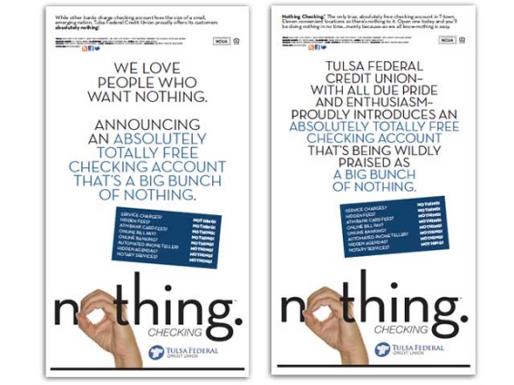
To differentiate their free checking from the competition, Tulsa Federal Credit Union chose to label it as “Nothing Checking,” for which it was awarded CUES Pinnacle Award. The campaign focused on a humorous approach by weaving “nothing” into the messaging. The campaign kicked off with a series of teaser ads scattered throughout the local Sunday paper. That was followed with a broadcast package of four 30 second television and two 30 second radio spots. In branches, the message was reinforced with lobby posters, POS displays, brochures, t-shirts and buttons.
Goal: 300 new checking accounts
Actual: 981 new checking accounts

