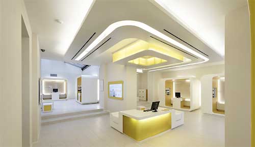
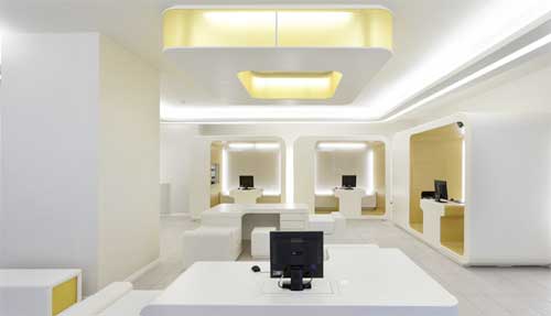
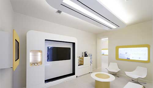
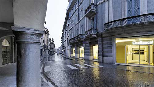
This branch design for Italian bank Chebanca! is about as radical a departure as you can get from the hallowed walnut-and-mahogany themes of yesteryear. Ultra-clean, über-contemporary, high-tech and super-light merchandising.

The Power of Localized Marketing in Financial Services
Learn how to enhance your brand’s local visibility, generate more leads, and attract more customers, all while adhering to industry regulations and compliance.
Read More about The Power of Localized Marketing in Financial Services

How Banks Are Fortifying Their Data Against Increasing Cyber Threats
This webinar from Veeam will detail the value of working together across your organization to be better prepared in cyber defense and response readiness.
Read More about How Banks Are Fortifying Their Data Against Increasing Cyber Threats
The bank has a special link off the homepage of their website. The bank says, “Che Filiali! La rete territoriale di CheBanca! si compone sia di filiali nel centro delle più importanti città sia di presidi nei centri commerciali.” Even though it’s in Italian, you just know it says something like, “Check out this killer branch design! It rocks tough!”
 The project is the work of Crea International, who has a 3-D video fly-through of the branch model at their website.
Tip of the Hat: To Experience Fix, for the tip.

