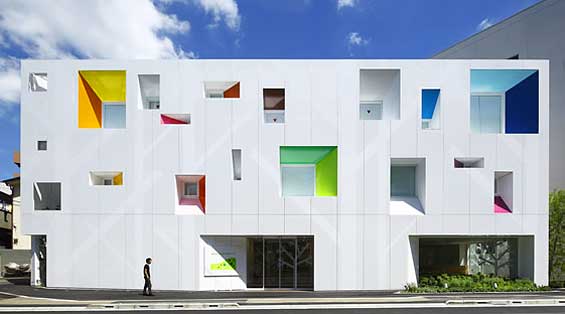
Sugamo Shinkin Bank – Bright Blocks
Colorful blocks and geometric shapes are used to create a clean, simple branch for Sugamo Shinkin Bank in Tokyo. Project by emmanuelle moureaux.
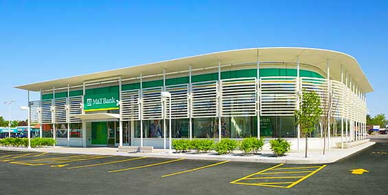
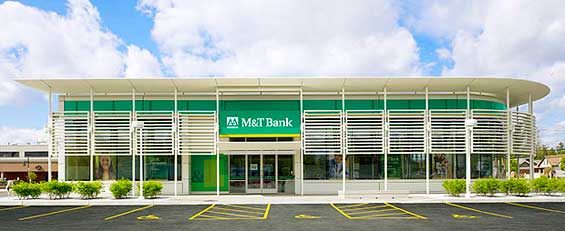
M&T Bank – Modern Model
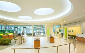
Intentionally more contemporary and energetic in form compared with M&T’s previous branches, this LEED-certified flagship building “represents the M&T identity three dimensionally through the application of its brand colors and materials,” according to the design team at Pentagram. The main lobby was intentionally designed to look like a large, open hall reminiscent of banks from the early 20th century. There are plans to introduce elements of this design throughout the bank’s branches.

How Banks Are Fortifying Their Data Against Increasing Cyber Threats
This webinar from Veeam will detail the value of working together across your organization to be better prepared in cyber defense and response readiness.
Read More about How Banks Are Fortifying Their Data Against Increasing Cyber Threats

Why Industry Cloud for Banking?
PwC’s Industry Cloud for Banking helps deliver personalized products and services that today’s customers expect.
Golden Pacific Bank
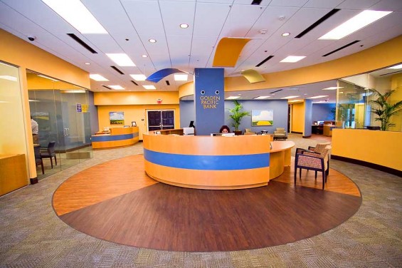
An attractive, color-coordinated branch with a central concierge desk at this Sacramento-based bank’s latest branch.
BNZ – Concept Store
This new branch model features an open floor plan in transactional areas, digital media and a well-lit storefront. It has monitors that run promotional videos, an internet kiosk and a free wireless network. Cafe-style booths replace private bankers’ offices. BNZ retail banking GM Chris Bayliss told the Otago Daily Times that “the store aimed to be such a radical change from the traditional branch that if branding was removed, customers would not know they were in a bank.” BNZ’s head of retail strategy Matt Sale told the New Zealand Herald that the bank had spent more than two years talking to customers to find out what they wanted from the bank.The bank intends to rollout the concept to its 179 branches at an estimated cost of $100 million. Project and photo credits by Warren & Mahoney, signage experts Rocket, branding specialists DNA and project managers RCP.
Generations FCU
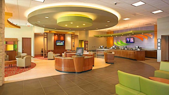
This branch by MGA Architects features an open floor plan and high ceilings. A circular soffit helps indicate that the podium in the center — the “welcome desk” — is then central hub of the branch. High-traffic areas use hard flooring which is easier to clean (and less comfortable than carpeting, which keeps people moving). Carpeting is used to encourage people to linger in “dwell zones.” Carpeting also works to dampen sounds. A waiting lounge is juxtaposed outside two private sit-down offices. Branch visitors must navigate to the back of the branch to conduct transactions, a “best practice” design principle. The branch looks a little light on merchandising, but it’s overall a very solid, strategic execution.
HAPO Credit Union – Wood-Paneled Interior
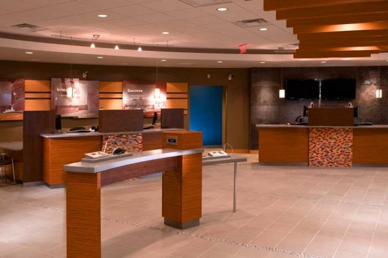
Weber Marketing Group used the core values of the credit union — trust, integrity, security, achievement — as the springboard for its multi-layered displays combining various materials such as metallic paper, acrylic, dimensional lettering and photos from the area. EHS Design developed the prototype with Weber Marketing and provided all interior and exterior design work.Design/build firm: Momentum.
TD – Slipque Credit Card Kiosk
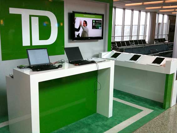
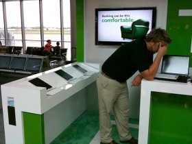
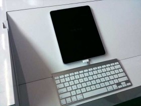
Two separate readers, Paul Stull from Arizona State CU and Paul Seibert from EHS Design, both sent this item of interest to The Financial Brand. This credit card marketing kiosk in the Buffalo airport is run by Elite Marketing employees on behalf of TD. It features two staff members and about eight iPads with keyboards used to enter applications. They offer a $5 meal voucher and a credit card carrying case if you apply. What can you get for $5 that you want to eat?
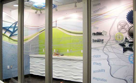
Arizona State CU – Rethink Banking Center
Paul Stull, SVP/Arizona State Credit Union, is quick to point out that this isn’t actually a branch. “It’s a ‘Rethink Banking Center,” he told The Financial Brand. The not-a-branch features a Sporg Bar. “Sporg” is Danish for “ask.”
“The ‘Sporg Bar’ concept came from some European designs that our Gen-Y panel reviewed and liked,” Stull said. “We kind of mini-crowdsourced the design by showing numerous space concepts and allowing panel members to react positively or negatively. The assignment wasn’t to tell us if it looked like a branch or even a financial institutions. It was to tell us if the space looked comfortable and or if it was the kind of place they would hang out or want to be involved with.”
The location has no cash, but staff are able to provide member service. Their primary role is to recruit new members and train existing members how to use the full service ATM.
“Our staff is actually a street team,” Stull said. The group, headed by 10 ASU grads who oversee apprentice undergrads, gets dispatched around the ASU campus to various events. The team gives away t-shirts in ASU colors, sporting URLs for the credit union’s dedicated ASU microsite.
Project and images by Weber Marketing Group.
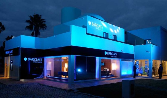
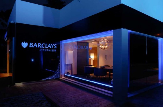
Barclays Portugal
It’s classy. It’s upscale. It’s everything private banking should be.
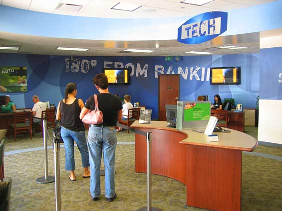
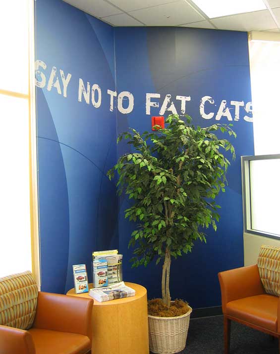
USA Fed – Say No to Big Bank Branches
The displays from Weber Marketing Group in this branch are oozing with brand attitude. Big, raw lettering boldly states “180° from Banking,” and “Say No to Fat Cats.” It’s too bad this credit union was just gobbled up by Navy FCU. Spike, USA Fed’s bulldog spokescanine, served the credit union well.
Sparkasse – Mixed Retail ‘Banking Hall’
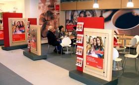
You gotta love Germans. They have beer halls, so why not “banking halls?” This branch concept from allen international blends mixed-use retail with banking services. Traditional banking activities are limited to one-third of the venue’s floor plan, leaving space for a coffee shop, bakery, Lotto concession, Tchibo concession and newsstand, all paying rent to the bank.
Menus in the coffee shop contain information about the bank information. The newsstand stocks bank literature and other Sparkasse-branded merchandise next to the newspapers; and customers signing up for new banking services are incentivised with promotional vouchers for Tchibo products.
All banking transactions are carried out by automated machines freeing staff to focus on customer service, sales time and cross-selling. Within the banking hall, there are a number of “conversation islands” where customers can carry out transactions via an interactive screen or consult with the bank’s staff. The staff are also available to chat informally with customers while they are sitting in the café.
Mashreq
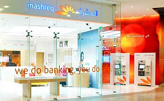
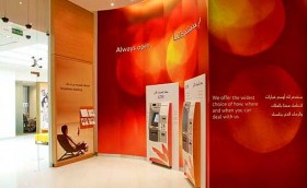
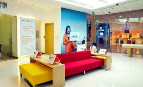
Mashreq began life as the Bank of Oman. Based in Dubai, it grew rapidly to become the largest private bank in the UAE. The bank initiated a new branch project with allen international, resulting in this design for the bank’s 50-branch network.
Lloyds TSB – Pilot Branch
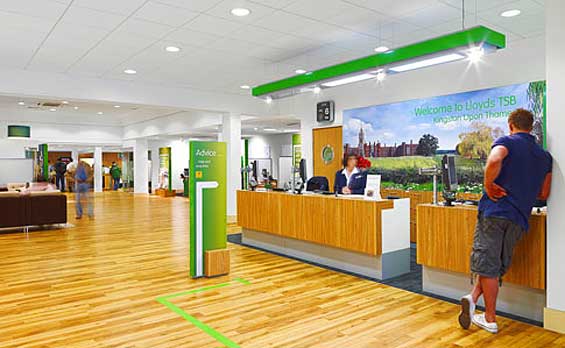
Lloyds TSB appointed the retail design specialists at allen international to change the face of their High Street branches. allen international developed a fresh contemporary look seen here in this pilot branch built in a warehouse. The then Head of Retail Banking for Lloyds TSB commented that it was “the best conceptual branch she had ever seen.” Lloyds TSB has 11 million customers and over 1,800 branches.
Standard Bank – Glass Murals
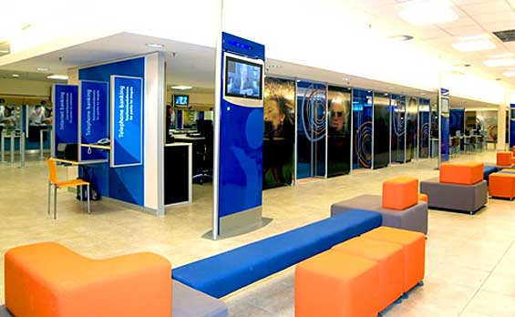
Standard Bank (SBSA) is the largest bank in Africa with over 500 branches. It looks like they are using cash recyclers at stand-up and sit-down stations, eliminating the need for a bullet-proof-glass enclosed secure transaction area. Projects and photos by allen international.
Applied Bank – ‘Coffee Money Café’
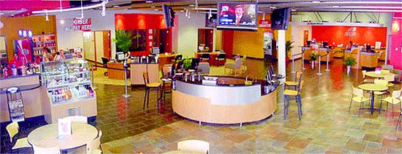
This branch is one half coffeehouse and one half full-service bank. The >“Coffee Money Café” offers specialty drinks, light fare food and free WiFi (computer provided, if necessary). The location is open seven days a week with extended hours. There’s also a conference room for community activities. Regular readers will be familiar with The Financial Brand’s position on branches aspiring to be cafés. If you’re going to try this, maybe it would be better to be the lessee instead of the lessor?
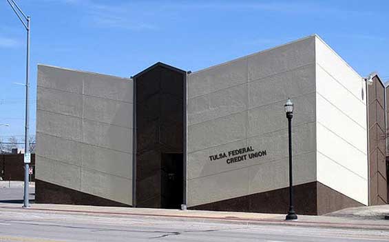
Tulsa FCU – Sinking Feeling?
This odd little branch comes courtesy of Chuck Bruen, the of CEO/First Entertainment and one of The Financial Brand’s favorite bloggers. The structure of this building sends an uneasy (if not unintentional) statement, undermining the notion of stability. Metaphorically- and literally speaking, it doesn’t look like this credit union sits on solid bedrock.

