The Financial Brand sat down with Anita McLendon, VP of Marketing for UMe Federal Credit Union, to talk about the organization’s recent name change from Burbank Community FCU. In this interview, McLendon shares her candid insights and discusses the challenges involved with rebranding a financial institution.
Why change names?
In September 2008, at our annual Strategic Planning Day with our board of directors, one of the key items listed as a weakness in our SWOT analysis was “name confusion.” There are over 352 businesses in Burbank that have “Burbank” as the first word in their name, just like we did. 352! And, one of those businesses is another credit union, located just down the street from us. Being one of 352 businesses in our market with a name that starts with Burbank, left us with no real name distinction. In fact, it created a significant amount of confusion, some of which has had a negative impact on our business. In one instance, it was detrimental to our safety. We called 911 for an employee who needed immediate medical attention, and the Emergency Response Team went to the other Burbank credit union instead of coming here.
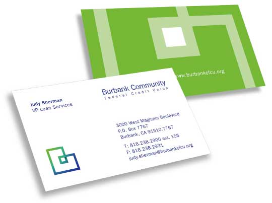
OLD NAME & LOGO
Not only that, we have always been a one-branch credit union. Yet for years, people have been telling us that they bank at “our other branch” (the other Burbank credit union’s branch). Potential employees have gone to “our other branch” for job interviews. And our vendors have reported to “our other branch” for meetings we’ve scheduled. For years, we have received paperwork from the Department of Motor Vehicles for loans to members we don’t have. For years, we have gotten mail addressed to department heads who have never been employed here.
Our old name, Burbank Community Federal Credit Union was a mouthful at 13 syllables. It worked well for us for a long time, and although it was long, it was functional. But, we wanted our name to be more than functional. We wanted it to better communicate who we really are, and most importantly, what we’re all about.

Move the Needle from Attrition to Acquisition
Vericast’s 2024 Financial TrendWatch explores seven of today’s most critical financial services trends to provide a complete view of the current loyalty landscape.
Read More about Move the Needle from Attrition to Acquisition

Industry Cloud for Banking from PwC
PwC’s Industry Cloud for Banking applies our deep industry knowledge to your specific business needs
When did the credit union first started talking about a name change?
The idea of changing our name has been explored many times. In 2004, when the credit union changed its charter to become a community credit union, Interbrand was brought in to do the rebranding work. At that time, they strongly recommended a bold name change — taking “Burbank” out of the name. However, most of the management team and the board of directors were not comfortable doing so.
In the last four years, during strategic planning sessions, the name confusion issue has been brought up time and time again. Then, two years ago, the management team and Board made a decision to actually explore our options and added it to the Business Plan. Even at that time, not everyone was convinced that we needed to change our name. So, we proceeded with the idea that we would engage in the name change process, but, decide whether we officially change our name after the work was done.
Debate and uncertainty existed within our management team about a name change, but, one thing remained certain: without a name change, we would continue to struggle to communicate to our market and existing members. So, as
part of our 2009 Business Plan, one of our core items was to begin exploring a name change. The process would include research, name development and exploration, logo integration, impact assessment, and implementation.
How would you describe the process?
The process was very thorough and methodical. We wanted as much real information as we could get. Phase 1 began by getting an accurate and authentic sense of the credit union — who we think we are, how we are perceived, what we do well, where we can improve, and everything in between. This included confidential and in-depth interviews with employees across all departments, the entire leadership team, a group of board members, and a random selection of members, including a member who left the credit union. We also conducted a competitive review to find out what we are up against.
Phase 2 was all about using the information gathered in Phase 1 to actually create our brand. This included a Brand Workshop, where we determined our Brand Attributes (we came up with four of them, but they are confidential) and our Brand Positioning Statement.
Phase 3 took us into multiple rounds of names. We went through hundreds of names on multiple occasions, evaluating them against our Brand Attributes. We narrowed down our favorites each time, carrying them over to our next meeting, finally getting down to three. A look-and-feel was developed for each finalist. As we saw the names come alive, they took on a whole new meaning for us.
UMe, the little underdog name, cut through the clutter. It measured up to all four of our Brand Attributes, and won the entire team over unanimously.
What was the most difficult part?
In my opinion, the process was intense. It was an exercise in patience for me. Spending time “sitting with things” was a necessary part of this process, and one that I’m not accustomed to doing. I like to move on things, get things done with a sense of urgency. With naming, I learned that things need to soak in, be reflected upon, digested. It was through the “sitting with things” part that I truly fell in love with UMe. When I first saw it and heard it, I actually hated it. It sounded silly to me. In fact, I remember saying, out loud, something like: “If we go with that name, I am going to feel stupid marketing it. I won’t be able to work with that name.” At the end of the process, I was UMe’s biggest fan!
What’s the rationale behind the new UMe name?
UMe is pronounced: You-Me. The emphasis is on “you” because “you” (the member) are what matters to us most. You + Me = UMe.
UMe represents the relationship that makes our credit union special: the connection between “our members” and “us.” the connection between “you” and “me.” Sure, it’s an atypical word, but we’re an atypical financial institution, and that’s something we’re really proud of!
Were there any other names considered? Was there a second choice?
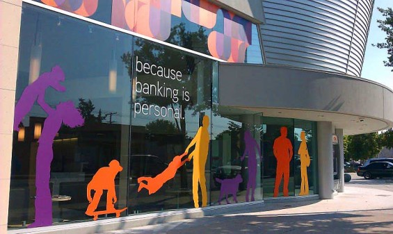
Nickel was actually the front-runner for most of this process. Many of us, including our CEO, felt like it was a solid choice, as the noun nickel is coin/money, which is the base element of our business. Furthermore, it’s the most solid, sturdy of the coins, which could be tied to the safety/security of our institution. And, the icing on the cake was that it’s look and feel is in line with the silver metal throughout our newly renovated building, making it seem like the building was designed with the Nickel name in mind.
The only negative connotation that arose was the “cheap” factor — that it’s “only a nickel/just five cents.” Although a simple rebuttal to that point was a relatively easy one: “every nickel counts.”
Our CEO was having lunch one day, near the end of this process, when he had an “ah-ha” moment. Yes, he realized, explaining Nickel could definitely be done; there’s the money correlation, the solidity of the coin that could symbolize the security of our institution, the visual ties to the elements used in our building… But it’s an explanation that takes work to explain. However, with UMe, it’s a simple explanation: it’s about us and our members. It doesn’t get easier than that.” So, when we really looked at who we are as a credit union, UMe took the lead.
Yes, money is the base element of our business, but it’s not the most important thing to us. It’s the relationship we have with our members that is at the core of who we are. It’s that same spirit that credit unions were founded upon: people, like you and me, coming together and pooling their money to provide loans to those in need. It made more sense to go with a name that embodied that spirit, that truly communicated who we are. And when people ask what the name means and how to say it will give us a platform for talking about who we are and what matters to us most. It was win/win all the way around. And, the best part of it all is that our name truly is authentic. It’s a great feeling to have a name that really reflects who we are. There’s no fluff, no bull. It’s just right. (Nerd alert!)
I went into this process loving Nickel — it was my baby, something that I loved the sound of and the visuals that could be created with it. I thought there was no way we would come up with anything better than that for our credit union. And yet in the end, I completely changed my mind. That was the biggest surprise of all.
Who was part of the name change process? How big was the team?
The naming team included:
- Anita McLendon / VP of Marketing
- Brian Hendricks / VP of Strategy
- Michelle French / Marketing Manager
- Robert Einstein / CEO & President
- Judy Sherman / VP of Sales and Service
- Two members of our board of directors
At certain points throughout the naming process, the naming team engaged the entire board for feedback, and then ultimately presented its recommendation to the entire Board for their final approval. The name change process really brought our team together, and we all came out of this process feeling like our team was
stronger than ever before.
What is the underlying strategy behind the brand?
Our brand strategy is to provide our members with an all-around WOW! banking experience. We define “WOW!” as the moment when you experience something unexpected. Whether it’s, “WOW! This is a beautiful building,” or “WOW! I can’t believe they’d do that for me.” Often, the biggest WOW!s come from the smallest
gestures – when someone remembers our name, when they go out of their way to help, when they see us as a person, not a number. WOW! is our opportunity to surprise and delight. It’s a way to have fun in our work, to challenge ourselves to think creatively. It doesn’t have to escalate to have impact. It’s as simple as anticipating a need: two minutes spent playing with a child so her mom can bank in peace, a caramel apple during the holidays. WOW! is our chance to think about what would make our member smile, to stand out from the crowd, to do something special.

How were staff involved with the name change?
We interviewed many of our employees, across all of our departments, along with board members and a random selection of 20 credit union members. Valuable feedback was provided and was used to develop our new brand.
We had a very slow and deliberate internal roll out, which allowed our employees time to become comfortable with the new name and brand, and to make them feel and be part of the process. We had several employee meetings where we discussed brand attributes, future marketing, overall credit union goals and strategies. These meetings helped all of us to get on the same page — united us as a team.
What’s the response been to the name? How have staff and members reacted?
After the slow roll out to our employees, we announced the upcoming change to our members — over a month before the public announcement — complete with an in depth FAQ, so they would not have any misconceptions about the change. We wanted to give our members time to absorb the upcoming change, time to adjust to the new name.
We communicated the change through a member letter, followed by a series of member notifications in our lobby, online, in our statements, etc. As we went live to our members, we were nervous. Even though we believed we had created the perfect name and brand for the credit union, we could not predict how people would respond. Luckily, the majority of our members responded with support. Many of them loved the new change. Our staff received accolades about the name and the look and feel of the brand. One member emailed the following: “Just wanted to tell you the website is gorgeous. That logo is delicious!”
While the overwhelming majority of our members supported the change, there were some who did not. We received negative feedback from a handful of members, and our management team was diligent about contacting each member who complained — personally — in order to address their concerns. We wanted to do everything we could to ensure that anyone who was displeased with the name change understood the reasoning behind it. In the end, the members who did not support the change, felt better about it after speaking with our management team. And, to date, all those who complained are still active members. One member did close his business account, however, his personal and joint accounts remain open and active.
Overall, we have been very excited and pleased with the response from our employees, members, and the community. We have a great staff, and we are grateful to them for their support, motivation and energy. Our employees truly embraced the new name. If any of them were apprehensive about the change, they never showed it.
Learn how to enhance your brand’s local visibility, generate more leads, and attract more customers, all while adhering to industry regulations and compliance. Read More about The Power of Localized Marketing in Financial Services Connect with your customers and provide lightning-fast support as effortlessly as texting friends. Two-way SMS text messaging is no longer optional.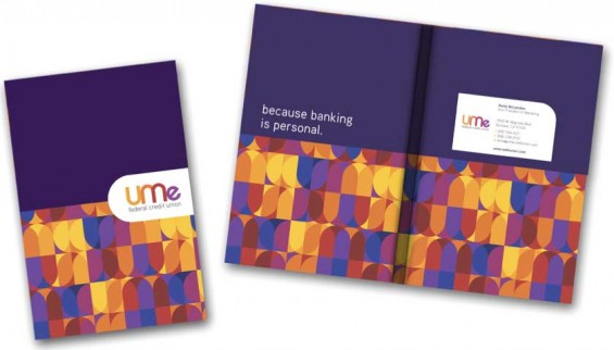

The Power of Localized Marketing in Financial Services

Instant Messaging. Instant Impact.
What kind of support did you receive from your agency partners?
We felt that we were too close to the project and not clearly objective. So, we made the decision to interview branding agencies to help us. We felt that we needed an organization that had branding experience and who could provide us with professional direction. We interviewed a variety of agencies, within and outside the credit union industry, and eventually signed a contract with Murnane Communications in March 2010.
Murnane Communications worked with us to create our new brand, so we wanted them to help us launch it, to help us accurately communicate it to our membership and the community. So, in addition to developing the UMe
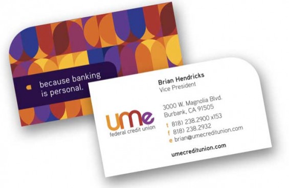
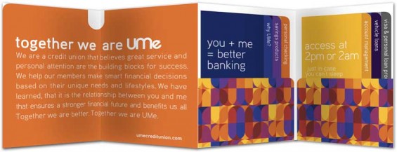
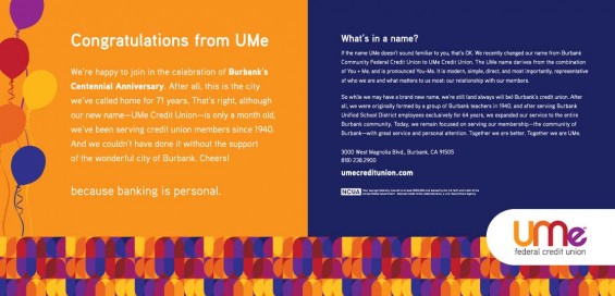
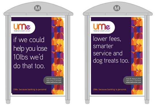
name, brand attributes and positioning statement, the Murnane team created the UMe support materials — business cards, letterhead, envelopes, etc, as well as our new brochure kit, and some initial launch advertising materials.
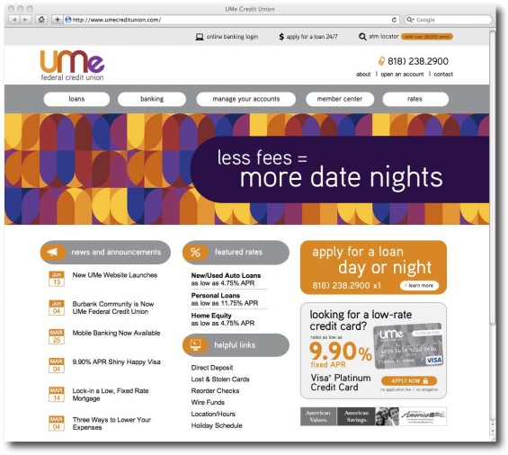
Subcat Marketing developed our new website and landing pages, which was an absolute overhaul. Not only were visual changes made, but the text/content was modified to reflect our new UMe voice. The Subcat team will continue our website work and maintenance/updates – and is, also, handling all of our other digital marketing efforts, including an ongoing email marketing campaign that we’re about to launch, online advertising, etc.
We will continue working with both teams throughout 2011.


