Banks and credit unions across the nation use billboards to promote their products and services. Like any other advertising media, there are right and wrong ways to use it. And like other media, billboard advertising has a few specialized techniques of its own.
First, let’s look at what a good billboard message should include:
- Short copy. Seven seems to be a magic number of words. Go shorter, but don’t add much more.
- Only one offer. Don’t confuse readers. They don’t have time to sort out mixed messages.
- One vibrant, clear graphic element. An image isn’t necessary, but if you use one keep it simple.
- Use an easy-to-read typeface. Sans serif. Make words large. Your message will be read on the move, from a distance, at speeds often over 50 mph.
- High Contrast. Be careful how you mix colors. Red letters on a blue background might look great on a computer screen, but good luck reading them from a moving vehicle.
- No disclosure copy. Don’t laugh. We’ve seen compliance officers add disclaimers to billboard designs. One example we considered for this clinic had an unreadable disclaimer.
Now let’s examine three billboard samples.
Read More: Advertising Clinic: Transforming Weak Bank Ads Into Strong Performers

The Power of Localized Marketing in Financial Services
Learn how to enhance your brand’s local visibility, generate more leads, and attract more customers, all while adhering to industry regulations and compliance.
Read More about The Power of Localized Marketing in Financial Services

Send the Right Offers to the Right Consumers
Achieve a better return on your marketing investment. Leverage behavioral data and analytics to target the right customers with the best possible offers.
Read More about Send the Right Offers to the Right Consumers
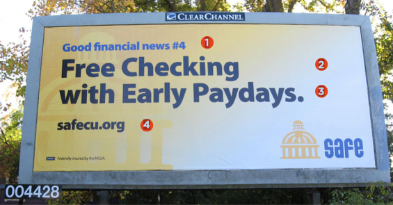
Here’s a billboard with a clear product message
This example is well-written, and well-designed.
1. This “kicker” sets the stage for the message (a “kicker” is a bonus slug of copy). It doesn’t distract or overpower the headline. The “#4” suggests the credit union has an entire list of deals to offer.
2. One product that’s easy to identify. Short message. Bold, dark headline.
3. Great teaser. Makes readers wonder and want to find out more. Wouldn’t you like an early payday?
4. Here’s how readers find out what the “payday” teaser means for them. However, a special landing page using a memorable URL would be preferred instead of just using the generic homepage.
The entire billboard can be read and understood by passing motorists. The best prospects will be intrigued by the free account and the Early Paydays promise. They can easily remember the URL.
Problem: The pale yellow background. A solid bright yellow works well on billboards, as well as a completely white background. Either would have been better.
Read More: 25 Banking Billboards: The Good, Bad & Ugly
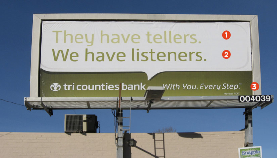
A short message… but wasted words
This billboard serves little purpose beyond just name awareness and recognition. It doesn’t “sell,” so it doesn’t move the needle.
1. The pale green color is difficult to read, especially in bright sunlight.
2. Puns don’t make good billboard copy. You can’t expect people to decipher your message in the few seconds they have to view it. It’s a clever copywriting gimmick that may win some advertising awards, but not any new business. Yes, it’s wordplay on “tellers,” but how many people want to walk into a financial institution and chat away with the “listeners?” More than anything, people want fast, accurate service so they can move on to the next chore. What advantage is this message selling? A relationship? It presumes consumers are more interested in investing themselves emotionally with their financial provider than they really are. At least the darker green is easier to read.
3. There’s no call-to-action or contact information. No URL. No phone number. You’d do better to save tagline copy like this for your brochures.
Read More:Direct Marketing Clinic: Chase Mailer Pros & Cons, Tips & Tricks

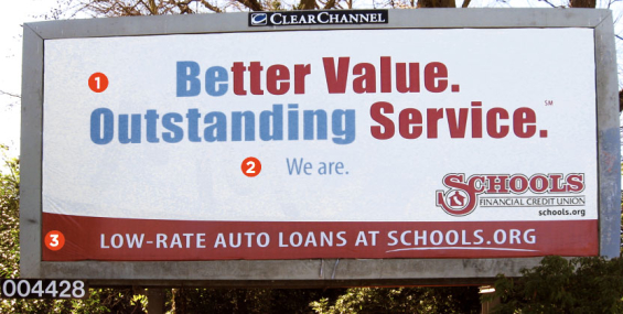
Word game sends muddled message
If you like Dan Brown novels, you’ll love cracking the multiple messages hidden in this billboard. Too bad motorists won’t have the time to figure it out.
1. The clever use of one headline for two different thoughts is a nice try. But as cars flash by, how many drivers will understand there are two messages? More likely, they’ll wonder why two colors of typeface were used.
2. The “We are” line only make sense if you understand that “all copy in blue goes together,” as in “Be Outstanding. We are.” But reading it any other way is confusing: “Outstanding Service. We are.” Beside “We are.” is self-congratulatory; other people don’t care what you think of yourself. Remember, your prospects want to know what you can do for them. Give them value, not puzzles.
3. Here’s the real selling point. Dump the confusing headline on this billboard. Auto loans with low rates is the product that should be promoted. The reversed-out copy on the red background should be the billboard message. It’s clear and tells people why they should become CU members.
Read More:Direct Marketing Clinic: Ally Bank’s Email Techniques
Closing thoughts
Focus on one product, sell it, and motivate people into action all with only seven words. See, you thought writing billboard copy was easy.
None of these three examples use a photo or illustration, which, as the cliché about being worth a thousand words says, can help communicate your message. The image shouldn’t distract from the message or be so unrecognizable that people have no time to read the headline. Graphics must complement or enhance the message.
Billboards for branding ads. Get your money’s worth by making a strong offer that inspires action.
Because billboards are often read as drivers flash by, you must put extra effort into crafting the most effective copy and design. Then, your billboards will fulfill their purpose — grab attention and get as many people as possible to buy what you’re selling.
Joe Swatek is Senior Copywriter, and Steve Bieber is Creative Director at ACTON Marketing. In their twenty years as a team, they’ve worked with hundreds of financial institutions on direct marketing promotions. They blog at Financial Marketing Insights. ACTON Marketing is a full-service direct marketing organization that provides complete direct mail marketing programs and strategies to financial institutions nationwide. Their work includes complete creative, production, staff training, and consultation.

