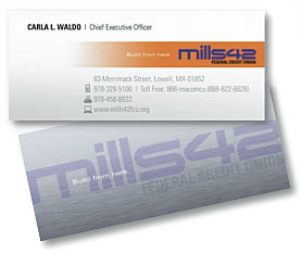
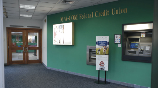
Mills42 Federal Credit Union is not big, by anyone’s standards. The credit union, based in Lowell, Massachusetts, has only one branch, $15 million in assets, and fewer than 2,500 members. Financial institutions don’t get much smaller. But with their new name and brand, they look more polished than many credit unions 50 times their size.
It wasn’t long ago that the credit union had a brand image one would expect to see from such a small organization. Back then, they went by the name “M/A-COM FCU,” a nasty-looking jumble of meaningless letters. Their website looked clunky and dated. And their branches were lifeless and totally unremarkable.
Now the rebranded Mills42 FCU has a brand identity that makes them look modern, progressive and tech savvy. They went from dumpy to downright cool — almost overnight. They look like serious players now. What a turnaround.
The credit union says Mills42 name is a nod to the heritage of the area and its role in America’s Industrial Revolution stretching back to the early 1900s. The “42” references the line of latitude where the credit union can be found on navigational charts. They say this is a tribute to immigrants from all over the world who came to work in the mills in the early days, and who still leave a cultural impression on Lowell today as the city is enjoying a renaissance.
The new brand slogan is “Build From Here.”
Read More: 11 Tips For Building A World-Class Brand Identity

Navigating Credit Card Issuing in an Uncertain Economic Environment
Build a modern credit card strategy that balances profitability and risk, adopts the latest technology and delivers the customization that cardholders demand.
Read More about Navigating Credit Card Issuing in an Uncertain Economic Environment

The Financial Brand Forum Kicks Off May 20th
Explore the big ideas, new innovations and latest trends reshaping banking at The Financial Brand Forum. Will you be there? Don't get left behind.
Read More about The Financial Brand Forum Kicks Off May 20th
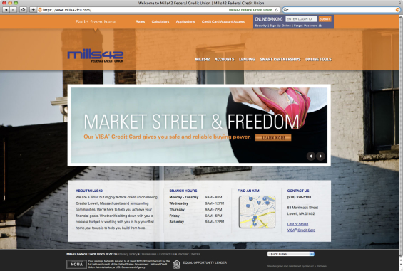
New Mills42 FCU website.
Perception Trumps Reality
This illustrates the power of perception surrounding the visual aspects of a brand. While “the clothes don’t make the man” (as the expression goes), it’s certainly true that what a man wears can go a long way towards helping him get noticed. If he dresses like a bum, he’s going to have a hard time getting dates.
The significance of this analogy is amplified for small financial institutions — both community banks and credit unions, who tend to have quaint, frumpy, tired brand identities. No matter how sophisticated they may be, they often look behind-the-times and technologically incapable.
Reality Check: Small banks and credit unions are struggling to keep up with the Big Boys. You can add all the tech bells and whistles you want — PFM, iPad apps, P2P payments, mobile deposits, etc. — and people will still see you as inadequate if you don’t have an image that goes along with that. If you look old and crusty, you are old and crusty.
Read More: How To: Brand Books For Retail Financial Institutions
No Excuses for Everyone Else
If Mills42 invests around 0.1% of its assets into marketing, its annual budget would be a meager $15,000. That their agency, Raoust+Partners, was able to pull off such an effective transformation within the credit union’s budget constraints is an impressive feat itself. Even if the agency chewed up the whole amount and didn’t leave Mills42 anything left for marketing, it’s still probably the best thing they could have done with the money.
Reality Check: If a puny $15 million credit union can afford to rebrand its identity, then all the other financial institutions don’t have any excuses.
If your institution’s image needs a makeover (and you know who you are), it’s time to step up and get on it. And here’s a good place to start: The Financial Brand’s Vendor Directory. There are 18 different Branding Firms listed there, and all have extensive expertise specifically in the financial industry (listings are not paid for).

