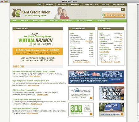
 The Financial Brand sat down with Kathy Hammond, VP/Business Development, Kent Credit Union earlier this year to talk about their rebranding project. The credit union rolled out a new logo, website and brand slogan, “We Make Banking Better.” While the rebranding is mostly cosmetic in nature, it’s a major image upgrade. There are plenty of credit unions with a lot more than Kent’s $38 million in assets and 6,300 members that don’t look this good.
What was the purpose or motivation behind the rebranding?
We wanted to re-evaluate what Kent Credit Union meant to our members, our board and our staff. And also what desires, wants and needs our members have. By combining the results of a member survey, a strategic planning session of executive management and board of directors, and “brandstorming” with the staff, we compiled valuable data from all perspectives of what Kent Credit Union means to each of them.
We also wanted a fresh, more relevant look that was representative of Kent Credit Union given all the components of branding. The new brand and identity is more iconic, focused and contemporary than our previous brand. It clearly links us to our roots in the community (Kent is known as Tree City), but also represents stability and growth. New banks and credit unions are expanding into our communities and I think the brand differentiates us from them.
OLD LOGO
NEW LOGO

Instant Messaging. Instant Impact.
Connect with your customers and provide lightning-fast support as effortlessly as texting friends. Two-way SMS text messaging is no longer optional.

How Banks Are Fortifying Their Data Against Increasing Cyber Threats
This webinar from Veeam will detail the value of working together across your organization to be better prepared in cyber defense and response readiness.
Read More about How Banks Are Fortifying Their Data Against Increasing Cyber Threats
Kent Credit Union’s slogan is “make banking better?”
How does Kent make banking better?
At Kent Credit Union, we take away the “fear” in banking. Our members’ funds are safe and secure, and backed by the full faith and credit of the United States government. We strive daily to make every banking experience a positive one, by providing excellent member service and offering a full array of products and services, many of them free.
We are committed to going beyond simply a financial relationship with our members. We are our community’s oldest credit union and have positioned ourselves to be a source for honest financial counsel; a safe place in the community that truly looks out for our members’ interests. Our new brand aligns with that. Our staff buys into this philosophy and displays it by learning names, taking a few extra minutes to chat when they can, or sending a dog biscuit through the tube at the drive-thru when they see a dog in the car. We’re committed to providing convenience, good rates and low fees, but also to giving members something extra – something better – at every opportunity.
How was the brand introduced to staff?
What are staff being asked to do to “live out the brand?”
Riding Tigers Communications did a presentation to our staff, explaining that branding is much more than a logo or a website. At the end of the presentation, they unveiled our new logo and website.
We also shared the results of a member survey with our staff to let them know our members’ likes and dislikes, and how they perceive Kent Credit Union. We compared that to our short-term and long-term strategic plan, all of which helped to formulate our new branding and the roles we would all play in achieving our goals.
The best thing about the rebranding is that staff was already living out the brand. The re-branding wasn’t about becoming something new, it was about better defining what we already are so we can communicate it better. The agency met with us multiple times, we spent a day taking them on a tour of our communities and our branches; they met our board, shot photos of the community, met most of our staff and talked with them about what we are. Then combined with a survey of our members, the new brand grew from our strengths as an organization. We never wanted to be something that we are not. Our staff was always making banking better.
Where are you at with the rebranding process?
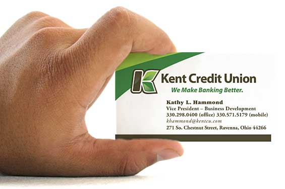
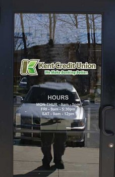
We started out with changing the imagery on our glass doors and replacing wall posters in the offices, along with business cards and other paper collateral. We also introduced the new logo at our annual meeting to our members, and have had several ads in the local media sporting our new logo. Brochures and other credit union literature will be introduced as we deplete current supplies, which may not be ideal, but in this economy, we must use our funds wisely.
We’ve also done giveaways such as pens, sports bottles, keychains, etc., with the new logo that have been distributed at showcases and various other credit union events.

