Bridge Bank – Keep the Color Scheme, Dump The Rest
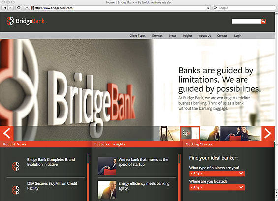
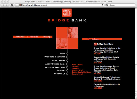
Bridge Bank is a full-service business bank focused on offering small- and middle-market loans in the highly competitive Silicon Valley. They launched in 2001 with a rather lackluster image. Their new rebranded identity is a case study in how design can affect a company’s image and people’s perceptions of it. The new look and feel preserves the bank’s original red-on-black color scheme, but adds a layer of style and sophistication seldom seen in the financial world. The new design feels super contemporary — almost like an internet company — and exudes a feeling of class without necessarily suggesting a higher cost to consumers.
Lesson #1: Never underestimate the impact your brand’s visual components have on people. There are quaint sayings like “never judge a book by its cover” and “beauty is only skin deep. While the clothes might not “make the man,” they can certainly help him get noticed. If people don’t notice you, you’ll never develop a relationship with them. That’s why you need to look as good as you can.
Lesson #2: When rebranding, you don’t need to dump the baby out with the bathwater. You can preserve some elements to provide a thread of consistency between the old and new identities. It also helps weave a PR story about “honoring the company’s legacy.”
Read More: How To: Brand Books For Retail Financial Institutions

Why Industry Cloud for Banking?
PwC’s Industry Cloud for Banking helps deliver personalized products and services that today’s customers expect.

Fractional Marketing for Financial Brands
Services that scale with you.
Read More: 50 of The Most Spectacular Website Designs in Banking
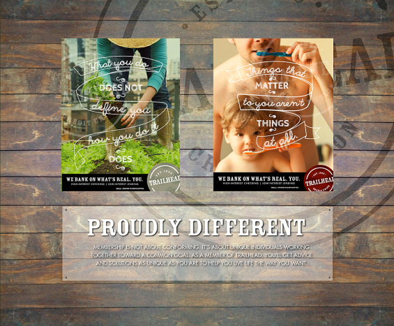
Trailhead Credit Union – Distinctively Northwest
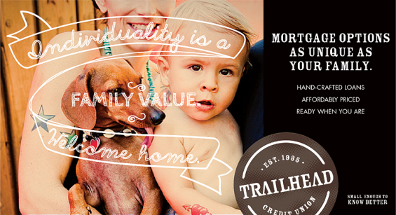
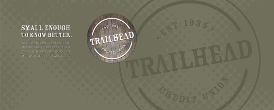
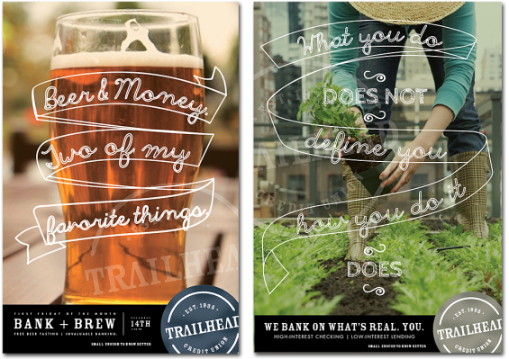
The credit union was one of nine in the state of Oregon with the word “Northwest” in their moniker, so they decided to change names. They didn’t want to abandon their Northwest roots, they just wanted a more distinctive name. So they rebranded as Trailhead Credit Union, and rolled out a new identity that has a breezy style that sets them apart — not just from other “Northwest” credit unions, but from all financial institutions. The new brand connotes themes of individual expression, casual confidence and commonsense wisdom. The unusual handwritten typographic approach imparts a sense of craftsmanship in the brand — a refreshing change from the cold, corporate, institutional feeling conveyed (intentionally or otherwise) by most financial marketers. Also note that the logo can appear in different colors, an unconventional decision some critics might decry as branding blasphemy. But with branding, there aren’t any rules, and if there were, the first rule would be: “Break all the rules.” Agency: Weber Marketing Group
Lesson #3: If you look like everyone else, you’re going to blend in… and that’s not what great brands do. Way too many financial institutions share the same names, same colors, same slogans, same photos, etc.
Lesson #4: There is always a fresh, creative solution to even the most tired problems. Trailhead isn’t the first financial institution to wonder how it could create a brand with Northwest appeal. They are just the first to use this execution.
Read More: Is It Time For You To Rebrand?
Vibe Credit Union – Can You Feel It?
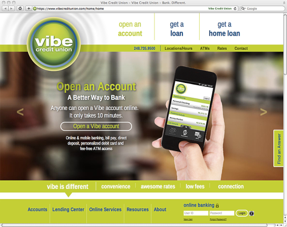
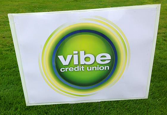
Vibe developed this new brand identity as part of its name change from “Telcom Credit Union” which it consummated in March 2013. The new look and feel is loaded with energy — so much so that the logo makes ripples wherever it lands. A tangy lime green color palette and emphasis on simplicity give this modest-sized financial institution a modern, tech-savvy image. Even on a plain white vinyl banner the logo looks great.
Lesson #5: Small financial institutions are seen as less tech savvy. In the internet age, this is a big problem. But they can use their brand identity to compensate for these perceptions. You can use your look and feel to attack people’s stereotypes and break yourself out of the mold. If you want to be seen as technologically sophisticated, you can design an identity that connotes that. Just make sure you walk the talk.
Read More: Knab Aims To Turn Banking Upside Down… And Backwards
Aldermore Bank – British Banking
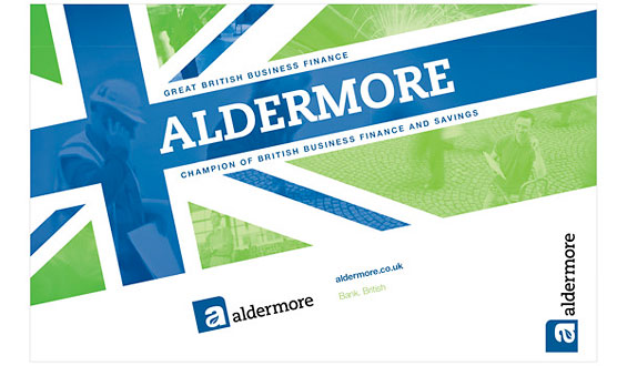
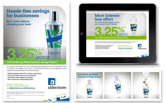
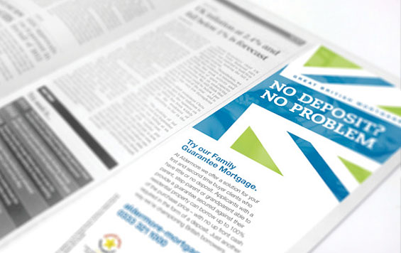
This denovo bank launched operations back in 2009. It’s very surprising that a bank that wants a patriotic brand — literally wrapping itself in the British flag — would choose to alter the colors on the sacred Union Jack. But these unexpected hues play a large part in why the Aldermore Bank brand identity catches your eye. For a bank that’s trying to position itself as a scrappy alternative that’s turning financial services upside down, this is a smart approach. Die-hard anglophiles might disagree.
Lesson #6: Zig when everyone else is zagging. Always do something unexpected with your brand identity. Lots of financial institutions love to talk about “surprise and delight,” but few apply the principle to their visual designs — yawn… Don’t be boring.
Lesson #7: Don’t be afraid to piss some people off. Great brands aren’t built for everyone. Great brands are polarizing — some people love them, others hate them. The worst thing you can have is a brand that just makes people shrug. The whole point of branding is to trigger an emotional reaction.
Read More: Everything You Should Know About Branding But Were Afraid To Ask

How Banks Are Fortifying Their Data Against Increasing Cyber Threats
This webinar from Veeam will detail the value of working together across your organization to be better prepared in cyber defense and response readiness.
Read More about How Banks Are Fortifying Their Data Against Increasing Cyber Threats

Instant Messaging. Instant Impact.
Connect with your customers and provide lightning-fast support as effortlessly as texting friends. Two-way SMS text messaging is no longer optional.
Aliant Bank – Clean & Conservative
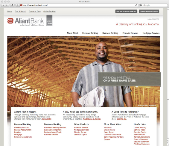
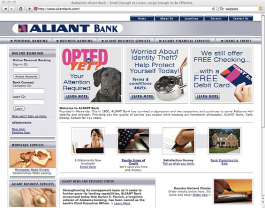
This 113-year old bank changed its brand identity, including a new logo, website and brochures. It’s a big improvement over Aliant Bank’s previous logo that looked like it was designed sometime in the 70s.
Lesson #8: Don’t get married to your look and feel. Just because you are a hundred-year old bank doesn’t mean you need to look like it. Great brands update and refresh their visual identities often. Some brands in the fashion sector will do it almost every year, although the average in the financial industry is around seven years. Don’t go more than a decade without revisiting your brand design. Keep upgrading it as time goes by or consumers will think you’re stale, inflexible and behind-the-times.
Global Credit Union – Local Artists for Local Flavor
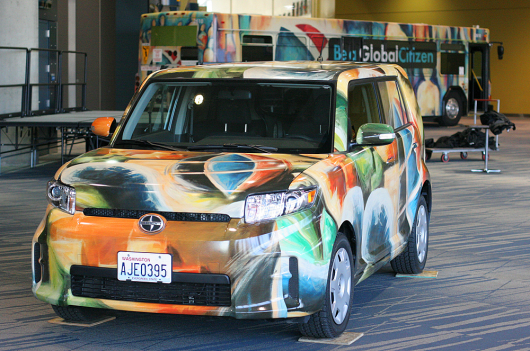
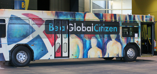
The new brand identity for Global Credit Union ($364 million assets) in Spokane, Washington was built through crowdsourcing. They wanted a more authentic brand than stock imagery can typically deliver, so they tapped artists in the local area to create graphics and music for the new look and feel.
“We started by reaching out to the community,” the credit union explains. “The pieces you’ll see in our new campaign are original works created by local artists and musicians — people who are doing what they’re passionate about, not because it makes them rich, but because it enriches their lives.”
Agency: Boom Creative
Lesson #9: Thousands of banks and credit unions lay claim to the “we’re local” position. But few things are more ironic in the world of financial branding than the “local” institution who uses an out of town (or out of state) ad agency to develop marketing materials with stock photos and phony testimonials. Banks and credit unions love to spout off about how they stand for this and stand for that… then promptly ignore all these cherished beliefs when it comes time to design the visual identity. There should be synergy between your brand’s strategy, its messages and its visual appearance. You can “live what you preach” in your brand identity. If you’re going to claim to be “local,” then you need to do something truly local with your look and feel.
Read More: 25 of The Coolest Vehicle Designs From Banks and Credit Unions
Numerica Credit Union – Coordinated Color Palette
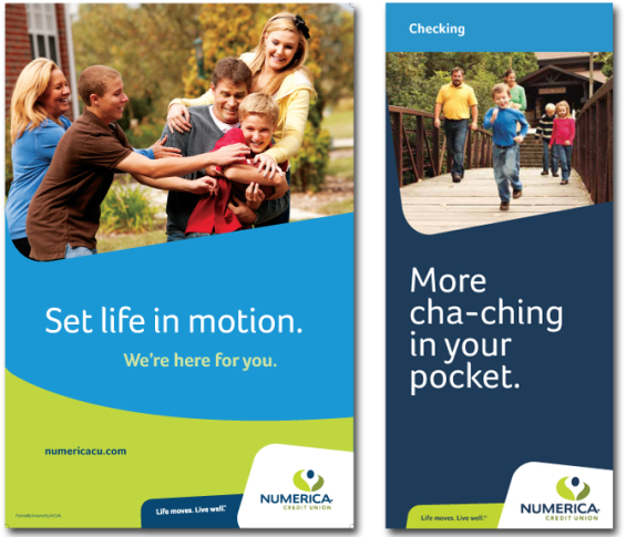
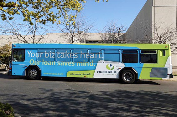
Many graphic designers complain about working with a limited color palette — “It’s boring! I’m tired of working with the same three colors all the time!” But the reality is that you will always grow weary working with your brand’s palette no matter how many colors it has. Everything in Coke’s world is always red. Home Depot is always orange. Numerica Credit Union is always cyan + lime + blue. Agency: The Karma Group
Lesson #10: You do not need a rainbow of colors to achieve good design. The best and biggest brands in the world exercise a level of discipline and restraint when picking colors that financial marketers should aspire too. When building brands, consistency and cohesion are key, and they aren’t the same thing. Consistency is doing the same thing predictably. Cohesion is doing things in a way that creates unity.
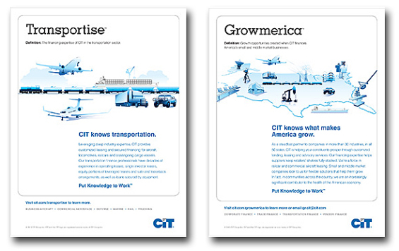
8. CIT – Bankspeak
CIT felt they needed a new vocabulary to express all that they stand for. So they coined their own language — combinations of words that reflect their approach and personality.
Lesson #11: CIT demonstrates how a financial brand can use copywriting as an important brand-building tool. Not many banks and credit unions think to utilize a consistent voice, style and message in their marketing, but CIT shows how copy can be used as a cornerstone branding. They’ve stuck with this campaign for a while. In branding, consistency breeds familiarity.

