 The emergence of a new, educated middle class with a larger savings capacity has meant Mexico’s demand for financial services is on the rise. Most Mexican banks have been slow to adapt.
Enter El Banco Deuno. This upstart bank is sporting a fresh brand identity that is simple, distinct, flexible and aesthetically pleasing. And the best part is that the new look-and-feel is actually based on strategy.
El Banco Deuno roughly translates to “one’s bank” — in other words, “my bank, and everybody’s bank.”
The bank’s slogan is, “El nuevo banco para el nuevo México,” which means, “The new bank for the new Mexico.”
The branding and design work was done by Saffron, a firm that prides itself on finding “inspiration in expressions of local culture and interpret them in a way that speaks the global language of design.”
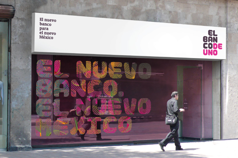
The identity integrates nicely into environmental applications.

The typography in the logo is as daring as anything ever attempted in the financial industry. Branding firm Saffron worked with Type Invaders to create a proprietary typeface exclusively for El Banco Deuno’s use only. The bank’s logotype and main typography were inspired by a pre-Columbian pattern found near Mexico city. It is a combination of the stone carved glyphs and the calligraphic quality from hand painted signage.

The Power of Localized Marketing in Financial Services
Learn how to enhance your brand’s local visibility, generate more leads, and attract more customers, all while adhering to industry regulations and compliance.
Read More about The Power of Localized Marketing in Financial Services

Industry Cloud for Banking from PwC
PwC’s Industry Cloud for Banking applies our deep industry knowledge to your specific business needs

The logo is designed to function in multi-colour scenarios to be more expressive and break the mold of the traditioanl bank which typically lives in more rigidly contolled colour environment.
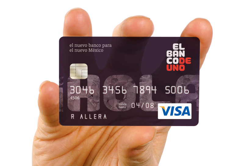
The letters are also used as container shapes for communication elements or illustrations.
Products and services are subranded, using a complementary color palette and the bank’s distinctive typography.


