The credit card industry is changing. The market is becoming increasingly competitive, and new entrants are coming, which means there’s significant potential for incumbents to lose market share and face increased marketing costs. In 2015, only 18% of consumers chose a credit card on brand preference. And consumers are happy to switch providers too, with 14% of credit card holders taking out a new card each year.
At the same time, acquisition costs are increasing. For instance, the cost per click for credit card keywords in Google AdWords has increased by more than 14% in the last year, according to the paid media agency Brainlabs. Liam Milner, Group Account Director at Brainlabs says this has largely been driven by increased competition.
It is against this challenging backdrop that Conversion.com analyzed the credit card websites for five of the largest banks in the UK: Barclays, HSBC, Lloyds Bank, Royal Bank of Scotland (RBS) and Santander. In the course of their evaluation, they leveraged a combination of usability testing, consumer surveys, third-party research and heuristic analysis.
Based on its assessment, Conversion.com concludes that there is significant opportunity for financial institutions to reevaluate how they position their credit card products online. None of the banks they looked at performed strongly, but Conversion.com says that adopting best practices for optimization and testing would dramatically increase results for all of them.
Here are five key themes that Conversion.com identified as components critical to the success of any online marketing campaign promoting banking products.
1. Consistency of Marketing Messages
The first goal of any landing page should be to confirm for the user that they are in the right place. Before a landing page can motivate the user to take action, it needs to reassure them that the page is consistent with the last action they took immediately prior to landing on the page.
For many potential credit card customers, this will be the search results page for keywords like “credit cards.” For both organic and paid listings, banks need to ensure that the message the user sees in their search results aligns with what they find on the landing page.
But surprisingly — given the high cost of advertising on credit card-related keywords — Conversion.com says this is often not the case.
For instance, Santander had been bidding on the search term “credit cards” using the following ad:
The ad’s main message is clearly focused on the reader’s needs, suggesting that they might find a credit card comparison tool or some sort of interactive card finder if they clicked on the link.The ad’s copy touts Apple Pay, “fast decisions” and a five-star rating from Defaqto. It’s fair to assume that these messages are motivating users to click on the ad, yet the landing page doesn’t seem to pay off on the implied promises.
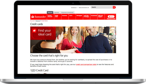
Instead of finding an interactive credit card comparison/shopping tool, users are simply presented with a few card options and told to “pick the ideal one” after reading long blocks of copy about each. After scrolling, the copy doesn’t mention any of the other benefits from the ad — Apple Pay, fast decisions nor the five-star rating.
Conversion.com found a similar problem with Barclays, who was running the following ad:
The ad emphasizes “flexibility with your finances,” but the landing page doesn’t mention anything about this. Instead users find a large volume of text and little motivational content. It’s just another standard webpage about credit cards — descriptive copy and rates.
If you’re going to dangle “flexibility” as a selling point for credit cards, you had better mean more than the typical purchasing “flexibility” that any credit card afford. There were only about a dozen words in the Barclays ad, and the main one was “flexibility.” It’s likely that anyone who clicked on the ad was looking for a truly flexible card — one that has a limit that can adjust dynamically, or features that can easily be activated/deactivated.
Key Insight: Considering how few words there are in a Google Adwords ad, you must make sure you’re delivering on each of them in your landing page. Writing effective ads for search and then converting clickers isn’t a perfunctory exercise. If your ad uses shallow platitudes and corporate clichés that point at a generic page, you’re going to get lousy results.
When optimizing the user journey, it’s easy to think about the landing page, but Conversion.com says banks must think about context — the experience before the landing page — so you fully understand the user’s mindset at the time they clicked. Otherwise, the user will quickly dismiss your landing page and bounce back to their search results.

How Banks Are Fortifying Their Data Against Increasing Cyber Threats
This webinar from Veeam will detail the value of working together across your organization to be better prepared in cyber defense and response readiness.
Read More about How Banks Are Fortifying Their Data Against Increasing Cyber Threats

Industry Cloud for Banking from PwC
PwC’s Industry Cloud for Banking applies our deep industry knowledge to your specific business needs
2. Segmenting Users By Motivation
Credit card customers are diverse. A report from The Financial Conduct Authority in the UK identified four key types of credit card customer:
- Borrowing for purchases – Looking to make either a larger purchase such as a holiday or furniture or regular spending such as utilities.
- Refinancing existing debt – Those with existing debt looking for a more cost-effective way to pay down their debt.
- Everyday spending – People who want to use their credit card for everyday spending and are typically motivated by rewards.
- Building credit history – Typically younger consumers with limited or impaired credit history who want to build (or rebuild) their credit history.
Conversion.com says it’s essential that the content on landing pages maps back to the user’s unique needs. Someone looking to build their credit score will have different requirements and motivations than someone who wants
to make big purchases with their new credit card. Treating all consumers the same will result in a high bounce rate, a low conversion rate and ultimately an unnecessarily higher cost-per-acquisition.
Because each user segment has different motivations, their potential objections are likely to be different too. As a result, Conversion.com says landing pages should appeal to each segment separately, and provide clear signposting to the product that’s right for them.
In the Conversion.com analysis, Barclays did this well. They’ve grouped their nine different credit cards according to the four different segments defined above.
Conversion.com says segmentation based on user intent is the best starting point for creating a more personalized experience. Taking cues from a user’s demographic, technological and behavioral profile can enable you to deliver a more relevant experience — not just on your campaign landing pages, but across your entire website.
3. Comparing Options
Choosing a credit card is a complex decision, with multiple variables to consider. Across each of the banks Conversion.com analyzed, there were multiple opportunities on each website to further aid the user’s decision-making process. As one subject in the usability study said, “I would have to call, so that someone could explain to me the differences between each of the cards.”
From a usability standpoint, Conversion.com singles out three key elements that each user is looking for:
1. Showing the key information in a clear and easy-to-read format. There are eight basic parameters with credit card offers: purchase offer, balance transfer offer, rewards, annual interest rate, annual (or monthly) fee, credit limit, default fee and balance transfer fee.
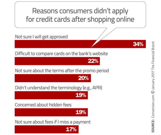
2. Clear terminology that explains the offer. In Conversion.com’s market survey, 19% of users stopped applying for a credit card online simply because they didn’t understand the terminology.
3. An easy-to-compare format. Showing credit cards in a list is harder to compare than a table. In Conversion.com’s usability testing, this has a clear impact on a user’s cognitive load (the mental effort required to make a decision).
Conversion.com found two examples where the experience missed the mark. Lloyds Bank stacked one card on top of another, with the terms of each credit card clearly presented and contextual pop-up boxes with definitions and explanations to help users understand “what these numbers mean,” but there is no way to easily compare the cards Lloyds offers.
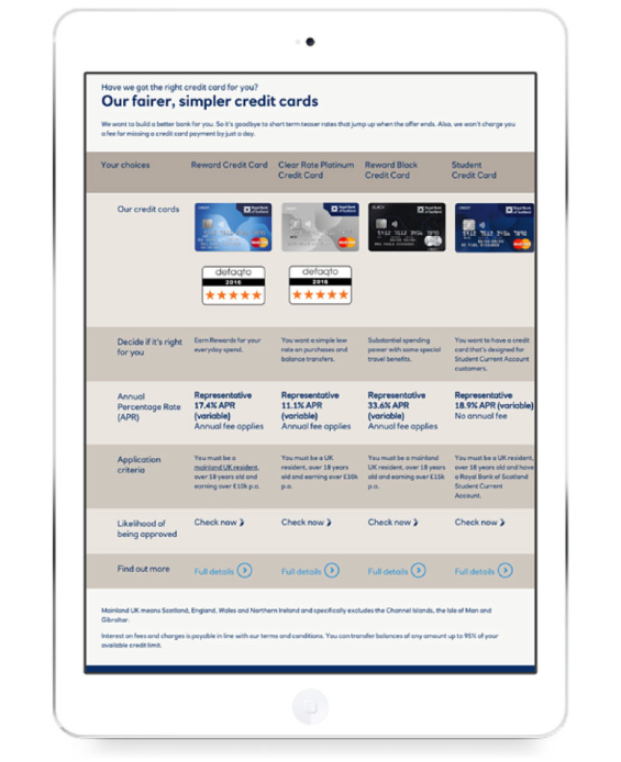
By contrast, RBS presents a more convenient and visually accessible grid that makes comparing its different cards fairly straightforward. However, there’s only limited information shown for each card, and there are no tools to help users define the terminology used on the page.

4. Overcoming Objections
According to the consumer survey Conversion.com fielded, by far the most common concern was whether the applicant would be approved. In fact, one in three respondents said they didn’t apply for a credit card because they weren’t sure they’d be approved. After all, a rejected application is a waste of time and hurts user’s credit score.
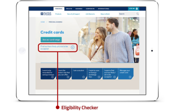
For such an important objection, Conversion.com says it’s surprising more financial institutions don’t offer an eligibility checker. With an interactive eligibility checker, the user doesn’t need to read a bunch of text about requirements and conditions. Instead, they can just complete a simple form to find if they’re likely to be approved.
5. Completing the Application
After developing and marketing the credit cards, then acquiring the visitor and motivating them to convert, the only thing stopping the visitor becoming a new customer is the application form.
While all banks are asking for similar information from their customers, Conversion.com found that there’s a significant difference in performance in usability tests.
Santander’s credit card product pages give a poor user experience. The main content is positioned below the fold, and the primary “Apply” call-to-action is hidden. In comparison, the secondary (and strategically less important) call-to-action “Calculate” is actually far more prominent. Look at the screenshot below to see if you can find the “Apply” link.
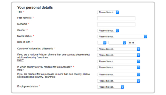
HSBC’s online application form structure performed poorly in Conversion.com’s usability tests. By left-aligning the form labels, it’s harder for the user to see how to fill out the form — a problem compounded when the user is presented with a series of dropdowns, which aren’t clearly aligned with the label.
Having a mobile-friendly landing page and form is basic table stakes for banks looking to compete in the Digital Age. And yet one bank in Conversion.com’s study (RBS) didn’t provide users with a mobile-compatible online application. And just because they had a mobile-friendly form doesn’t mean the experience was optimized. In Conversion.com’s analysis, only HSBC managed to use the correct keyboard for each field’s input. Other banks, like Barclays, made it harder for the user to complete fields like date-of-birth and phone number which need the number keypad; instead Barclays defaulted to the standard alphabet keypad.
Closing Thoughts
Advertising costs are expected to continue increasing, and the market is likely to become significantly more competitive. Disruptive entrants won’t have the technical limitations or organizational deficiencies of legacy providers. Best practice design standards will be their starting point, not the “goal” they’re chasing. This is why fintech startups and neobank challengers are better positioned to success than the the traditional financial institutions. Retail banks and credit unions need to ramp up their digital skills, obsess over UX and scale up their testing to maintain their competitiveness.
You can read the entire 44-page report about marketing best practices and online UX in the credit card industry by visiting the Conversion.com website (click here).


