People don’t like to read a lot of text on a web page — hence the popular expression “TLDR” (too long didn’t read). That’s why making marketing communications more effective depends on using images to catch the eye, bullet-style content to trim words, and infographics to illustrate key concepts.
Banks and credit unions that adopt this type of visual approach for their website content can reap meaningful benefits like higher sales.
Even better, there is no need to re-write an entire website. The effort can be as simple as finding opportunities to re-purpose and enhance the existing content.
Doing so yields outsize results. It creates a remarkably more engaging website experience, highlights brand and product value succinctly, better communicates important messages, and helps support digital sales goals.

The Financial Brand Forum Kicks Off May 20th
Explore the big ideas, new innovations and latest trends reshaping banking at The Financial Brand Forum. Will you be there? Don't get left behind.
Read More about The Financial Brand Forum Kicks Off May 20th

How Banks Are Fortifying Their Data Against Increasing Cyber Threats
This webinar from Veeam will detail the value of working together across your organization to be better prepared in cyber defense and response readiness.
Read More about How Banks Are Fortifying Their Data Against Increasing Cyber Threats
Create a More Engaging Website Experience
“I love reading long paragraphs of text on the web,” said no one, ever.
Visual content increases the chances that a consumer will begin reading a site in the first place. This goes beyond product information and extends to the brand story and business goals.
A perfect example is the “About” page.
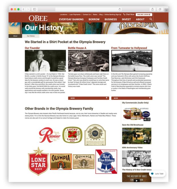
More often than not, a financial institution’s About page consists of paragraphs of text that detail the roots of the bank or credit union and the values it espouses. This content is often an important part of the consumer journey. It can be a key differentiator and motivator, prompting someone to choose one bank or credit union over another.
Adding visual elements is a way to increase the impact of a financial institution’s unique story and strengthen the brand.
The example shown here is from O Bee Federal Credit Union in Lacey, Washington, which got its start serving employees at Olympia Brewery.
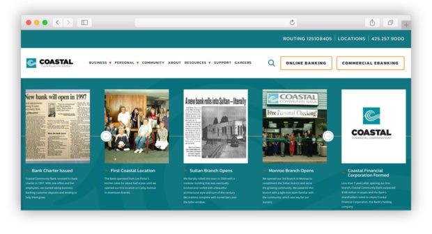
 Some institutions use illustrated timelines with historical photos to achieve this effect, as in this example from Coastal Community Bank in Everett, Wash.
Showcase the Value Proposition More Effectively
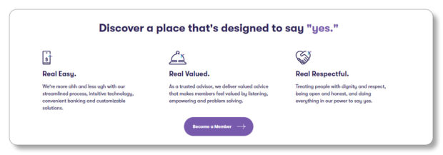
In many cases, breaking long blocks of type into points or buttons makes a big difference, but they have to be broken out in a way that registers on the eye. Tiny bullets won’t cut it.
Not visual
Visual
Visual
Help Consumers Absorb Product Information
Visual content is easier for people to digest. It enables them to better understand the distinct features and benefits of the products and services — which can also be competitive differentiators for a financial institution.
Options for visual display include: icon bands, content organized into columns and comparison charts, and points of emphasis and distinction. All of these enhance the level of comprehension for people who are reading the information, to better support the consumer journey and decision making.
Not visual
Visual
The pages listing Checking or Savings accounts are prime places to create this kind of improved experience.
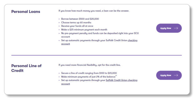
Most banks and credit unions offer multiple types of accounts with creative yet arbitrary names. These accounts require explanation to convey what the differences are to consumers shopping around.
But the same tactics can be applied with other products as well, whether personal loans or mortgages.
Not visual
Visual
Visual
Having visual elements to call out perhaps which account is most popular, who or what each is best for, or even just the main distinctions among the products can provide valuable guidance.
Helping website visitors choose the right financial solution for their unique needs can increase consumer comfort, confidence and overall satisfaction. This can lead to a positive, profitable relationship.
Read More:
- Top Marketing Challenges for 2023 and How to Overcome Them
- How to Stretch Your 2023 Marketing Budget as Media Prices Rise
- Credit Card Promotions Focus on Offering Value, in Nod to Inflation Grinch
Give Directional Cues and Emphasize Important Messages
Visual content, with its more distinctive treatment, is less likely to be missed. So this can be an especially helpful way to provide directional cues to consumers, showing them where to click to do what it is they came to the site to do.
Not visual
Visual
Visual content also helps ensure that important messages are received.
So whether the goal is to highlight key messages and features, draw attention to timely offers, or emphasize calls to action, visual content is a great way to accomplish this.
For example, on a page promoting home equity credit, a bank or credit union might want to highlight how this can be used toward large expenses and life events.
Another option would be to demonstrate how simple the application process is, from pre-approval to all-digital applications. This can help position the product based on relatable financial goals or life stages while eliminating potential barriers to encourage action.
When taking a more visual approach to content, everything remains HTML based, supporting Americans with Disabilities Act compliance, offering optimal value for an on-site search engine optimization strategy, and maintaining responsiveness to provide a consistently positive experience across different screen sizes and devices.

How to Begin Enhancing Content Presentation
If your website is built on a flexible content management system, this will give you greater capabilities to create visual content. Not only does it provide enhanced control for marketing and messaging, but it also enables the development of components that can be used to create custom content experiences.
This makes it easier to maintain consistency across the site, while allowing for the creation of unique presentations based on the specific product or page.
Features or components that support visual content can be robust single-purpose solutions, or as simple and adaptable as larger or distinct text styles, horizontal or vertical lines that provide visual breaks, or branded backgrounds to give more emphasis to a specific statement.
Such elements can often be introduced easily, and if your content or site overall needs an overhaul, you can certainly plan to create more visual content as part of a full redesign project rather than a refresh.
Just remember this: It’s not what you say, it’s how you say it that will make a difference to your audience.


