FNB’s new website concept is so unique and unusual, it takes four separate online marketing experts in the banking industry to review it.
 Frustrating Hiccups & Confusion Pepper The FNB Online Journey
By Laurie McLachlan, Andera
Recently many big U.S. banks have redesigned their websites to deliver a cleaner, more modern user experience, to sell more effectively, and to address online application abandonment. But often times, the biggest innovations come from institutions outside of the U.S. With FNB’s website, we’re going to focus on some of the key items that influence online acquisition:
1. Creating a great first impression – Does the site seem safe and credible?
2. Selling convenience – Am I sure that this bank has ATM and branch locations that are convenient to me?
3. Selling products effectively – Does the site help me choose the best products with confidence?
4. Facilitating the online application process – Is it fast and easy for consumers to apply online?
Creating a great first impression. The first thing that strikes you about the new FNB site is well… it’s different — really different. FNB’s site doesn’t feature any cliché images of happy people or happy customers, nor much imagery at all for that matter. It is professional and polished, but what really stands out more than anything is the navigational structure; it’s unlike any U.S. institution website I’ve come across.
( See More: 50 Of The Most Spectacular Website Designs In Banking )
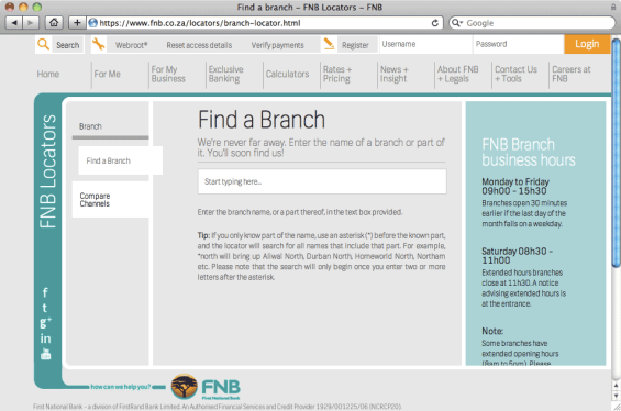
Selling convenience. Selling is hard when you’re hard to find. The home page and main navigation of FNB’s site make no reference to “Find an ATM” or “Find a Branch” so I clicked “Contact Us” and I found these search tools there. First, I searched for a branch location, but — egad! — the search tool asked me for a branch name. Maybe if I were a customer, I’d might already know of a branch located nearby, but what about everyone else? And what about those who might refer to your branches using other names than you do? Next, I tried finding an ATM and I encountered the same issue. I clicked “Find an ATM” and I landed on a page with all kinds of information… just no list of locations. There was a search bar, but without any instructions it wasn’t very clear how to use it so I gave up.
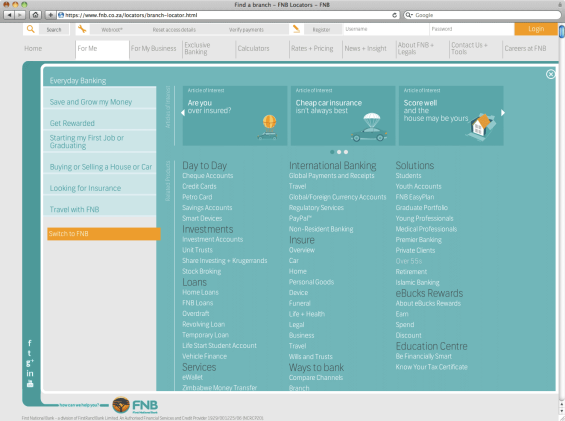
Using a consultative selling approach. FNB tried to incorporate goal-based selling in its website with a section titled “For Me.” If you click on “Everyday Banking,” you might expect FNB to present you with basic checking and savings account options. Instead, they present you with a really long list of products. I guess they expected you to click on- and then read about each one to figure out what you need. It’s a lot to ask.
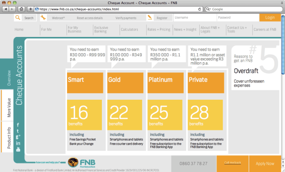
FNB’s “Cheque Account” product matrix feels familiar. It is about the best thing we’ve managed to come up with in the U.S. At first, I liked how it clearly explained what you needed to qualify for the various accounts. It made sense: higher earners get more benefits. However, you can’t tell the difference between the “Smart” account with 16 benefits and the “Gold” account with 22, since the matrix only lists a few selected benefits. Observant users may eventually notice the vertical tabs along the left (“More Value” and “Product Info”), but I never could find all of the benefits they were counting.
It was also difficult to figure out what each account costs since the pricing listed at the bottom of the matrix is phrased as “from R40.00 based on the unlimited pricing option.” I couldn’t find any information on the unlimited pricing option or their fee schedule. I’m guessing that the average consumer glosses over this detail and so I click “Apply Now” and forge ahead.
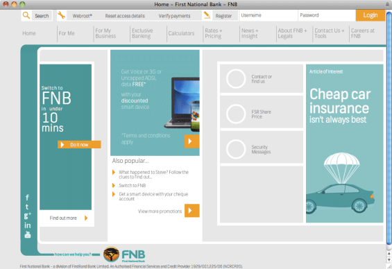
Facilitating online applications. It’s simply shocking how hard it can be to find online application links. That’s why I was so happy to see that FNB makes it so easy to start an online application right from the homepage. FNB’s website dedicates prominent space letting site visitors know that they can switch to FNB in under 10 minutes. That’s smart, because most consumers will bail if it takes longer.
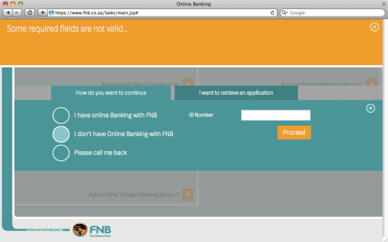
When I clicked the orange “Do It Now” button. When FNB asked me to pick the types of accounts I wanted, I wasn’t sure how to do it. Eventually I figured it out, but it wasn’t immediately obvious or intuitive, and took some time to decipher. The next screen asked whether I was already signed up for online banking with FNB. When I said no, “I don’t have online banking with FNB,” the website prompted me to enter a tracking cod so they could retrieve my application. Now I love that they offer a “save and resume feature,” but I was terribly confused since I hadn’t saved (much less started) an application previously. Am I not able to open a new account unless I already have online banking? I clicked the orange “Proceed” button even though I didn’t have an ID number. I was stopped by an error message that stated: “Some required fields are not valid.”
It would appear that FNB doesn’t allow new customers to open accounts online. If that’s the case, it’s a colossal missed opportunity. Whatever the case may be, they could do a better job explaining what is needed to open an account online and provide some guidance on the process (e.g., cues, prompts and info [?] links). Instead, they left me feeling like I made a mistake and I was pretty confused about what I needed to do next. I suppose if I were an actual shopper in South Africa looking for a new account, I’d drive to the nearest branch… I just can’t be certain it would be FNB. Especially if I can’t find them.
( Read More: 10 Tips To Drive More Online Applications )

Industry Cloud for Banking from PwC
PwC’s Industry Cloud for Banking applies our deep industry knowledge to your specific business needs

Are You Ready for a Digital Transformation?
Unlock the potential of your financial institution's digital future with Arriba Advisors. Chart a course for growth, value and superior customer experiences.
A Fresh Customer Centric Approach
 By Daniel Agmon, Backbase
FNB’s new public website is leaps and bounds ahead of what other banks have attempted to date, especially in terms of its modern look and feel and customer-centric approach. It has the potential to be a homerun with old and new customers alike. Let’s take a look at what they got right and where they may have veered too far off course.
One thing that is immediately apparent when visiting the new FNB site is the focus on customer experience. It’s incredibly visually appealing and everything, from navigation to tools and bonus content, is geared towards engaging with the customer — talking to them, rather than at them.
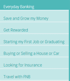 The retail banking section of the website provides a clear menu of the most used products, and is bursting with carefully targeted, integrated content that is readable and informative (if not a bit impractical in execution and presentation).
The secondary navigation is attractive and appealing. Rather than boring old buttons, the navigation employs clickable blocks of text and icons that make the experience a little more fun. This has the added bonus of easing consumers into the potentially overwhelming number of products and solutions available within the retail banking section.
FNB drastically simplified the online application process. Visitors can get to the meat of the form in just a few clicks, and find a clear idea of what kinds of documents they’ll need to finalize their application. The process is slick, giving users a shopping cart pre-filled with all the different products they had seen while on the site. This is a truly innovative idea — recapping a list of products customers evaluated, then allowing them to choose what products they want to proceed with.
One other thing that stood out was how FNB highlighted customer service, with online and phone support options consistently and prominently displayed on every page.
That FNB chose to embrace responsive design is also commendable. The public-facing site performs well across mobile and tablets. It seems that a lot of effort was put to adapt the site to the multichannel.
( Read More: Responsive Web Design For Financial Institutions: Fad Or Strategy? )
However, there are a few areas where improvements could still be made. The whole process of researching the different account plans could be smoother and simpler. In the “Cheque Accounts” section for example, the design incorporates oversized elements and complementary colors which might be difficult for some users to take in. The list of services is bewildering and could easily overwhelm many users.
Although the navigation is generally very well done, there are some inconsistencies. Specifically, the “Product Info” tab on the left leads to different pages, depending on how you navigate to it. Clicking on products from the bottom of the “Overview” tab takes the customer to the “Product Info” tab, but the same information cannot be found when clicking directly on “Product Info.” Much of the information contained on this section of the site is repetitive and a little confusing, which is a shame considering the layout could be very effective. Customers may also be confused by elements which appear to be clickable by displaying the hand-pointer cursor when mousing over blocks that aren’t actually clickable.
Overall, the flat design looks clean and modern but some old fashioned elements and small inconsistencies in the composition of the elements drag it down a notch. But in the big picture, these small blips don’t detract from the fact that FNB has taken a big step forward, creating an innovative, bank 2.0 online experience. Obviously FNB will optimize the site over time, and it will be interesting to see how the site evolves over the next few months.
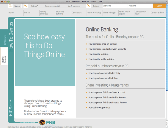
It would be even more interesting to monitor changes to the design of FNB’s online banking system, but alas that’s on the other side of the “iron curtain.” It would be great if FNB would create a live demo to give everyone — potential customers and us industry analysts — a chance to look inside the online banking site and see for ourselves if they’ve been as successful there as they were with the changes to the public-facing marketing site.
( Read More: Wells Fargo Revamps Website Homepage With Lifestage Carousel )

 The Site Design Destroys The Bank’s SEO
By John Siracusa, mOSa eBank Marketing Services
I’m not going to address the aesthetics of design today. Instead, I’m going to focus on how the structure of a website’s design can affect its ability to rank in search results. In other words, we’ll examine the nuts and bolts of FNB’s site to evaluate what works and what doesn’t in terms of search engine optimization (SEO).
Avoid iFrames and JavaScript when SEO matters. The site is constructed using both iFrames and JavaScript, neither of which are very SEO friendly. Google’s spiders can read these to a certain extent, but its understanding of the content on these pages is limited. Look at FNB’s “For Me” and “For My Business” sections from the home page. None of these pages has their own individual URLs. This means that they are not targeted for their own keywords, nor can these individual services receive inbound links from other sites to gain authority. When an entire site is constructed this way, all hope for SEO is lost. JavaScript, when it is used, should be a supplement to enhance the user experience in the form of simple, easy-to-use navigation menus and other helpful tools. It should not be used as the site’s primary infrastructure because Google’s spider will stumble while crawling it. UX is only one small factor when it comes to search ranking; it should never take precedence over SEO.
( Read More: 5 Ways To Fine Tune Your Bank’s SEO Strategy For Maximum Impact )
SEO should not be an afterthought. For banks, geotargeted keywords matter. FNB’s site fails to make use this to their advantage. When a bank uses locally based keywords, it reduces competition to only those in their geographic area making it easier to rank highly in the search engines. The title tags on the FNB site are generic, with titles such as, “Overview – Private Banking – FNB.” A better, geotargeted title tag would read “First National Bank | South Africa | Private Banking Overview.” The lack of SEO is further evident when individual pages are examined and the meta descriptions and meta keywords are found to be empty. Maybe the site was designed with plans to optimize later, but the two should work together — now, from the very beginning. No design should ever be executed before factoring the SEO effects.
Keyword analysis is priority #1. When analyze the keywords associated with FNB’s website, we can see that traffic is generated by obvious brand-centric terms like “FNB” and “First National Bank.” The institution should also exploit other terms like “Johannesburg” so that critical customer segments can still find them in search results. In the Q2 2013, FNB ranked for 1,800-2,100 different keywords, down about 850 terms since relaunching with the new site. Although a drop in rankings is typical with a major site redesigns, FNB may not be able to rebound due to the iFrames and JavaScript site architecture.
The bottom line is that while the site design is attractive and optimized for mobile devices, they really missed the boat with SEO. A site that looks good still performs poorly for search marketing if it is not optimized. I recommend doing away with iFrames and JavaScript. The bank would still be able to deliver a user-friendly, dynamic, search engine optimized website.
( Read More: 50 Essential SEO Terms Financial Marketers Should Know )

Navigating the Role of AI in Financial Institutions
83% of FI leaders agree investing in AI is essential for 2024 but how you leverage AI is instrumental in success and meeting customer expectations.
Read More about Navigating the Role of AI in Financial Institutions

Why Industry Cloud for Banking?
PwC’s Industry Cloud for Banking helps deliver personalized products and services that today’s customers expect.
 Innovative… But Too Unconventional
By Michelle Brown, ZAG Interactive
The foundation of this radically designed website includes a variety of features that are trying to be cutting-edge but ultimately impede a positive user experience and prevents the FNB from to capitalizing on obvious marketing opportunities.
Development – From a technical developmental standpoint, HTML5 with JavaScript and JQuery are utilized heavily. The “loading” screen appears frequently — nearly every time a page or section is loaded — which will undoubtedly annoy many users. Their use of responsive design is commendable, but the phone version of their site appears to be a stripped down redux that sacrifices all marketing value. The same can be said about their online banking login page, which should open in a new browser window to allow for additional marketing messages. Of lesser consequence but still noteworthy: PDFs should open in a new browser window –standard UX 101.
Design – On a positive note, there are consistent calls-to-action on product and service pages, and good cross-reference between their products and education materials. The consistent branding between the website and FNB’s other online properties is terrific, allowing them to maximize cross-marketing and branding opportunities.
The new website’s fixed top navigation is a plus, and the scrolling horizontal nav interface is innovative and eye-fetching. But their mega menus are so large and overwhelming that instead of becoming a navigational asset, they instead turn into a drawback. Web conventions say the ideal is no more than seven top navigation links, yet FNB has at least 12. It would be interesting to see visitor stats and site analytics to evaluate FNB’s approach.
Overall, the FNB website may be a nod to contemporary European design, but this level of change seems too drastic and frustrating. It would have been better if the bank implemented these larger changes gradually in stages.
Marketing – The new design is so convoluted that marketing messages are lost and opportunities missed. Aside from how smartly FNB has integrated its social media channels, the new site design seems to lack any kind of overall marketing strategy. Most tragically, the site doesn’t seem to have an effective SEO strategy that capitalizes on inbound opportunities. Because much of the site is built with frames in JavaScript, search engines will struggle reading and indexing pages. Google needs a separate and unique URL for each page, otherwise how else can they point users to them in search results?
( Read More: 7 Tips to Building Campaign Landing Pages That Work Harder )

