A lot has changed since the 1990s. Back then, websites functioned much like digital flyers — static pages that described a company and its services, perhaps with a few links to more static pages with further information.
Now websites are a tangle of stories, information, multimedia, transactional services… the list goes on and on. There is now so much people can do online that building or restructuring a website has become an onerous, intimidating task.
Is your website up to today’s new standards? Are you meeting consumers’ elevated expectations? How do you determine what your website really needs and what are just nice-to-have, but unnecessary, add-ons?
As a starting point, try this: Think of your website as a digital branch. (After all, consumers should be able to do almost everything they can do in a branch on your website, right?)
The branch experience offered by most banks and credit unions has been carefully orchestrated through decades of experimentation and evaluation. How easy or difficult is the experience? Sometimes the branch model needed a major remodel, while other times all that was needed was a fresh coat of paint. You need to approach your website with this same perspective — a digital version of your branches, with the same capacity to surprise, delight or irritate consumers.
Then consider some of the everyday situations that occur at your branches as though they were taking place on your website.
Scenario #1: Someone walks in the door. What’s the experience look like?
Are your branches formal and ornate? Sleek and modern? Whatever mood your physical space evokes is intimately tied to your brand, and that mood should be echoed on your website.
For example, if your branches are homey and intimate, you would never place a blinking neon sign in the middle of the room to advertise record-low interest rates, so don’t do it on your website.
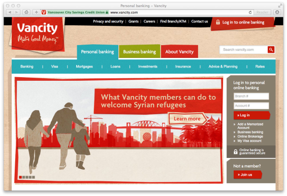
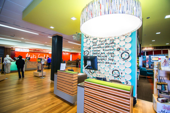
Check out how Vancity, a credit union in Vancouver, Canada, seamlessly evokes the same bright, contemporary, playful mood both online and in its branches:
Scenario #2: Someone walks in the door. What kind of greeting do they receive?
Would you ever greet someone in your branch without a smile? Not likely! You might not be able to make your website smile, but that doesn’t mean it can’t be friendly. Bland language and drab stock photography can chase off website visitors faster than a disinterested teller in a branch.
Here’s how Linn Area Credit Union welcomes its online visitors:
Welcome to Linn Area Credit Union where you’re part of the family. We’re so glad you’re here!
We’re not like other financial institutions. If you’re one of our fabulous members, you already know this. And if you’re not a member yet, you’re probably a skosh jealous. Feel free to snoop and click around. Call us for help or information – or if you just want to chat!
This friendly language issues a warm welcome to website visitors just like cheerful branch staff do in person.

The Financial Brand Forum Kicks Off May 20th
Explore the big ideas, new innovations and latest trends reshaping banking at The Financial Brand Forum. Will you be there? Don't get left behind.
Read More about The Financial Brand Forum Kicks Off May 20th

Navigating the Role of AI in Financial Institutions
83% of FI leaders agree investing in AI is essential for 2024 but how you leverage AI is instrumental in success and meeting customer expectations.
Read More about Navigating the Role of AI in Financial Institutions
Scenario #3: Someone needs to make a simple deposit. Where should they go?
In most branches, tellers or ATMs handle the simplest, most frequent transactions, which is why they’re easy to find. You wouldn’t lead a customer up a flight of stairs and down a dark hallway so he can deposit a $50 check. Does your website force him to jump through unnecessary hoops for similarly simple transactions? Do they need to mine through endless tabs and menu items to get to your core services?
Pay attention to the online services your visitors use most frequently, and make sure using those services is a pleasant, intuitive experience.
Here’s one example. Ally Bank has put careful thought into the key services consumers are most likely to look for.
Rather than overwhelming its visitors with flashy features, they’ve instead prioritized four actions users are most likely to want to take: “Step up your savings,” “Deposit checks on the go,” “Maximize your coverage,” and “View our rates.”
Scenario #4: Someone is trying to get help with a mortgage. Who can help them?
Some transactions are more involved and may require multiple conversations with a specialist. How can you get your customers started and ensure proper follow-through?
Would a branch employee help someone seeking a mortgage loan by handing her a sheet of paper that lists the 200 services your branch offers and hoping she can figure out where to go? Hopefully not! He would likely take a moment to understand what she needs and then personally guide her to the proper person.
Likewise, your website needs to guide your visitors to the services they need and provide them with a clear sense of process once they get there. Here’s how Wells Fargo greets customers interested in applying for a home mortgage
Scenario #5: Someone leaves. Are they satisfied or frustrated?
If a customer were to storm out of your branch scowling, you would know they were unhappy with the service they received. Unfortunately, you don’t get such visual cues from your online visitors. How can you determine whether people are happy with your website?
Here’s a simple user test that can help you gauge your visitors’ experience. Offer five people a free lunch, gather them in a room, and give them a list of tasks to complete on your website. (According to Nielsen, five users is generally all you need.)
Ask them to provide feedback along the way, and most importantly, measure how they feel at the end of the task. Are they frustrated? Satisfied? Would they willingly return to complete the same task?
Usability testing may sound intimidating, but it’s not rocket science. With enough pizza, it can even be fun!
Cameron Madill is a respected digital marketing expert. He has won numerous awards, including recognition as one of “Portland’s 40 under 40 business people.” Cameron’s multi-disciplinary quest as a lifelong learner — combined with his entrepreneurial spirit — inspired him to co-found PixelSpoke, a digital marketing agency focused on credit unions and community banks. In just two years working with local financial institutions, PixelSpoke has been honored with a CUES Golden Mirror Award, a MAC Gold Award, and a CUNA Marketing Council Diamond Award.


