Banking websites aren’t having the impact on sales that they should. In other words, they are broken. Sure, websites today look better than they did five years ago, but at their core, they are still digital brochures that are primarily designed to drive consumers to branches.
That approach doesn’t work, explains James Robert Lay, CEO at Digital Growth Institute. Lay says banking providers haven’t learned how to wean themselves off their dependency on branches — in fact they haven’t even really tried. Compounding the problem, they still rely on traditional marketing tactics and broadcast media more than they should. And senior leaders aren’t very savvy when it comes to online strategies. All this adds up to digital disarray.
Then you add in a dose of what Lay says are the three most common fears that prevent financial institutions from making progress — (1) fear of change, (2) fear of failure, and (2) fear of the unknown — and you have a banking industry that’s rife with ineffective websites.
If you agree with Lay’s assertion that the website is the most critical component of any bank or credit union’s digital growth engine, then you should take his advice to heart. Here are three insights from Lay to get your website in shape so that it starts performing as a lead generator.
Read More:
- 20 Visually Stunning Website Designs From Banks & Credit Unions
- Turning Your Banking Website Into A Sales And Marketing Workhorse
- 5 Best UX Practices to Drive More Conversions on Banking Websites

The Financial Brand Forum Kicks Off May 20th
Explore the big ideas, new innovations and latest trends reshaping banking at The Financial Brand Forum. Will you be there? Don't get left behind.
Read More about The Financial Brand Forum Kicks Off May 20th

Unlocking Digital Acquisition: A Bank’s Journey to Become Digital-First
This webinar will offer a comprehensive roadmap for digital marketing success, from building foundational capabilities and structures and forging strategic partnerships, to assembling the right team.
Read More about Unlocking Digital Acquisition: A Bank’s Journey to Become Digital-First
1. It’s All About Content
Content is key. Content has two jobs. The first is to help the consumer. The second is to sell.
“Most website content is just a list of bullet points which appeals to consumer’s analytical left brain — the logical side,” says Lay. “Instead, you need to appeal to the right brain — the emotional side. Consumers buy with their heart.”
According to Lay, the narrative for a website’s storyline should go something like this: a consumer with a problem meets an emphatic guide (you) that builds trust and offers a solution, so that the consumer feels comfortable taking action and finding a happy ending.
“You can’t simply move offline content over to a website and expect that website to sell,” he says. Instead, you need to simplify content by reducing text and use videos, graphics and other visuals to engage consumers. “Rather than text-heavy content, look at more interactive and engaging content such as calculators, comparisons, testimonials, quizzes, reviews, checklists, and infographics.”
To accomplish all this, Lay recommends that financial institutions take a radical step: trash the content on their current site and start from scratch.
2. Increase Your Investment
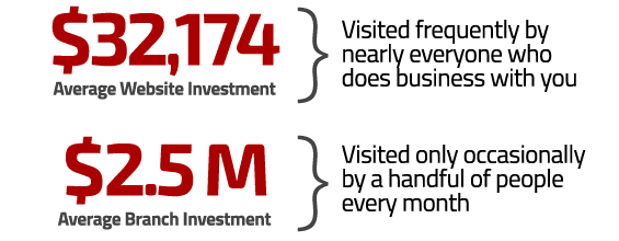
According to the Digital Growth Institute, the average amount invested by financial institutions to build a website is a $32,174. This is nowhere near enough, Lay says.
“Most financial institutions spend $2.5 million to $5 million average to build and operate a new branch,” bemoans Lay. “But only 13% of financial institutions spend $80,000 or more on a new website, which is better than $30,000 but often still not enough.”

Lay says this disparity in spending between online and offline channels is crazy when you consider that the majority of consumers today start shopping for financial products online.
“A sales channel this critical demands a greater level of investment than most banks and credit unions allocate,” says Lay.
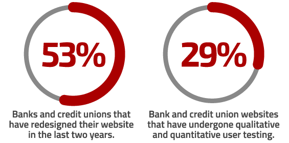
Research conducted by the Digital Growth Institute reveals that nearly half (47%) of banks and credit unions have a website that is more than two years old, a fact that troubles Lay, who says that banking websites require constant optimization and upkeep, and their lifespan is relatively short.
What’s more, most of these websites have never even gone through user testing to determine how consumers actually experience the website.

“Thinking that you know how consumers use any website is a dangerous assumption,” says Lay.
To gain greater insight and truly understand how consumers engage with your site, Lay recommends using the following tactics:
- Heat maps of clicks, mouse movement, and page views to see how consumers are interacting with your website.
- Live recordings of consumers performing tasks and then providing verbal feedback.
- Behavioral recordings that document how consumers interact with your website during different stages of their buying journey.
- Survey consumers about ways to improve the website.
- Analyze competitors’ websites with an eye toward promoting differentiation.

3. Focus on the Journey
Many banks and credit unions place generic banner ads for “Free Checking” and “Auto Loans” on their website, believing that these ads prompt consumers to take action. Research conducted by Lay’s firm suggests otherwise. While 79% of financial institutions admit having rotating home page banner ads, the actual percentage of clicks on these ads is a pathetic 0.3%.
In contrast, personalized banner ads move consumers to action. Personalized ads result in an average 19% increase in sales.
“It’s tragic, but only 13% of banks and credit unions personalize website ads based on consumer’s digital behavior,” says Lay.
Four out of five banks and credit unions only push product, with links that have direct calls-to-action like “Apply Now” and “Open An Account Today.”
“Financial institutions tend to go right for the sale and ignore the role of the website as a lead generation source,” says Lay. “If consumers aren’t ready to buy and are given no other option, they will simply leave.”
What’s missing? Lay says banking providers need to give consumers a reason to interact with them, so they can nurture a relationship.
“Only 2% of web traffic converts to a sale on the first visit, and the average buying cycle for a new account is two to three months,” Lay points out.

What’s missing? Helpful resources, buying guides, calculators, glossaries, tutorials and other educational materials. Lay recommends having different calls-to-action other than just the “Buy, Buy, Buy” button.
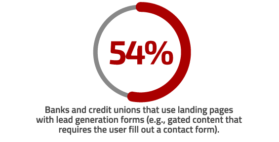
“Give users the option to request more information, or download value-added content,” says Lay. “This will allow you to capture the consumer’s name and email so you can continue to nurture that lead.”
“With websites, it’s all about the journey,” Lay concludes. “Nurture and guide the buying journey and the sale will happen.”


