If you like the examples showcased below, you may also want to check out the websites for Kiwibank, Goldman Sachs, Banque Heritage and Zurich. And thanks to comments from readers, also take a look at Standard Chartered, Mango and New Resource.
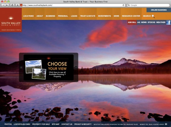
South Valley Bank – Stunning Scenics
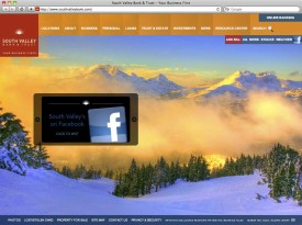
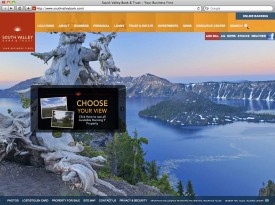
The star of this website is a huge, gorgeous scenic photo from around the rural Oregon area where the bank is based. Every time you refresh the website or visit a new page, one of 5-6 stunning images rotates in the background. Visitors’ attention is force-focused on one of three small banner ads cycling against this scenic backdrop.
Unfortunately, there’s no online banking login on the homepage. Online banking customers are routed to a much less impressive page.
Navigation is handled by a rather large number of tabs (16 in total) resting atop the photos, but the design seems to work. South Valley tucked a link to its Facebook page in the upper right corner. There are seven links with nitty gritty at the bottom of the page.

Navigating the Role of AI in Financial Institutions
83% of FI leaders agree investing in AI is essential for 2024 but how you leverage AI is instrumental in success and meeting customer expectations.
Read More about Navigating the Role of AI in Financial Institutions

Industry Cloud for Banking from PwC
PwC’s Industry Cloud for Banking applies our deep industry knowledge to your specific business needs
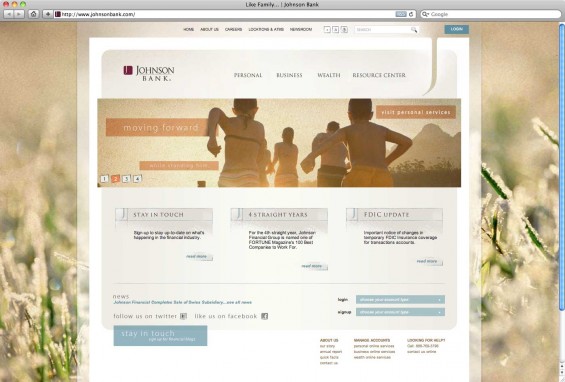
Johnson Bank – Understated Upscale Elegance
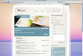
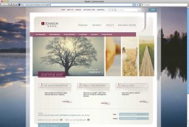
Using overexposed photos and varying layers of translucency, this bank achieves a visually appetizing aesthetic appropriate to its upscale audience. Background photos change as you move within the site. Four large, horizontal banner ads deliver dynamic content on the homepage, with three blocks of newsworthy items below. Twitter and Facebook links are incorporated into the site’s footer block.
Salem Five – Dashboard with Beautiful Local Backdrops
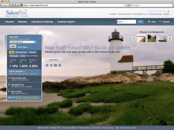
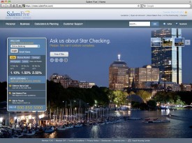
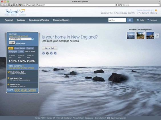
Site visitors can choose from one of 19 different background images, each a lush visual image celebrating a uniquely New England lifestyle. The bank eschews traditional “boxed” banner ads on the homepage for a series of four simple text ads superimposed over the backdrop. It creates an overall calming effect.
The copy uses New England vernacular: “Wicked good rate and easy access with a Star Home Equity Line.” And with a wry, understated tone, the bank says, “Ask us about Star Checking. Please. We can’t contain ourselves.”
There is a complex dashboard with rates, contact options and an online banking login. There are links to Twitter and Facebook accounts.
Nearly every page on the site can be accessed with one click from the homepage, thanks to four primary drop-down menus each with an exhaustive list of links. Interior pages are more traditional, and skip the beautiful background images.
Bankwest – Happy Banking Website
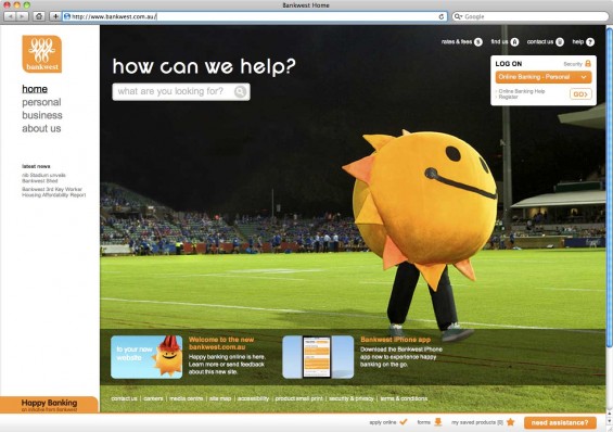
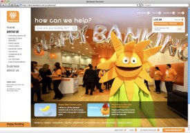
This financial institution in Western Australia has positioned itself as the home of “Happy Banking” for many years. The bank has a team of five stuffed spokescharacters, including a squirrel, sunflower, sun, teddy bear and dog. Now they’ve got a new style of website to match their quirky personality (although the white, omnipresent sidebar is a bit distracting).
One of the site’s main features — besides the giant photo — is the interactive search tool. Much like Google’s real-time search results, Bankwest’s search tool displays suggestions before you hit “enter” on your keyboard.
ASB – Yellow
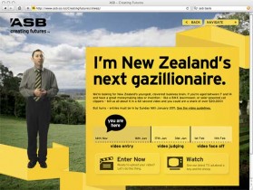
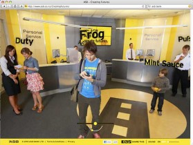
ASB differentiates its online experience with minimalist simplicity and heavy doses of the bank’s signature brand yellow. What makes this website unique is that the online banking login area — something usually relegated off in a corner somewhere — has become the design’s hero. ASB recognizes that the people who visit its website most often are online banking customers. “Hello.”
There are only 14 links in the primary yellow area on the website, including five main tabs, four banner ads and five other miscellaneous links. All the messy navigation (essentially a site map) is buried below the fold. The bank lists its Twitter and Facebook accounts on the homepage and under its contact options. Despite the bank’s conversational tone, live online chat in not publicly available.

Lake City Bank
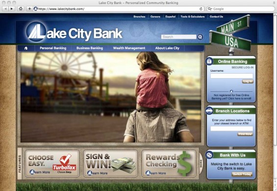
This site went live in 2009. it combines cutting-edge HTML and CSS design techniques, the latest advances in 3D Flash technology and a bandwidth-saving, JavaScript-based navigation system. The site is properly formatted for different situations, including a printable version as well as a handheld version. Both alternate versions of the site work from the primary URL.
Darden Employees FCU – Simple Blocks
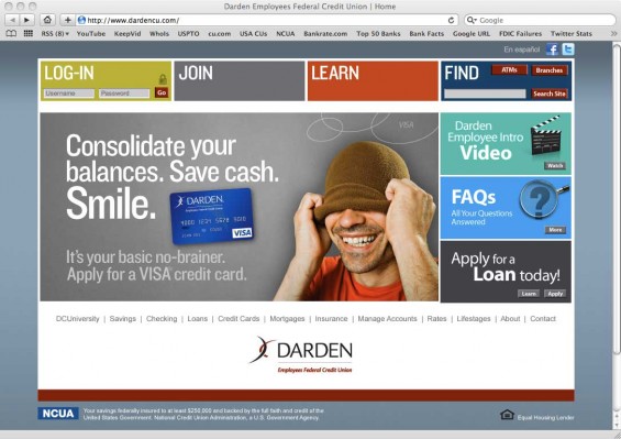
Darden Employees FCU only has $11 million in assets and 1,800 members, but its website looks more sophisticated than many credit unions 50 times their size. The site’s architecture is structured into simple, colorful blocks and large, photo-driven banner ads. Product-level navigation is placed lower on the page, below the visual content. Twitter and Facebook links are tucked into the upper right corner.

