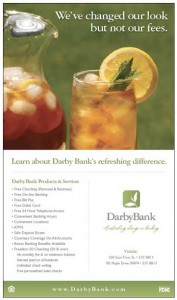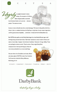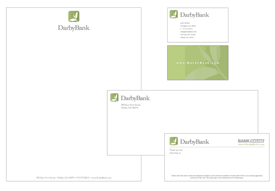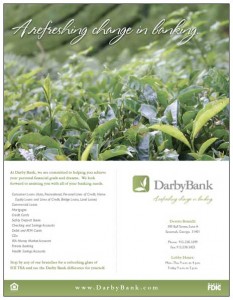
The agency that led Darby Bank’s rebranding, the Kidd Group, says they uncovered one common thread in discovery sessions with the bank — their core values: Integrity, Commitment, Excellence, Teamwork, Energy and Ability. Kidd Group turned those values into a brand acronym, ICEATEA (the bank says it’s pronounced ICE-T), that Darby takes very seriously.
“Our new logo symbolizes both our strong growth and the historical values that underlie it.”
— Darby Bank
The bank says its new logo — a robust and sprouting tea leaf — captures the essence of their core ideals.
The bank also says its overall brand identity “embodies hospitality, graciousness, the ability to invigorate and the willingness to reach out to others.” You can see an example of the old look-and-feel here.
The rebranding effort was honored with a 2008 Financial Marketing Award.
 Client: Darby Bank
Agency: Kidd Group
Designer: Eric Shepard

Fractional Marketing for Financial Brands
Services that scale with you.

Instant Messaging. Instant Impact.
Connect with your customers and provide lightning-fast support as effortlessly as texting friends. Two-way SMS text messaging is no longer optional.
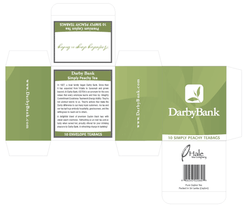
Darby Bank serves its signature sweet peach tea at all branches as a
reminder of the core “ICE TEA” values that have shaped their identity.
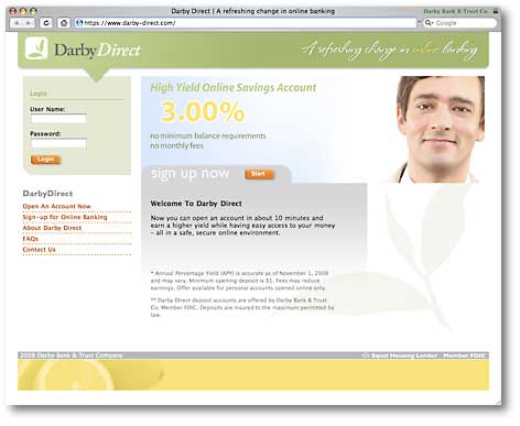
https://www.darby-direct.com/

