In honor of the new season of Mad Men (season three starts Sunday, August 16), here’s a showcase of financial ads from yesteryear. The ads come from a different world than we live in today — before compliance departments saddled paragraphs of legal disclosures on rate ads. You’ll notice how few of the ads targeted consumers. Banking bank then was all about business accounts.
Note: You can click on most of the ads to view a larger size.
TORONTO DOMINION
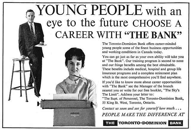
This help wanted ad promises the “finest working conditions in Canada.” Given today’s definition of “working conditions” and considering Canada’s affable reputation, it seems like an odd thing to promise. If you were too nervous or shy to stop by the local branch about a job, you could write for their free employment booklet, “The Sky’s The Limit.”
BANK OF AMERICA
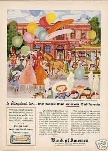
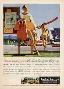
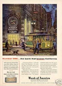
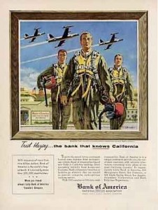
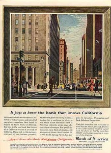
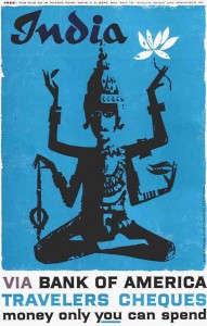
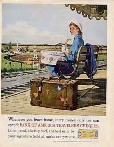
The banking powerhouse demonstrates its branding acumen back before the concept of “branding” had even been formally introduced. The ads have a consistent voice, message and style. Some of the ads feature a product promo for traveler’s cheques. Note the Old English calligraphic typography used in this older version of the logo. State by state, BofA has branded itself and the bank of the U-S-of-A.

Instant Messaging. Instant Impact.
Connect with your customers and provide lightning-fast support as effortlessly as texting friends. Two-way SMS text messaging is no longer optional.

Industry Cloud for Banking from PwC
PwC’s Industry Cloud for Banking applies our deep industry knowledge to your specific business needs
BANK OF AMERICA
Two different ads for traveler’s cheques. If you liked the cool one from India, you could write the bank a letter and they would send you a full-size poster version of it.
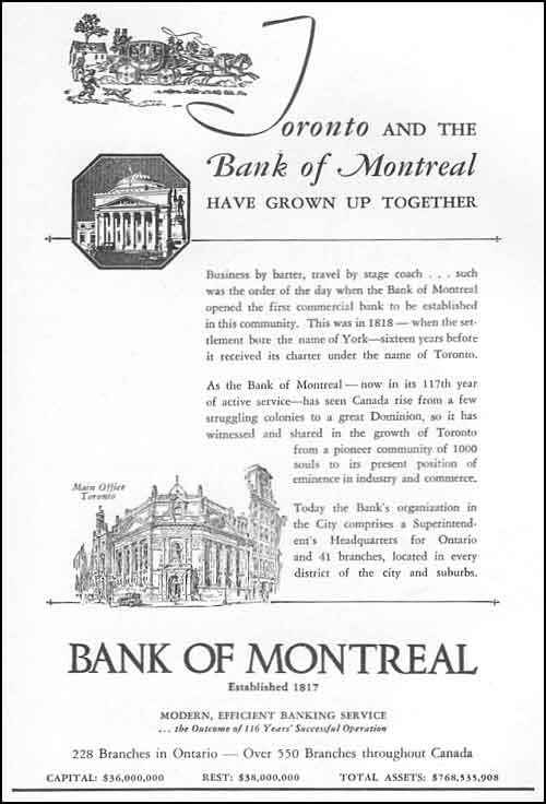
BANK OF MONTREAL
Bank’s have been touting how long they’ve been in business since at least 1935, as in this ad where the bank is celebrating its 117th year. The message may have had value 75 years ago, but these days, as someone on Twitter recently noted, “It only proves you haven’t gone out of business…yet.”

CADDO NATIONAL BANK
This ad must have come out around the time fire and the wheel was invented, because it’s promoting the idea of having “a bank account.” For its time, this was probably a powerful ad, because even by today’s standards, the ad still packs a punch. Notice how the bank includes its capital position.
CHELSEA NATIONAL BANK
The monospaced computer typeface — a necessity in the early days of computer displays — screams “We want you to think we’re hip and computer savvy.” But the illustration says “tangerine dreams and marmalade skies, man.” Who cares? The scene is groovy.
DRY DOCK COUNTY
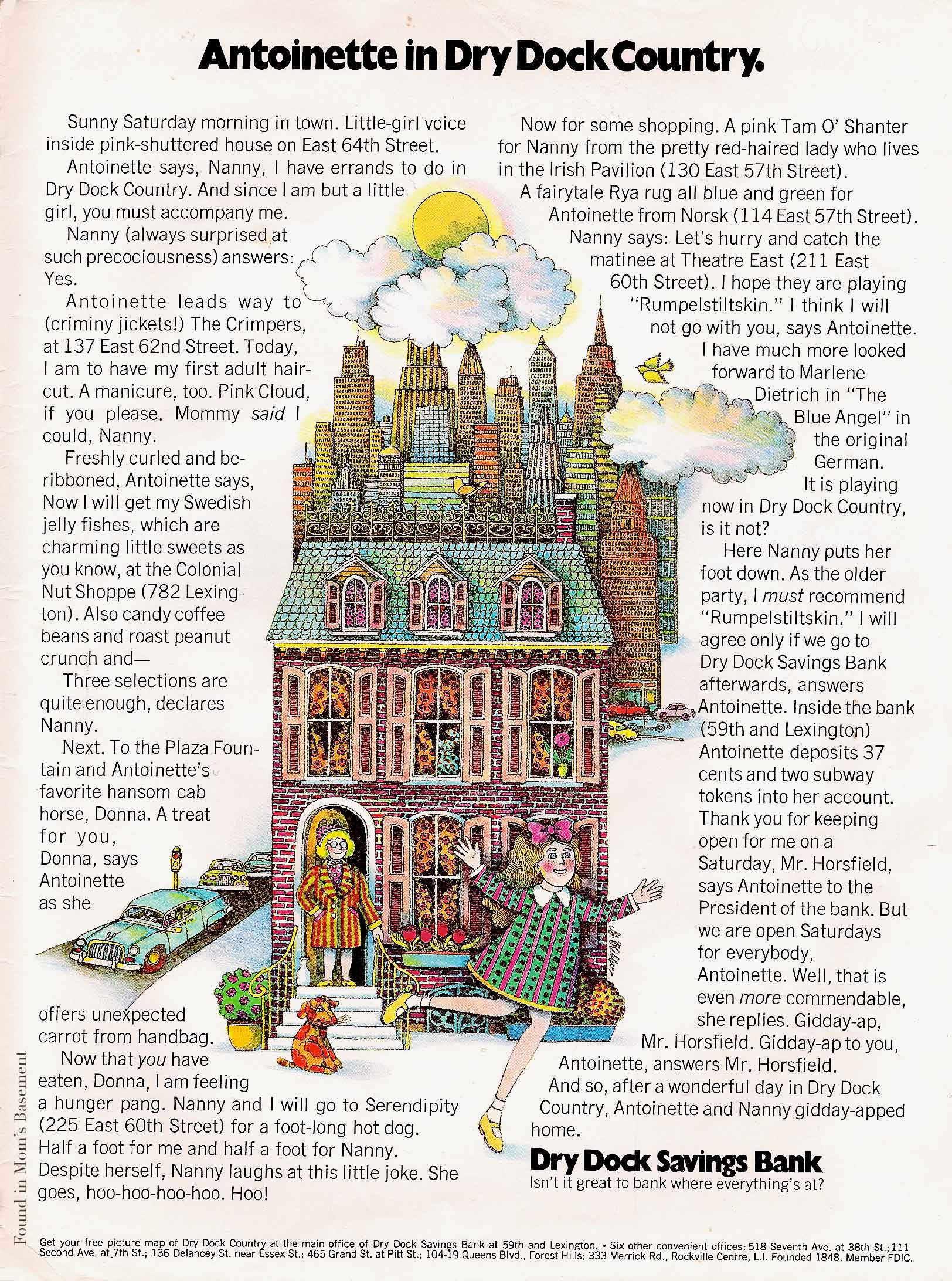
This is what’s known as a long-copy ad. It seems hard to believe, but there was a time when ads with this much copy were all the rage. Everyone had a story to tell, so they told it. These days, such a longwinded and rambling presentation would probably be laughed at. “Who has the time to read this?” The advertiser isn’t even mentioned until the 10th paragraph, where the bank touts its Saturday hours. Notice the offer for a free picture map of the local area.
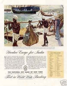
THE NATIONAL CITY BANK OF NEW YORK
This ad hails from a time when it was considered shrewd business to have underpaid (and underdressed) “natives” do your dirty work.
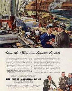
THE CHASE NATIONAL BANK
Did you know that Chase once referred to itself as The Chase? This ad must have been what happened to the last ad after a merger, presumably between Chase and National. Oppressed natives have been removed from this all-white world.
SHAWMUT BANK
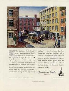
In advertising circles, this ad is what’s known as a “headless wonder,” meaning it has no headline. The advertiser — in their hubris — thinks they are so interesting and important that you’ll feel compelled to read the ad. No need. It probably just said what all the other bank ads said back then: “We’ve been around since 18XX and have helped our community grow because of our unique local knowledge and experience.” Sound familiar?
WELLS FARGO
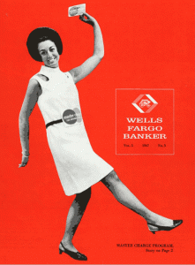
The gal on the cover of this internal newsletter looks like she might be getting pretty excited about The Branch of the Future. Oh wait, that didn’t come around for another six or seven years.

BANK OF AMERICA
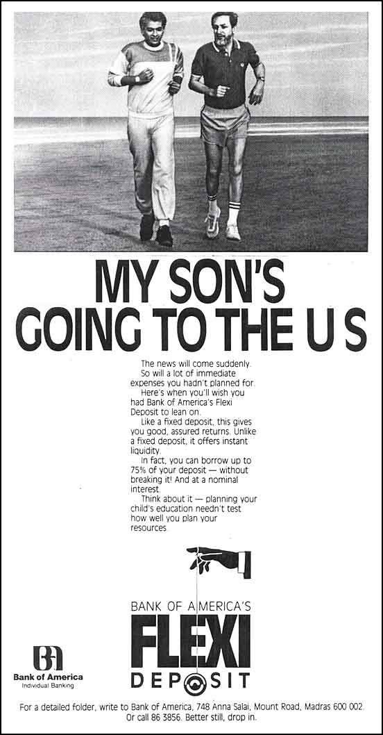
This ad ran in India. It targeted parents of children headed to the U.S. to get their college degrees. The ad pre-dates “no penalty CDs,” so the best they could offer was a loan on 75% of your CD’s principal. Interesting choice to include the illustration of a yo-yo.
BANCO NACIONAL
Is the guy in the illustration paying a monkey for bananas?

