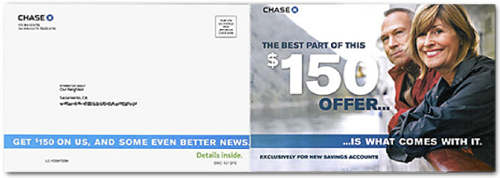
In October 2012, Chase Bank used a folding, four-panel self-mailer to promote its savings accounts using a $150 cash offer as the main hook. Let’s examine how the mail piece is put together so you can see how you might improve your own direct mail marketing. The folded, finished size is approximately 6 x 9 inches. Here’s what the complete mailer looked like :
Achieve a better return on your marketing investment. Leverage behavioral data and analytics to target the right customers with the best possible offers. Read More about Send the Right Offers to the Right Consumers PwC’s Industry Cloud for Banking applies our deep industry knowledge to your specific business needs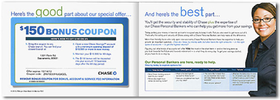

Send the Right Offers to the Right Consumers

Industry Cloud for Banking from PwC
Outer Cover Panel: Big Photo, Big Offer
Let’s start with the colorful outside cover panel.
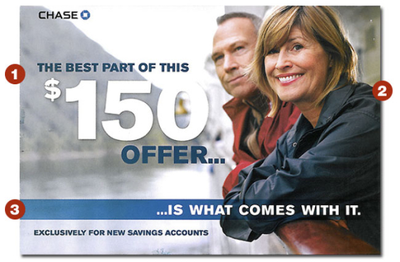
Two points on the cover catch the reader’s eye: the cash amount and the photo.
1 – Big Offer. The large $150 amount is the most likely reason the mail recipient will consider opening and reading the offer. Here it’s prominent, as it should be.
2 – Engaging Image. Good use of a people photo. We’re all attracted to photos of people. In this case, the more mature couple in the photo reflects the readers whom this promotion targets.
Choose photos that appeal to women prospects. Women open or influence the opening of 89% of all financial accounts. Marketing to women techniques, like this photo, are important for financial promotions.
3 – Strong Teaser. Good teaser copy makes the prospect curious as to what part of this offer is better than the $150, and further encourages people to open the mailer.
Address Panel: Strengthen Presentation of Offer Summary
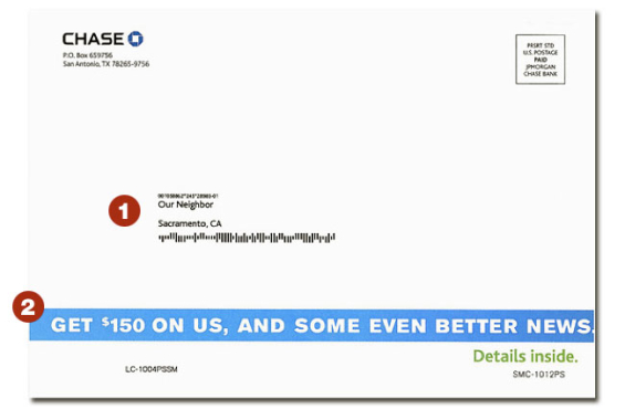
Quite often we see address panels with little or no design elements. We suspect designers see this as the post office’s area and they’d rather not mess with it. But this side appears face-up in the mailbox and is the first side the mail recipient sees. It’s crucial to get it right.
1 – Open Invitation. The mail is addressed to “Our Neighbor” versus an actual name, which means recent movers (some of the best prospects for switching or opening new accounts) can take advantage of this offer.
2 – Design Tip: Emphasize Offer. Here’s the teaser, but the mailer could be improved with a larger headline, larger size dollar amount, and a photo or graphic that would attract attention as the mail is pulled from the box or sorted on the kitchen table.

Inside Left Panel: Clever Coupon
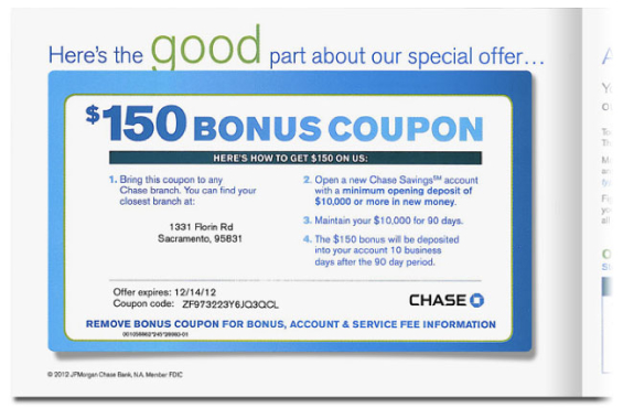
This panel uses an involvement device — seldom seen with financial promotions, but a very effective technique: a removable coupon (the area enclosed in blue below, approximately 4.25 x 7.5 inches). Direct mail tricks like this typically boost response because the recipient becomes engaged, and spends more time examining the offer. With direct marketing, the more readers engage with a piece, the more likely they are to take action.
Details of how to redeem the offer are shown in four simple steps. Simple, concise, is always best when giving the details and redemption information. It’s like a cheat sheet or guide for the prospect. Showing the nearest branch location promotes the convenience factor and makes the reader think more about the offer.
Probably the best feature of the entire mail piece and the factor that makes the coupon ideal: it covers up all the disclaimer copy. Fine print is revealed only when the coupon device is lifted off the page.
Instructions for branch personnel are printed on the back of the coupon, so it’s hidden from view and makes the mail piece appear easier to read. And talk about a promotion that’s easy to implement operationally — putting the promotion’s internal instructions for staff is brilliant.

Why Industry Cloud for Banking?
PwC’s Industry Cloud for Banking helps deliver personalized products and services that today’s customers expect.

Move the Needle from Attrition to Acquisition
Vericast’s 2024 Financial TrendWatch explores seven of today’s most critical financial services trends to provide a complete view of the current loyalty landscape.
Read More about Move the Needle from Attrition to Acquisition
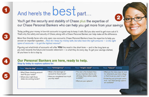
Inside Right Panel: The “Best” Part?
Here’s where you find the sales pitch and product information.
1 – Limp “Bonus.” The reader might argue the “best” part of the offer is the $150 bonus. That’s the disadvantage of making good/better/ best comparisons of your own offer.
2 – People Photo. Good use of a photo. Looks like a “real” person making eye contact with the reader, and not a fashion model.
3 – Personal Banker. Bankers assume a personal banker is a great advantage to a prospect (and a cross-selling advantage to the bank), but not all consumers want that sort of help. They simply want things to run smoothly so they don’t need extra help. However, because of the upper income class this is intended to attract, that may be less of a negative factor.
The copywriter for this project might feel handicapped by the limitation of a single panel for the bulk of the copy. A prospect might see the panel as “too much” copy. But if by now the teasers and other techniques have worked, the prospect will be drawn into reading the details.
4 – Call-to-Action. This subhead includes the final, necessary call-to-action. That’s good, but wait…
5 – Complex Chart. This final series of questions looks squeezed-in, with its smaller font size. The offer appeals to a more mature group, many of whom are forced to use reading glasses. While the chart format adds another visual effect to the mailer, the (unanswered) questions (instead of information) it includes might be unnecessary and the space could be better used to spread out the sales copy.
Bottom Line
The Chase self-mailer savings account promotion has two very effective panels and two that could be improved. Overall, the $150 cash bonus is certainly eye-catching enough to get prospects inside the mailer where they examine the details. The offer and photos make it appear this promotion targets Boomer generation affluent households. Now you can use the pros and cons discussed here to judge the effectiveness of your direct mail campaigns.

