Like a phoenix from the ashes, BankUnited has resurrected its brand. Christened with a new identity, the once struggling financial institution has managed to turn its brand around from FDIC failure to successful IPO in a matter of months.
The rebranding of BankUnited presented a very unique and difficult set of challenges. Founded in 1984, BankUnited had become the biggest bank in Florida at the time of its collapse back in 2009, right at the peak of the financial meltdown. Focused heavily on residential real estate, the bank had succumbed to risky adjustable-rate mortgages, and like some 300+ other banks, fell victim as the economy slipped into recession. In 2009, the FDIC seized the failed bank and sold it to a group of investors who reintroduced BankUnited as a new startup.
The recapitalized BankUnited has since become one of the more profitable and well-capitalized financial institutions in the U.S. The company has been restructured from the top down and its employees consolidated in a new headquarters in Miami Lakes. The rebirth was capped earlier this year with a highly successful IPO, the first brought by any bank to be resurrected from the financial crisis.

BANK UNITED – OLD LOGO
The existing BankUnited logo featured an illustration of a palm tree.
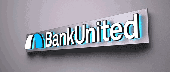
Luke Hayman and Paula Scher at world-renowned design firm Pentagram created the new BankUnited brand identity. Scher is perhaps best known in the financial industry as the designer behind Citibank’s current brand identity. Pentagram says the new identity conveys the accessibility of a local bank with the gravitas of a global brand.
The new BankUnited identity is designed to grow with the bank. BankUnited now has more than 80 branches in 13 Florida counties, but plans to expand with seven new locations and, eventually, beyond its current footprint.
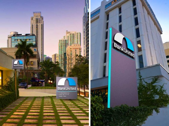
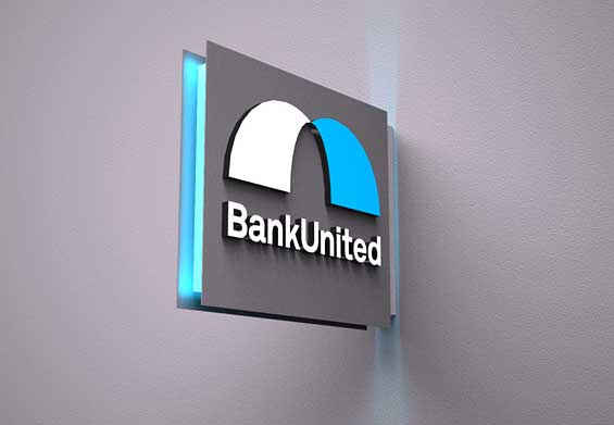
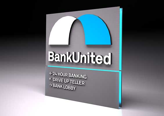
To accommodate these expansion plans, designers ditched the bank’s old logo — a palm tree which clearly anchored the bank in Florida. They opted instead to create an abstract symbol called “the bridge,” based on the curving forms of the bank’s initials, B and U. Pentagram says that the icon is inspired by the causeways of Miami, but also represents a bridge between south and north, local and global, today and tomorrow, now and the future.
“Bridges move people and companies from one place to another,” says James Wood, BankUnited’s corporate creative director. “This is the bridge to the future of BankUnited.”
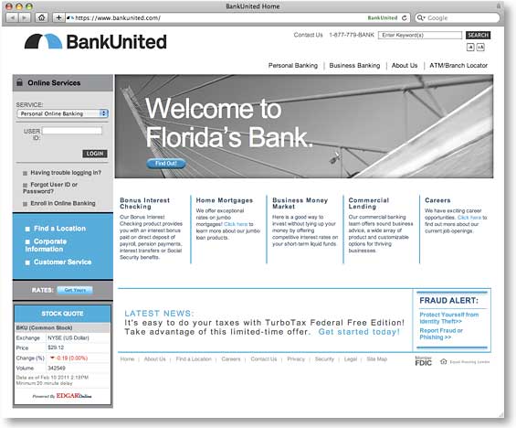
The bridge will be used as a graphic motif on credit cards, print collateral and digital applications, and the identity is currently being implemented in environmental graphics at bank branches. The new identity made a high profile debut when BankUnited executives rang the opening bell of the New York Stock Exchange on January 28, the day of the company’s IPO.

The Financial Brand Forum Kicks Off May 20th
Explore the big ideas, new innovations and latest trends reshaping banking at The Financial Brand Forum. Will you be there? Don't get left behind.
Read More about The Financial Brand Forum Kicks Off May 20th

The Power of Localized Marketing in Financial Services
Learn how to enhance your brand’s local visibility, generate more leads, and attract more customers, all while adhering to industry regulations and compliance.
Read More about The Power of Localized Marketing in Financial Services

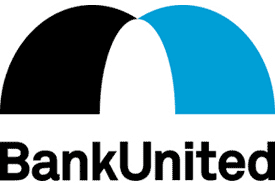
BANK UNITED – STACKED LOGO
Alternate version of the new logo.
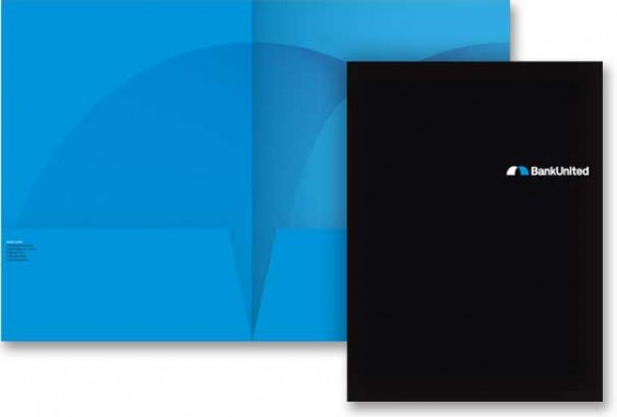
BANK UNITED – POCKET FOLDER
The “bridge,” as it’s called, is used as a graphic motif in print collateral and credit cards.
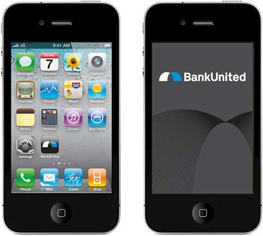
BANK UNITED – iPHONE APP
The identity applied to a BankUnited iPhone app.

