Bankinter is one of the leading banks in Spain. A few years ago, the bank felt its brand had become stale, cold, impersonal and no longer connected with a younger audience, so they hired the identity experts at Saffron for an image makeover.
What makes Bankinter special? The folks at Saffron says it boils down to the bank’s “exceptional thinking.”
“This became the basis for a brand idea that’s aspirational as well as pragmatic: ‘a bank that thinks, for people who think,’” Saffron explains. “Bankinter attracts thinking customers; thoughtful, skeptical and capable of making their own decisions.”
As a “thinking bank,” Bankinter lays claim to a number of innovations. They were the first Internet Bank in Spain, the first mobile phone bank and the first bank to use text messaging.
 What all that has to do with the resulting tangy orange brand identity is anyone’s guess. But the new look is certainly smart, fresh and contemporary.
“Bankinter’s personality emerges in the way it communicates,” says Saffron of the new image. “Sophisticated, intelligent, informed — even opinionated and outspoken. It is authoritative, thoughtful and direct. Everything about the visual style including the specially designed typeface emphasizes this.”
You could throw in youthful, warm and vibrant. Whatever words you might use to describe the brand identity, it safe to say it isn’t stale, cold and impersonal.
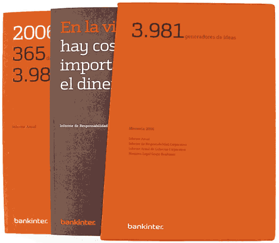
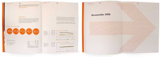
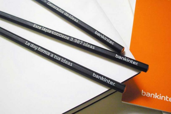
Bankinter clearly isn’t the first brand in history to wrap itself in orange. There is the European telecom giant Orange, and, of course, ING in the financial industry. What makes Bankinter so noteworthy is the extent to which they’ve bathed themselves in a single color. The brand is drenched in orange everywhere. While many organizations cringe at the idea of limiting themselves to only one hue (“It’s so boring!”), Bankinter deserves recognition for its bold and courageous use of color as a tool to differentiate its image.

Fractional Marketing for Financial Brands
Services that scale with you.

Instant Messaging. Instant Impact.
Connect with your customers and provide lightning-fast support as effortlessly as texting friends. Two-way SMS text messaging is no longer optional.
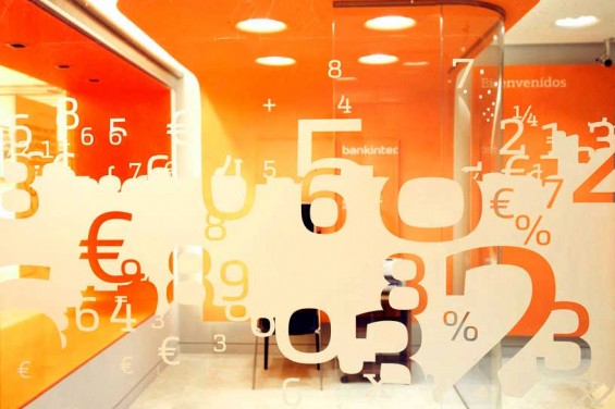
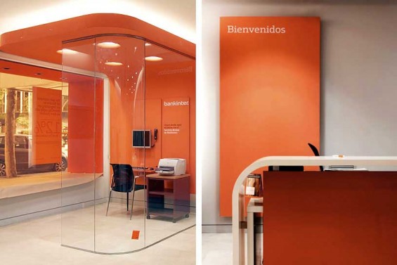
BRANCH INTERIOR
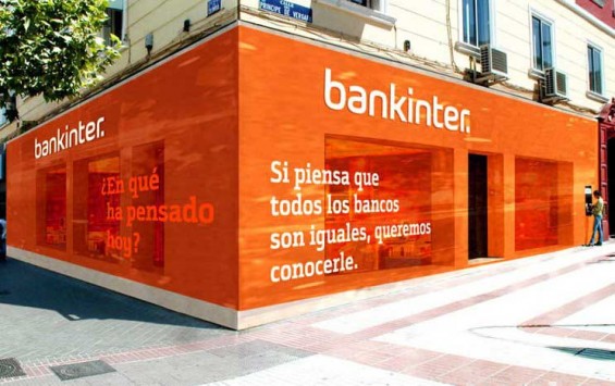
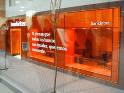
EXTERIOR BRANDING & FASCIA DESIGN
Even the windows are tinted orange. The text translates:
“If you think all banks are equal, we know.”
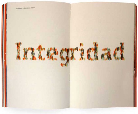
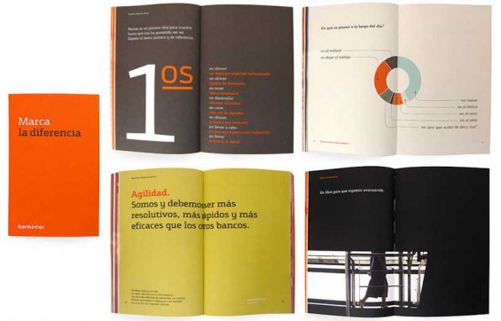
BRAND BOOK
A handy guidelines manual designed to be more practical and easier to digest.
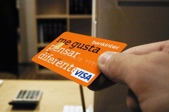
DEBIT CARD
The text on the card translates to “I like to think differently.”
BRAND VIDEO

