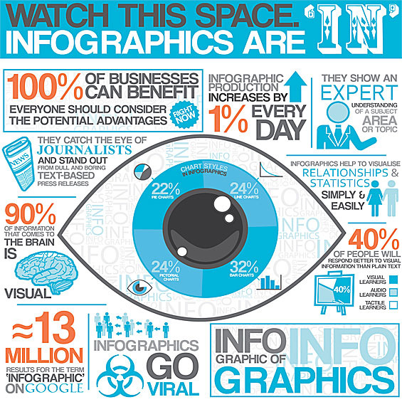
Infographics artfully portray voluminous data which otherwise may be ignored or sleep-inducing. A mix of design, writing and analysis, infographics are akin to swallowing big data in tablespoon portions.
They have been around a long time. Newspapers used them to emphasize a point or explain a concept. However, with a big push from the surge in content marketing, the popularity of infographics has grown exponentially. Nevertheless, financial institutions seem to resist them. Banks and credit unions don’t incorporate infographics into their content anywhere near as much as other industries. And yet the voluminous consumer and commercial data produced by banks seems to be ideal fodder for infographical interpretation.
Here are seven reasons you should incorporate infographics into your financial institution’s content marketing strategy:
- Reinforces your brand position when the subject matter complements your marketing goals.
- Appeals to people who prefer to learn visually. 40% of consumers respond better to visual information than straight text.
- The color and design of an infographic captures the eye, bringing your (otherwise dull) stories to life.
- Large sets of data become coherent, even interesting.
- Easily shared on social networks — infographics give financial institutions their best shot at going viral.
- A good way to improve your SEO. You’ll bump up your website’s ranking because infographics score well with Google’s search engine algorithm.
- In a mass data environment, infographics appeal to consumers who have less and less little time and short attention spans.


Unlocking Digital Acquisition: A Bank’s Journey to Become Digital-First
This webinar will offer a comprehensive roadmap for digital marketing success, from building foundational capabilities and structures and forging strategic partnerships, to assembling the right team.
Read More about Unlocking Digital Acquisition: A Bank’s Journey to Become Digital-First

How Banks Are Fortifying Their Data Against Increasing Cyber Threats
This webinar from Veeam will detail the value of working together across your organization to be better prepared in cyber defense and response readiness.
Read More about How Banks Are Fortifying Their Data Against Increasing Cyber Threats
Liberty Bank recently created an infographic to grab the attention of Millennials and promote its new all-digital debit account. The topic was around low-cost ways to have fun in Chicago. Money-saving ideas underscored the bank’s brand which is around helping neighbors save money – only this time we aimed at younger people rather than the typical audience of older adults. Using various link-building techniques, we reached many more readers than might be achieved with a simple blog post. One Reddit link brought 1,500 readers to Liberty’s website.
Design firm Dot Dash offers ten helpful tips for creating your own strong infographic, among them:
- Closely analyze and study your data to find the juiciest nuggets. Resist the urge to share everything — be a ruthless editor.
- Rank your facts in order of importance, and put your most newsworthy facts at the top.
- Send your designer(s) the supporting reports (the sources where you found your underlying data).
- Large numbers are boring. Make it visual — show, don’t tell.
- Distill it down — make it as simple as possible.


