A score of 1 to 5 is assigned for each of the following three categories:
Message Clarity – How well is the intended message conveyed? How easy is it for the reader to understand what it is they are supposed to do or remember? How much work does it take the reader to decipher the message?
Volume of Copy – Experts in the billboard industry recommend holding to around seven words of copy (or less) in billboard headlines, and no more than 14 words on the entire ad (including website URL, disclosures, etc.)
Visual Style & Design – How attractive, eye catching and visually engaging is the billboard?
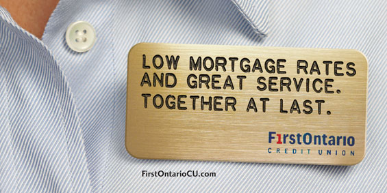
First Ontario Credit Union
Intended Message: Get a mortgage here.
Message Clarity: ![]()
Visual Style & Design: ![]()
Volume of Copy: ![]()
Overall Grade: B+
Tip: The line about “together at last” could be replaced with a call to action.
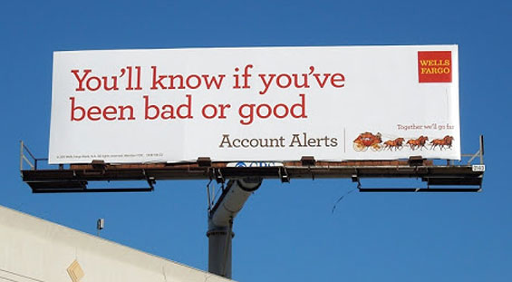
Wells Fargo
Intended Message: Get a checking account here.
Message Clarity: ![]()
Visual Style & Design: ![]()
Volume of Copy: ![]()
Overall Grade: B+
Tip: Consider adding a visual element that complements the concept (e.g., a mobile device), and dump the tagline. Taglines should almost never be used in billboards, as they usually detract from the primary message while adding unnecessary words. Assuming this ad ran during the holidays, it deserves some bonus credit for the turn of a popular seasonal phrase.

Why Industry Cloud for Banking?
PwC’s Industry Cloud for Banking helps deliver personalized products and services that today’s customers expect.

Navigating the Role of AI in Financial Institutions
83% of FI leaders agree investing in AI is essential for 2024 but how you leverage AI is instrumental in success and meeting customer expectations.
Read More about Navigating the Role of AI in Financial Institutions
Read More: Advertising Clinic: 6 Tips For Better Banking Billboards
Pioneer Credit Union
Intended Message: Switch to Pioneer.
Message Clarity: ![]()
Visual Style & Design: ![]()
Volume of Copy: ![]()
Overall Grade: A
Tip: Add URL, preferably something funny and memorable.
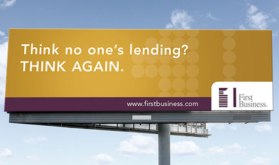
First Business Bank
Intended Message: Get a business loan here.
Message Clarity: ![]()
Visual Style & Design: ![]()
Volume of Copy: ![]()
Overall Grade: A-
Tip: The billboard could make it more obvious what kind of loan(s) are the focus.
Cyprus Credit Union
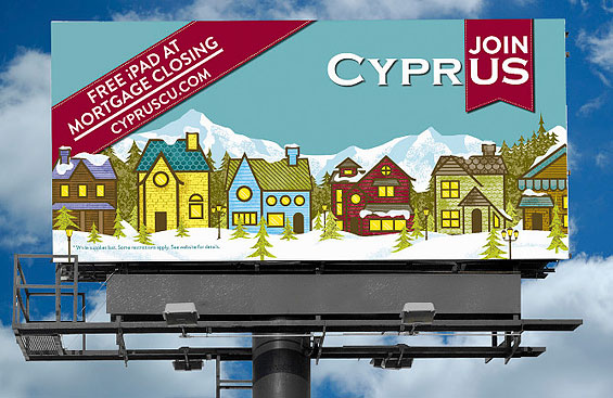
Intended Message: Get a mortgage here.
Message Clarity: ![]()
Visual Style & Design: ![]()
Volume of Copy: ![]()
Overall Grade: B+
Tip: It’s not immediately clear what Cyprus is (a credit union) or what they offer (banking services, specifically mortgages).

More: Creative Showcase: Good/Bad Billboards, Qrossword, World Record
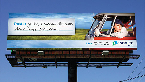
Intrust Bank
Intended Message: Trust us.
Message Clarity: ![]()
Visual Style & Design: ![]()
Volume of Copy: ![]()
Overall Grade: C
Tip: The quasi-testimonial offered in this billboard could express a more concrete advantage. All she’s saying is that “trust is getting direction.” She isn’t definitively saying that Intrust delivers the direction she needs at the right times.
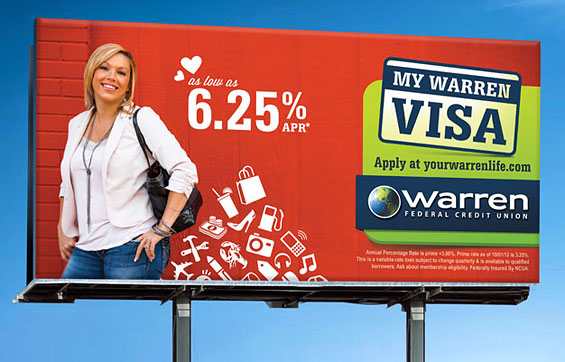
Warren FCU
Intended Message: Get a credit card here.
Message Clarity: ![]() .
.
Visual Style & Design: ![]()
Volume of Copy: ![]()
Overall Grade: B
Tip: It might be helpful to put the words “credit card” somewhere in the copy, perhaps right next to the two little hearts. Disclosure copy on billboards is never legible — why bother?
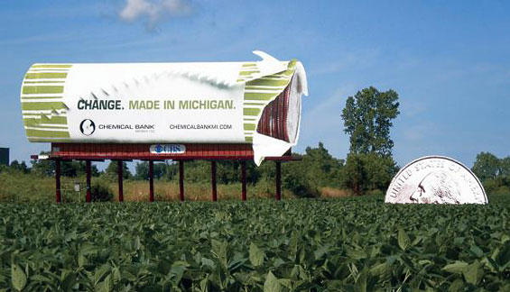
Chemical Bank
Intended Message: Bank with us because we’re local.
Message Clarity: ![]()
Visual Style & Design: ![]()
Volume of Copy: ![]()
Overall Grade: A-
Tip: The meaning/message behind the headlines could be more clear: How is Chemical Bank responsible for making “money” and “change” happen in Michigan? Do readers Or should we just enjoy a good visual pun?
[nativevads]
More: Creative Showcase: Human Billboards, Tear Jerker, Freezing Dummy
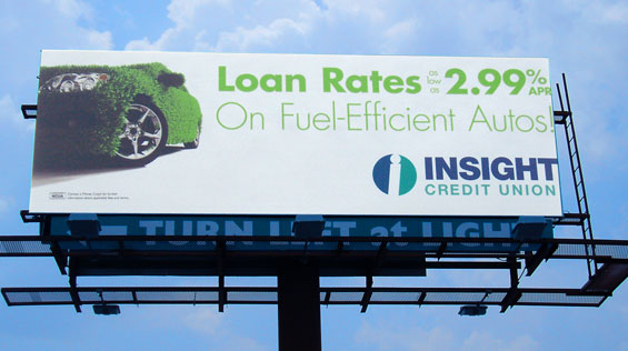
Insight Credit Union
Intended Message: Get a loan for your fuel efficient vehicle here.
Message Clarity: ![]()
Visual Style & Design: ![]()
Volume of Copy: ![]()
Overall Grade: A
Tip: Adding the URL “insightcreditunion.com” wouldn’t hurt.
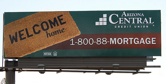
Arizona Central Credit Union
Intended Message: Get a mortgage here.
Message Clarity: ![]()
Visual Style & Design: ![]()
Volume of Copy: ![]()
Overall Grade: A-
Tip: Mortgage rates are low, so perhaps include the best possible APR. However, this billboard is so simple in its execution — even the call to action and contact info are efficiently combined into one element — that making any changes might kill what makes it special.
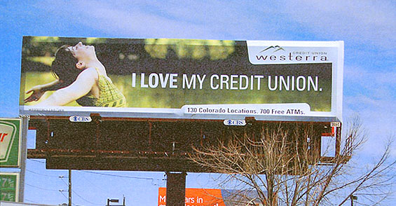
Westerra Credit Union
Intended Message: Remember us.
Message Clarity: ![]()
Visual Style & Design: ![]()
Volume of Copy: ![]()
Overall Grade: C+
Tip: The billboard is fetching to the eye, and it proclaims Westerra is a “credit union” loud and proud. But two key facts are tucked away at the bottom: 130 locations and 700 free ATMs. Now that’s something to brag about!
RBC
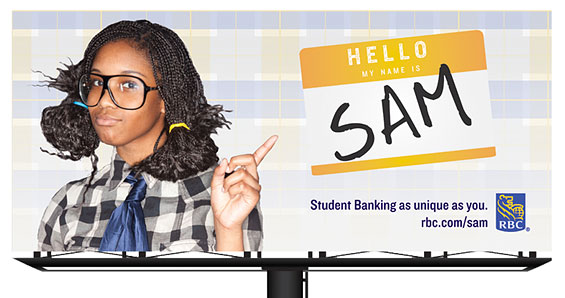
Intended Message: Get a student checking account here.
Message Clarity: ![]()
Visual Style & Design: ![]()
Volume of Copy: ![]()
Overall Grade: C+
Tip: Great concept, but the giant “Hello My Name is Sam” badge overpowers the real message — that RBC offers banking services suited to the student lifestyle. The subhead should be the main, dominant headline: “Student Banking as unique as ____ .” The fill-in-the-blank could be filled with the (somewhat smaller) nametag sticker.

More: Creative Showcase: Icicle Tricycle, Mariachi Band, Bad Habits, Rickshaw
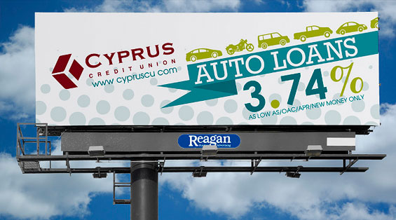
Cyprus Credit Union
Intended Message: Get an auto loan here.
Message Clarity: ![]()
Visual Style & Design: ![]()
Volume of Copy: ![]()
Overall Grade: A
Tip: There’s too much kerning on the 3.74% interest rate. The conditions — “as low as / OAC / new money only” — could have been rephrased “for qualified borrowers” to tone down the legalese.
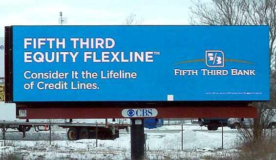
Fifth Third Bank
Intended Message: Get a home equity line here.
Message Clarity: ![]()
Visual Style & Design: ![]()
Volume of Copy: ![]()
Overall Grade: C-
Tip: Even if the product’s official title is the “Fifth Third Equity Flexline,” there’s no need to repeat the words “Fifth Third.” There should be a call to action strong than to just “consider it the lifeline of credit lines,” which smacks of a desperation loan from a lender of last resort.
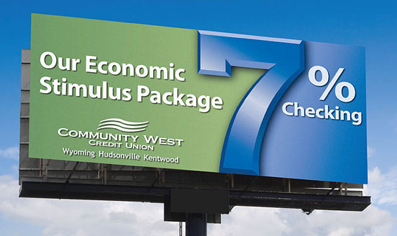
Community West Credit Union
Intended Message: Get a checking account here.
Message Clarity: ![]()
Visual Style & Design: ![]()
Volume of Copy: ![]()
Overall Grade: A
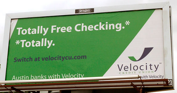
Velocity Credit Union
Intended Message: Switch to Velocity.
Message Clarity: ![]()
Visual Style & Design: ![]()
Volume of Copy: ![]()
Overall Grade: A-
Tip: Eliminate the line of copy that says “Austin banks with Velocity,” and move the call to action and URL down a bit. That gives more room to explore more dynamic/creative typesetting options for the headline and its payoff.

How Banks Are Fortifying Their Data Against Increasing Cyber Threats
This webinar from Veeam will detail the value of working together across your organization to be better prepared in cyber defense and response readiness.
Read More about How Banks Are Fortifying Their Data Against Increasing Cyber Threats

Send the Right Offers to the Right Consumers
Achieve a better return on your marketing investment. Leverage behavioral data and analytics to target the right customers with the best possible offers.
Read More about Send the Right Offers to the Right Consumers
More: Creative Inspiration: Musical Bus Stop, Airport Stunts, Sneaky Banana
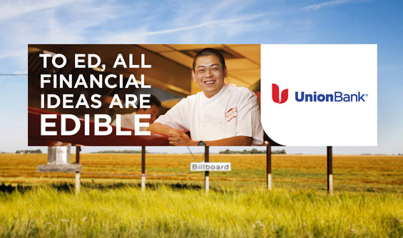
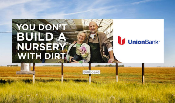
Union Bank
Intended Message: Get a business loan here.
Message Clarity: ![]()
Visual Style & Design: ![]()
Volume of Copy: ![]()
Overall Grade: D-
Tip: Don’t be oblique. Be clear about what you’re selling.
Altura Credit Union
Intended Message: Refi your auto loan here.
Message Clarity: ![]()
Visual Style & Design: ![]()
Volume of Copy: ![]()
Overall Grade: B-
Tip: To hit the refinancing message harder, the billboard could say “Auto Loan Refis.” The line “starting as low as” could be typeset much smaller, and rephrased “starting at.”
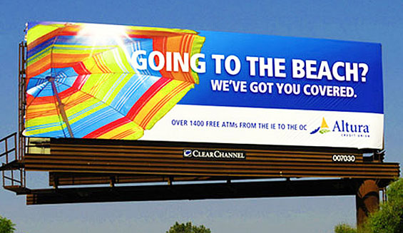
Altura Credit Union
Intended Message: Get a checking account here.
Message Clarity: ![]()
Visual Style & Design: ![]()
Volume of Copy: ![]()
Overall Grade: D
Tip: If you don’t read the ten words of micro type, you won’t know what this billboard is about, and even then you might not be really clear about what it’s selling. If you just read the headline, it could be an insurance ad. Another example where the subhead should be used as the main headline.
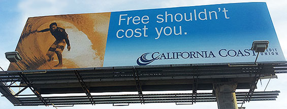
California Coast Credit Union
Intended Message: Get a checking account here.
Message Clarity: ![]()
Visual Style & Design: ![]()
Volume of Copy: ![]()
Overall Grade: D
Tip: This billboard presumably promotes free checking, but the headline is nothing more than a philosophical statement. The adjacent photo has a loose connection to the concept of “freedom,” but does little to support the concept or product being promoted. The headline should be more direct, so that it’s more obvious what the billboard is selling.
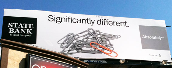
State Bank & Trust
Intended Message: Bank with us because we’re different.
Message Clarity: ![]()
Visual Style & Design: ![]()
Volume of Copy: ![]()
Overall Grade: F
Tip: The visual support for the headline is weak — a paperclip is still a paperclip, the only thing that’s different is the color, and that difference is arguably insignificant. The tagline “Absolutely” is vague, particularly in this context.
First Exchange Bank
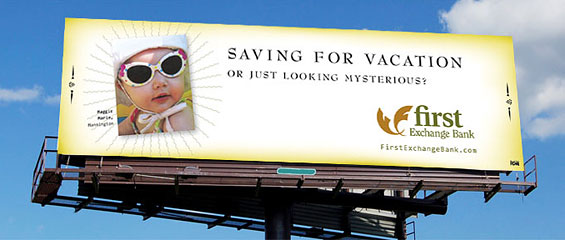
Intended Message: Get a savings account here?
Message Clarity: ![]()
Visual Style & Design: ![]()
Volume of Copy: ![]()
Overall Grade: F
Tip: Start over with another concept.

