“Uncomplicated Banking”
ANZ’s growth strategy hinges on the wider Asia Pacific region, believing the bank’s future lies beyond the shores of Australia and New Zealand.
 “ANZ is increasingly a regional bank, now operating in 32 countries and speaking 19 different languages,” observes Mike Smith, CEO/ANZ.
But, according to ANZ, the bank’s brand had become “fragmented and not consistently leveraged across all customer touch points and messages.”
In strategy documents provided to The Financial Brand, ANZ says it rebranded in order to look like “one bank,” and “provide a consistent experience for people wherever they come into contact with the bank.”
“A strong, unified brand across all our geographies is an important part of our future growth,” Smith said in a press release.
At the core of the brand strategy is a promise that is — quite literally – “simple”:
Uncomplicated Banking
Simple Solutions to Complex Problems
ANZ says “Uncomplicated Banking” is about delivering products and services that are convenient, simplified and straightforward. But ANZ says “uncomplicated” doesn’t always mean “simple.” “Certainly, our customers don’t want their experience with us to be any more complicated than it needs to be,” the bank explains. “But ‘uncomplicated’ means different things to different audiences. In every case, we listen and use a language they can understand.”
A “People-Shaped” Bank
ANZ spent 18 months developing the strategy, including research with branch staff and customers in China, Vietnam and Australia.
“We talked to more than 1,300 customers and 250 staff around the Asia Pacific region,” the bank said. “Despite differences in culture, geography, language or business type, they all said they wanted a bank that was two things: uncomplicated; and focused on people.”
ANZ describes its vision of a “people-shaped” bank as “one that shows respect and understanding for its customers.” The bank has tied its core values to align accordingly:
- We do this by being responsive to customers needs and being approachable and transparent in all of our interactions and living our values.
- We’re a bank that is shaped by our customers. We understand their needs. And we prove it in what we say, and the experiences and solutions we offer.
- We see things from their point of view. We are a bank that demonstrates empathy and values our customer’s voice.
- We talk with them. Not at them. We listen and speak in a way that makes it easy for them to understand.
- We talk from experience – we share insights to provide proof we really do understand their lives. We value each individual.
- We demonstrate this by how we behave with our customers and also our colleagues.

Unlocking Digital Acquisition: A Bank’s Journey to Become Digital-First
This webinar will offer a comprehensive roadmap for digital marketing success, from building foundational capabilities and structures and forging strategic partnerships, to assembling the right team.
Read More about Unlocking Digital Acquisition: A Bank’s Journey to Become Digital-First

The Power of Localized Marketing in Financial Services
Learn how to enhance your brand’s local visibility, generate more leads, and attract more customers, all while adhering to industry regulations and compliance.
Read More about The Power of Localized Marketing in Financial Services
Rolling the Lotus Out Slowly
ANZ’s most significant change to its brand identity was a redesigned logo. ANZ simplified the typography and adding a symbol, something the bank calls a “lotus.” ANZ describes its lotus as “a symbol of unity and growth relevant to customers regardless of differences in language and culture.”

“The symbol provides another way for staff, customers and the community to recognize and connect with ANZ and what we stand for,” the bank says of its lotus. “Especially in regions where the name ANZ is not yet well recognized, or where non-English characters are used.”
ANZ offers further rationale for its lotus symbol:
- The organic nature of the symbol acknowledges the core premise of our business – growth.
- The three shapes signify Australia, New Zealand and Asia Pacific, Europe and America — our three regions coming together as one.
- The central human shape represents our customers and our people — the driving forces behind our business.
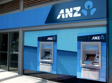
ANZ doesn’t feel any particular pressure to rush the brand identity change-out. The new brand will be rolled out in stages over the next year or two. ANZ says it will “contain costs by linking to business-as-usual upgrades.” ANZ has already switched signage on buildings, branch collateral, corporate stationary, advertising and online.
The Financial Brand’s first article about the new ANZ logo in the Spring of 2009 didn’t receive much attention until the bank debuted its new identity on its home turf later in the year. Then in the fall, a flood of Australian designers and financial marketers descended on the story, viewing it over 2,850 times and making the article the #2 most-read on the site last year.
ANZ expects the initiative to cost AUS $15 million in 2010, claiming the cost does not represent a significant increase in marketing expenses.
The rebranding effort also marks the first global advertising campaign for ANZ. In Australia, the campaign consists of TV, print and outdoor ads, and in-branch materials.
“A Long Way to Go”
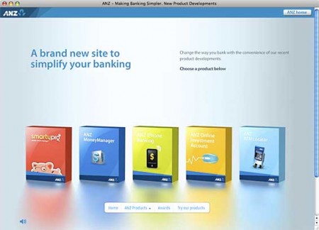
As part of its branding process, ANZ looked at the ways it was already making banking uncomplicated, and came up with it calls some “Initial Proof Points.” Among some of the products and services recently introduced by ANZ:
- Smarty Pig – Goal-based savings
- ANZ Money Manager – Online personal financial management tools (PFM)
- ANZ iPhone Banking – Mobile phone banking application
- ANZ Online Investment Account – Internet-based stock portfolio platform
- Online ATM Locator – It actually helps you find all kinds of locations, not just ATMs
But ANZ also recognizes its ‘Uncomplicated Banking’ strategy raises expectations beyond what the bank is currently delivering.
“Really delivering on our new brand promise to our customers and staff is an aspiration,” ANZ explains. “We have made some good progress but we still have a long way to go.”
The bank’s strategy calls for “additional proof points” and “future initiatives in 2010.” Some of ANZ’s other recent and planned initiatives include:
- Establishing a simplified fee structure by eliminating 27 fees on personal accounts.
- The introduction of specialist bankers who focus on individual customer needs including retirement specialists, small business specialists and Asian specialists.
- Simplified mortgage pre-approvals.
- Extending branch opening hours during the Christmas season. This includes late nights and open Saturdays in major shopping centers.
Key Takeaways: Average brands are built around what the organization can already deliver today. Breakthrough brands are built by living out the brand to its fullest potential. You will never maximize the opportunities lurking within your brand unless the entire organization makes changes. It takes time, energy and money.
ANZ New Product Developments
A subsection of the main ANZ website detailing some of the bank’s recent product and service launches.


NEW LOGO – INDONESIAN AIRPORT
ANZ started introducing its new logo in its outer markets before rolling it out in Australia.


