[Editor’s Note: This program is about 18 months old, but it just crossed my desk for the first time last week. Have you heard of it? After generating some initial buzz, it doesn’t appear to have gained any real traction. Sources at Netbanker say there was a controversial video that may have had the power to take this promo viral, but the video was offensive enough that it was pulled. Nevertheless, the program illustrates one way you can creatively link products with Web 2.0 initiatives.]
MoveOutMoveUp.com, an interactive microsite from ING, speaks with a wry voice to the unique circumstances typical renters endure prior to home ownership.
 Entertainment – rather than sales or information – seems to be the site’s primary purpose. There’s plenty of amusing distractions related to the frustrations of renting, but most of the content only tangentially connects back to ING’s lending efforts.
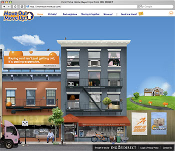
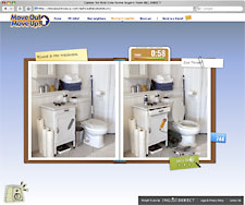
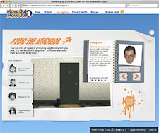
Much of the all-Flash site is designed like a video game. In fact, the site features two actual games: Photo-Hunt, where you find the differences between two similar-looking photos, and Avoid the Neighbor, where you have to navigate an orange ball away from a swarm of irritating neighbors (Nosey Nora or Creepy Carl, for instance). Both games are fun, but only for about 5 minutes. Not a lot of replay value.

Why Industry Cloud for Banking?
PwC’s Industry Cloud for Banking helps deliver personalized products and services that today’s customers expect.

Send the Right Offers to the Right Consumers
Achieve a better return on your marketing investment. Leverage behavioral data and analytics to target the right customers with the best possible offers.
Read More about Send the Right Offers to the Right Consumers
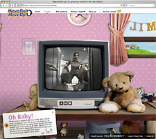
There are two videos at the site. One video depicts a woman’s frustrations as she loads and unloads groceries into and out of an apartment elevator. It’s not very interesting. The other video is a shade away from a fart joke. A gal’s hopes for a romantic dinner in her ultra-tiny loft are dashed when her boyfriend comes out of the bathroom wafting his hands – surprisingly unfunny as far as “light-a-match” moments go.
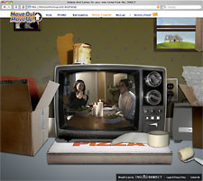
The videos merely depict renters’ motivations behind moving out (annoying elevators, pervasive poo smell), but doesn’t give a lot of advice on moving up. ING missed an opportunity to really reach out to renters with some helpful tips and information. Instead of just telling renters, “Yeah, we get it,” ING could have also said, “And here’s some things you might not have considered.” Some people call this lifestage marketing. Whatever you call it, ING didn’t do it.
Key Question: What on- and offline marketing did ING use to drive traffic to the site?

The site is pretty entertaining, fairly engaging and occasionally funny, which isn’t very common in financial services. It just lacks that certain spark or magic or cleverness required to catapult an idea into the viral stratosphere.
 The interface isn’t obvious, which is part of the site’s charm. There is a sense of discovery as you explore the interface.
There are a number of little creative gems sprinkled throughout the site, like ING’s signature orange ball which makes clever cameos here and there.
Key Takeaways: Web 2.0 tools should not be deployed simply to create “engagement” and “conversation” – that touchy-feely crap doesn’t create sales. Business objectives should drive your Web 2.0 strategies. Build your Web 2.0 solutions around products critical to your success.
This campaign was a collaborative effort involving ING Direct’s Marketing team, its lead strategic agency GWP Brand Engineering, and its online creative agency Creative Priority.


