Of all the components of your brand — your position/promise, your products, your service experience, etc. — none is more visible than your logo. While it doesn’t represent the entirety of your brand, it is the visual shorthand you use to identify your organization publicly. All the associations consumers have with your brand get summarized and categorized under this one single symbol.
Some organizations — financial institutions in particular — feel that they send a positive message by preserving their logo unchanged for decades; it projects an image of stability and security, their argument goes. But if you look at what all the big, successful, breakthrough brands have done over the years — inside and outside the financial industry — you’ll likely draw a different conclusion. Almost all of the most admired brands on earth tend to refresh their logo (or entire brand identity) about every ten years or so.
Why do they do this? Simple: to stay relevant.
Unless your brand position is one built around themes like heritage and nostalgia, you need to update your logo from time to time to project an image that connects with each new generation of consumers. Certainly there are some successful financial institutions that have wrapped their brands in the heritage of days gone by (e.g., Wells Fargo and their iconic stagecoach logo), but most banks and credit unions these days are trying to project the image that they are technologically savvy. Besides, most historical brands in the banking world were merged away long ago, so the “heritage” card isn’t one that most banks could play if they wanted to.
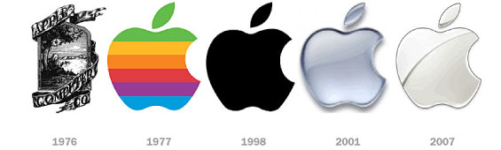
Apple has been using the same basic shape for over 35 years now, but they’ve not been afraid to render it differently. The designer of the modern Apple icon added the “bite” to help distinguish the shape from a cherry. Steve Jobs added the rainbow palette to reflect the varied range of personalities working at the scrappy startup. But when Apple was founded in 1976, their logo looked like it was more suited to a fruit company than a computer company. There is no chance Apple would be the ultra-slick tech brand they are today if their logo was still the same hand-engraved vintage etching they used back in 1976 — an esoteric image of Sir Issac Newton sitting under an apple tree.
Reality Check: It’s hard to convince consumers that you have a mobile-friendly brand in a world dominated by Apple, Google and Facebook when you have a dated, aged logo that screams Atari, Pan Am or Tab.
Consider this analogy. If you were still wearing the same outfits today that you did in high school, how would people perceive you? A bit behind the times, don’t you think? Stuck in your ways. Clinging to the past. Uncool, unstylish and unpopular. And that’s 180° from the brand image most financial institutions want to project.
Reality Check: The younger the audience you are targeting, the more often you need to refresh your brand’s identity.
Kids (of all generations) don’t like to adopt their parents brands. That’s why brands like Cadillac, Abercrombie & Fitch and Schwab have used their identity as a tool to reinvent themselves, making an old brand new again.
Reality Check: The bigger an organization is, the less often the logo can/will change.
It’s much easier for a credit union with one branch to rebrand its corporate identity than for a massive multinational bank to make even the slightest tweak to its logo. Smaller institutions have the edge over big banks when it comes to rebranding their identity; it’s easier and less expensive. For large institutions, it’s a logistical nightmare, not to mention the cost.
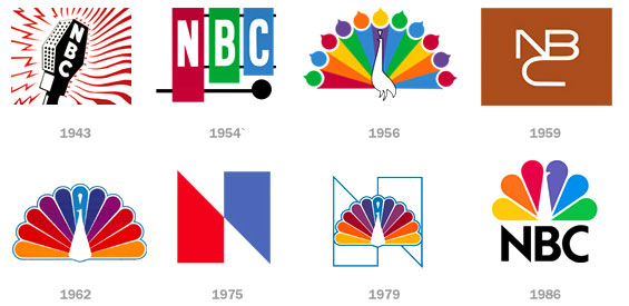
NBC has gone through some sweeping changes since their first design. NBC began as a radio station broadcast network as early as the 1920s, and used a microphone logo from the 20s until 1942. Their timeless rainbow peacock design emerged in 1956 to celebrate and encourage the ubiquity of color televisions. This peacock logo experienced many permutations throughout the decades, and today some people don’t even realize that the NBC logo is supposed to be evocative of a bird.
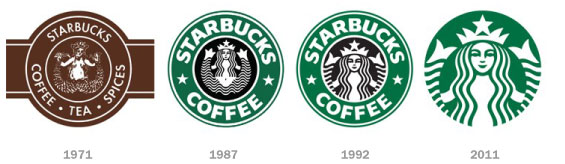
The original Starbucks logo is a bare-breasted, two-tailed Melusine (a type of mermaid), which is hardly appropriate for the mass market brand the company enjoys today. “Most corporate logos go through rather natural evolutions that adapt with changes in consumer tastes,” notes Jason Nazar with DocStoc. “Companies design new logos in order to embrace new cultural design aesthetics, but still make a point to maintain recognizable elements of their brand.” Starbucks provides a good example of a logo progression that eases customers into a new style while preserving the essence of their old logo.
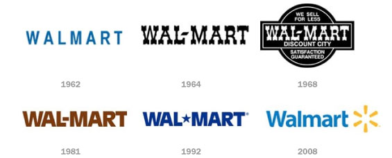
Walmart has experimented with various colors and variations in its logo over the years. In 1962, when Sam Walton started, the company, the logo had simply the word spelled in a very basic design. The logo was changed in 1964, when a hyphen was added and the color was also changed from blue to black, known as the “Frontier Font Logo.” The 1968 logo was mainly used for uniforms, in-store signing etc, but was not used in advertisements. The 1981 logo changed the curly font to a more solid font, giving the company a more stable, established and professional look. The hyphen was replaced by the star in 1992, and the original blue color of the logo returned.
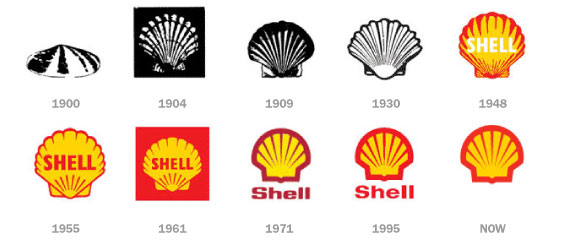
Back in 1900, when the company was started the logo was a realistic and simple shell which lies flat on the ground. This was a pectin or scallop shell, but today the company has a logo which is bold, colorful and much more simplistic.
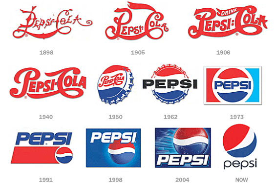
Pepsi, one of the biggest soft drinks companies on earth, was first initially called “Brad’s,” but the name was quickly changed to Pepsi-Cola, which is visible in the first 1898 logo. The founder, Caleb Bradham, designed the first few logos, but once he sold the company in 1933, the brand’s new owner gave it a new look and kept updating the logo with some regularity.