Postcards can be powerful marketing tools. They are like miniature billboards that should “pop” when taken from the mailbox. Typically, postcards can be produced quicker and production costs are usually less, so they’re easier to get in the mail faster. Messages tend to be simple, easy to digest, and easy to remember. They allow you to reach your best prospects in their homes, and you can personalize your offer for relatively little additional expense.
But your postcard designs need to be hitting on all cylinders, or you’re not going to see the results you expect. To be successful, every postcard needs a simple, focused message, a strong offer, and a call to action
Here are three distinctly different postcard examples that illustrate effective postcard marketing techniques.
Pretty & Pointless: Looks Good, But Where’s The Offer?
Themes can cause problems. Too often, all the effort is spent forcibly twisting the copy to fit the premise… at the expense of the sales message. This postcard has weak copy, no offer, the product is almost impossible to find, and no call to action. It wastes precious marketing dollars because it’s unlikely to generate results, even with help from “superheroes.”
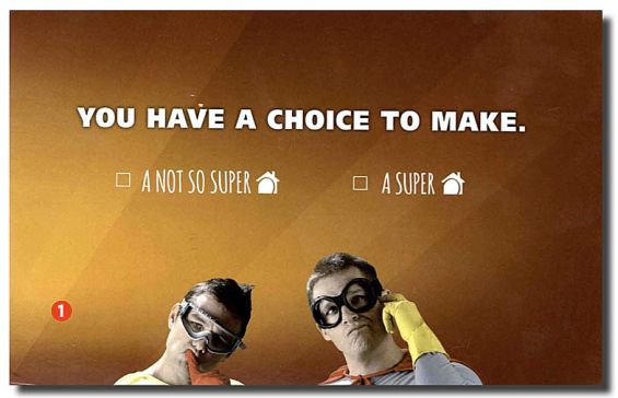
1.) Front of Postcard. This side is wasted. If you must use a theme, at least focus the theme on a product and offer. A “theme” doesn’t benefit consumers, but a product and offer does. This postcard could be from anyone for anything. The harried single mom isn’t going to take the time to figure out what this is about — one brief look at this and it will immediately be discarded as irrelevant and unnecessary.
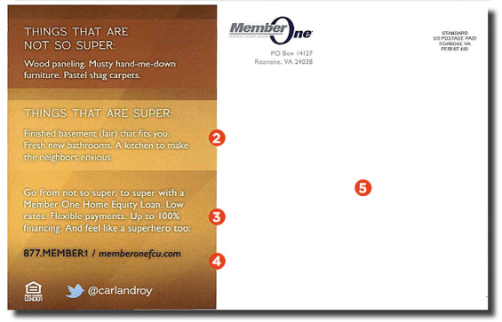
2.) Tangential Benefits. If you haven’t figured it out by now, this postcard is for a home equity loan, so the credit union tossed in a couple references to the standard projects people use a second mortgage for — kitchen remodel, finished basement. Consumers already know why they need money and how they are going to spend it. Instead, you need to tell them why they should borrow using this particular loan product.
3.) Product Buried. Prospects won’t hunt for the product, and yet you can’t find the first reference to what this postcard is about until after you’ve already read 60 words, by which point you’ve already chucked it in the waste bin. And there is no product offer — no special rate, no incentive, no giveaway, nothing.
4.) No Call to Action. Adding your basic contact info (phone, web address) is not a call to action. You need to tell readers precisely what to do next and repeat the offer, like this: “To learn more about our special 3.5% APR offer for a Home Equity Loan, call us at XXX or visit our website at XXX.” Furthermore, this postcard lacks any method or mechanism to track its ROI. If the CEO asked the marketing department how many loans this postcard generated, no one would have the answer. And yet the credit union will spend valuable real estate promoting a bizarre Twitter account that has almost nothing to do with financial services. It’s almost like they’d rather you follow them on Twitter than get a loan.
5.) Dead Zone. They’ve taken the phrase “white space” too literally. The post office doesn’t require this much empty area for the address. Use some of this valuable territory to sell the product.
Read More: Direct Marketing Clinic – Chase Mailer Pros & Cons, Tips & Tricks
Sensory Overload: Saying the Right Things the Wrong Way
Blech!!! Look away! That might be the reaction from many prospects who see this eye-straining postcard. Too many colors and font sizes, and not enough white space. This is what a late-night TV ad looks like on a postcard. Readers aren’t going to take the time or effort to organize your message into a cohesive, structured offer that makes sense. This is a great offer that has been completely undermined by the cluttered, messy design. Good design creates credibility. While the copy hits all the right points, the overall design will make most readers suspicious of the company.
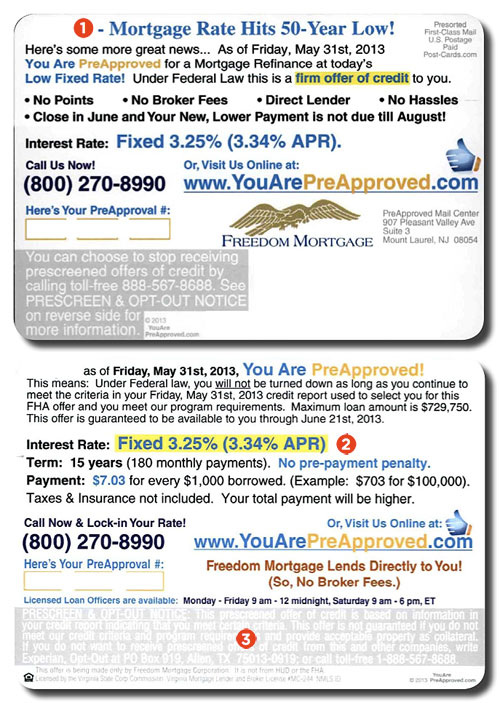
1.) Good News, You’re Pre-Approved. This makes a solid headline, but it’s lost in the disorganized copy. Set the benefit apart so it’s noticed.
2.) Solid Offer. A good offer, but it’s scattered across both sides of the postcard. For clarity, the bullets “No Points” and the June/August payment delay should be combined with the other product offer details shown on the card’s opposite side.
3.) Legalese. Here’s a reason why a pre-approved offer isn’t appropriate for a postcard. With a pre-approved offer, government-required disclaimers must be included on both sides. The legalese devours way too much space. Also, credit bureaus insist they review and approve marketing pieces sent to their lists, so it’s surprising that this hard-to-read, white-on-light-gray copy got by their compliance department.
Read More: Direct Marketing Clinic – Ally Bank’s Email Techniques
Now That’s Better… A Clear Offer
This is very good use of a postcard to deliver a strong offer. It’s focused and easy to understand, even with a quick glance during the walk from the mailbox to the door. It’s simple. It’s direct. It promotes the product and offer. This is an ideal model of how to create an effective direct marketing postcard.
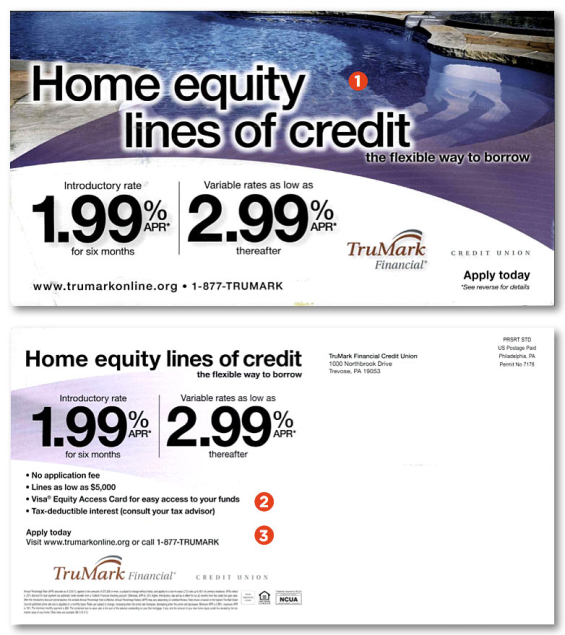
1.) Headline. No mistaking what’s going on here. The product, a benefit, incentive (rate), and call to action all on one side. The swimming pool image just gets in the way. A blue sky with the edge of a house showing would have better served the message.
2.) Specific Product Benefits. After repeating the product and rate offer, here are benefits that appeal to prospects. It’s best to give details, but space is limited.
3.) Call to Action. This call to action (“Apply Today”) is okay, but it would be better if it included an invitation to a specific branch near the recipient’s house, a dedicated (and trackable!) phone number, and/or a unique website landing page for the offer.
Read More: Direct Mail Clinic – Designing Bank Marketing Envelopes That Sell
Additional Advice
Marketing postcards come in various sizes. Use them to promote special events, new products and services, announcement and reminder messages, and basic product offers.
Larger cards (approximately 10.5 x 6 inches) stand out from other mail in the box. Add images if they reinforce the message and color to direct the eye, but don’t let your visuals steal the show.
Depending on the promotion, you can use up to 150 words of copy, but always keep messages simple and straightforward.
If needed, a digital press can create highly personalized postcards that repeat the prospect’s name in the text and include other variable copy like rate and dollar amounts, redemption dates, phone numbers, neighborhood branch addresses, PURLs, and promotion codes.
Consider the pros and cons shown in these examples when you create your own marketing postcard. Combined with the right opportunity and message, postcards are an effective, productive advertising format.